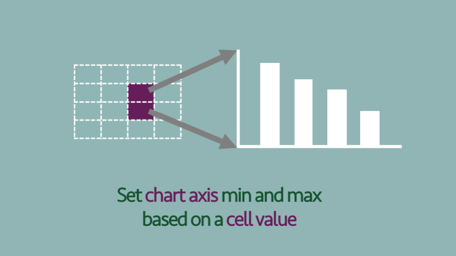
“Not again…” I think to myself every time I change the minimum and maximum values of a chart axis. It’s such a tedious task, and I know I’ll be doing it again at a future point. It only takes a few seconds, but all that time starts to add up. There are various chart objects we can link Read More
Category: Charts
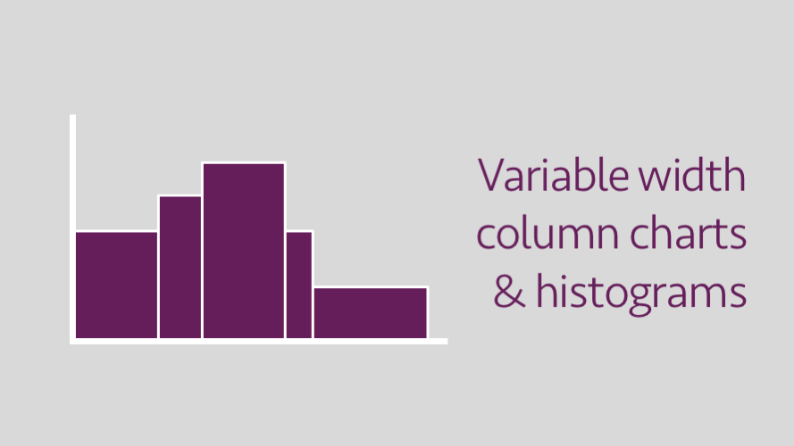
Variable width column charts and histograms in Excel
In Excel, the standard column chart will display all columns with the same width at regular intervals. However, in some circumstances, it would be better for the width of each column to be different. For example, where each column represents different ranges of data. This same principle of column width also applies to histograms. Excel Read More
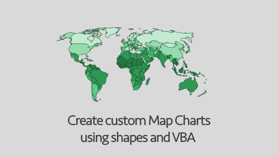
Creating custom Map Charts using shapes and VBA
Whenever I see promotional images for expensive BI Dashboard software, they always show the same thing – a map with countries or regions highlighted in different colors. It sends the subtle message that maps are the pinnacle of Business Intelligence (whether they are or not is a different matter altogether). Until Excel 2016, these Map Read More
Highlight specific bars in a bar chart
Sometimes in a chart we want to highlight certain bars so the reader can quickly see the important information. An example would be to highlight our company when it is compared with its competitors (see the chart below). In this chart, it is very easy to see how Fox Books compares to its competitors. There Read More
The fastest way to create Bullet Charts
My first experience of Bullet Charts came from reading Information Dashboard Design by Stephen Few in 2007. This was the year I started to get serious with dashboards. Initially, to create Bullet Charts I used the 3 stacked bar/column charts approach. Later, I moved to using the two-axis stacked column where possible, but in general, Read More
How to format multiple charts quickly
Today I would like to share with you the best tip I learned last year. Why has this had never occurred to me previously? I have no idea. But I can honestly say that this has already saved hours of my life. Given the long hours we are expected to work these days, I know Read More
Create a tolerance chart in Excel
A tolerance chart shows how a result compares to a maximum and minimum permitted range. These charts are often used in industry to check whether a process is working correctly and within permitted limits. The image below shows the type of chart we will be creating. The data This chart requires various values: Minimum value Read More