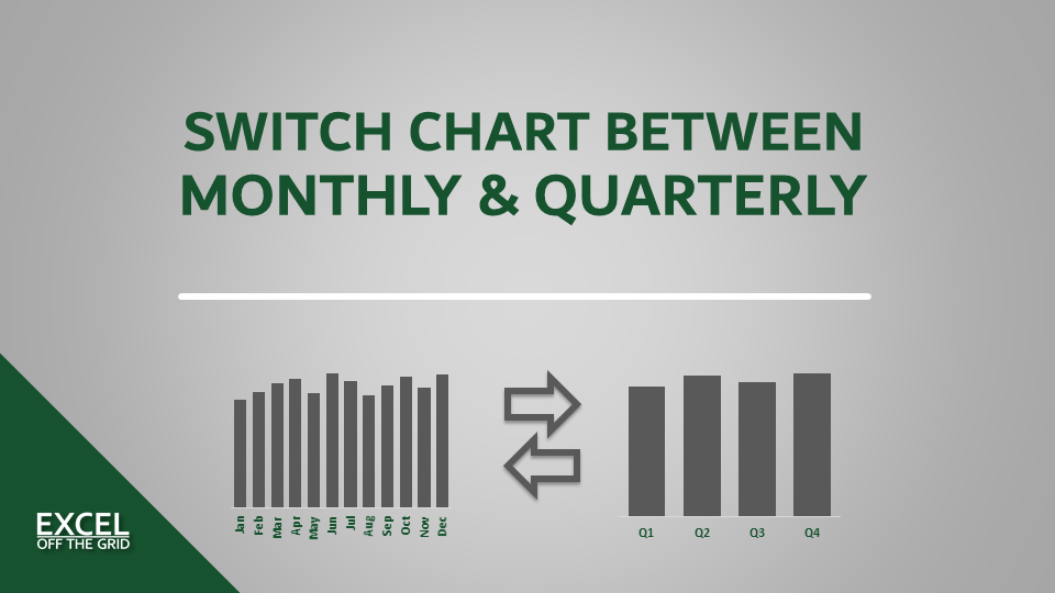
In this post, I want to answer a question asked by a reader. The question was from Nick:
“I have a chart on a separate chart sheet, where I’d like to add a developer object (button, option box or checkbox) to control whether data is shown quarterly or monthly. Any idea how to do that?”
In this post, we’re going to answer that very question.
Table of Contents
Download the example file: Join the free Insiders Program and gain access to the example file used for this post.
File name: 0027 Switch chart between monthly and quarterly.zip
Watch the video:
Scenario
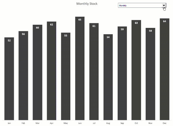
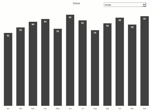
Here is our scenario. As shown in the screenshot below, there is monthly and quarterly data.

From this, we want to create a chart on a chart sheet, on which we can easily switch between displaying monthly or quarterly values.
Creating the chart
Let’s start by creating a chart and formatting it.
Select the cells containing the monthly data, then click Insert > Clustered Column Chart.
Format the chart however you wish. In this example, I have:
- Increased the Gap Width to 50%
- Changed the fill color to dark gray
- Removed the major gridlines
- Set the vertical axis minimum to always start at zero
- Removed the vertical axis
- Added data labels
- Positioned the data labels to be Inside End
- Formated the data labels to be white, bold, size 11.
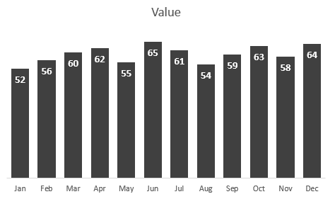
The formatted chart now looks like this:
Move the chart to a separate sheet
Charts can either be on the face of a worksheet or as a separate sheet by itself. Switching between them is simple enough.
Right-click on the chart, select Move Chart… from the menu.

Select New sheet and give the chart sheet a name. I’ve gone with the default value of Chart1. Click OK.

The chart now moves to a separate sheet by itself.
Create the drop-down list
Next, let’s create a drop-down list, which we will use to switch between the monthly and quarterly options.
Enter the values Monthly and Quarterly in a list on the worksheet (I’ve used cells G3 & G4 on Sheet1)
Select the chart sheet, then click Developer > Insert > Combo Box (Form Control). While I’ve used a Combo Box, any object with a cell link will work.
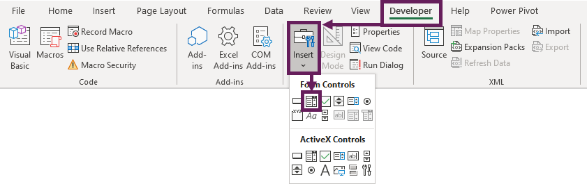
The mouse changes to a small cross. Click and drag the mouse on the chart in the position where you wish to position the drop-down box. We can easily move and resize it later if it’s not quite right.
Right-click on the drop-down, select Format Control…

For the input range, use the list we created a few moments ago.
For the cell link, select any worksheet cell. I’ve used cell H3 on Sheet1.
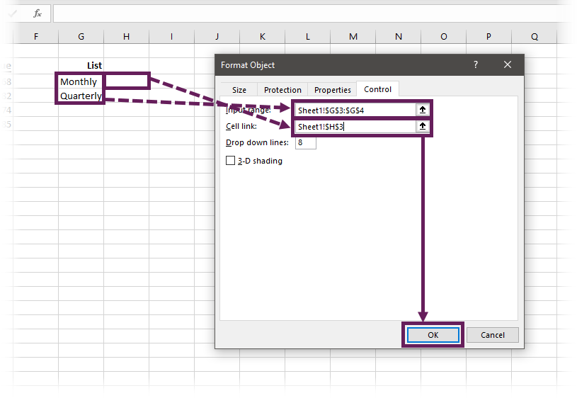
The cell chosen as the cell link displays the selected position within the drop-down. If Monthly is selected in the drop-down, cell H3 displays 1, if Quarterly were selected, it would disoplay 2.
The drop-down box can now switch between the options in the list; it won’t change the chart yet, as it’s not currently linked.
Create dynamic named ranges
The key to the switching functionality is using a named range as the source for the chart. So, let’s create some named ranges.
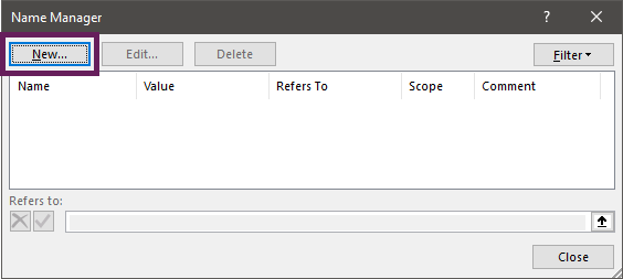
Click Formulas > Name Manager.

In the Name Manager dialog box, click New.
Give the named range a name (I’m using ChartSource in this example).
In the Refers To box, we are going to enter a formula. There are many formulas that we can use to create a dynamic range. For this scenario, we are going to use CHOOSE.
The arguments of the CHOOSE function are:
=CHOOSE(Index_num, Value1, Value2, [Value3]...)
- Index_num = Specifies which value argument to select
- Value1 = The value to return if the Index_num is 1
- Value2 = The value to return if the Index_num is 2
- Value3 = The value to return if the Index_num is 3… etc.
CHOOSE can handle up to 254 values; in our example, we are only going to use 2.
- Value1 will be the monthly values
- Value2 will be the quarterly values
The Index_num will reference the cell link from the drop-down box. Therefore, when the drop-down changes, CHOOSE returns either the monthly or quarterly data.
=CHOOSE(Sheet1!$H$3,Sheet1!$B$3:$B$14,Sheet1!$E$3:$E$6)

Click OK to close the New Name box.
Repeat the same steps to create a named range for the labels.
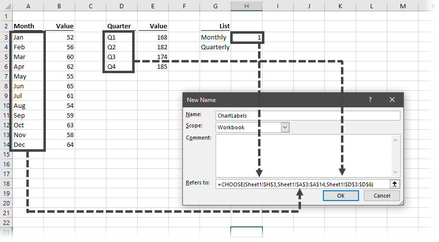
We should now have two named ranges set-up. One for the chart data and the other for the chart labels.
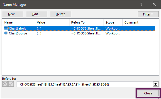
Click Close to close the Name Manager dialog box.
Used named ranges in the chart
Next, let’s use the named ranges in the chart. Right-click on the chart and click Select Data… from the menu.

Click the Edit button in the Legend Entries section.
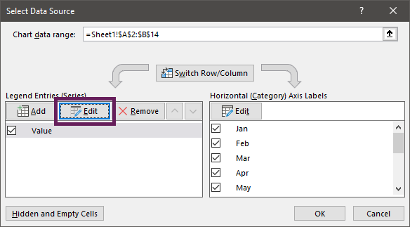
The Edit Series dialog box opens. In the series values field, replace the range with the named range. We need to retain the sheet name at the start of the named range. If the sheet name has a space in it, then it must have single quotes around the name, followed by a ! (e.g., =‘My Sheet’!ChartSource). However, if the sheet name is without spaces, then it doesn’t need single quotes (e.g., =Sheet1!ChartSource, as can be seen in our example below).
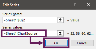
Click OK to close the Edit Series window.
Repeat again for the chart labels.

Click OK to close the Select Data Source dialog box.
Now we can test the drop-down. It should be possible to switch between the monthly and quarterly options.
If your chart formatting changes when switching between the charts (as shown above), don’t worry, we can fix that.
Change chart series formatting
Start with the formatted chart selected.
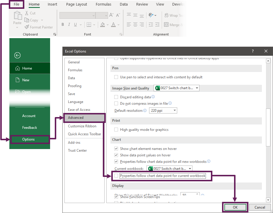
Click File > Options. In the Excel Options window, select Advanced, scroll down to the chart section, and untick the Properties follow chart data point for current workbook option. Click OK to close the options window.
Now, try the chart drop-down again; the formatting should remain.
Create a dynamic chart title
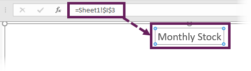
Currently, the title of the chart just says Value. Let’s make that more dynamic too. In cell I3 of Sheet1, enter the following formula:
=INDEX(G3:G4,H3) & " Stock"
This will display Monthly Stock or Quarterly Stock depending on the drop-down selection.
To add this to the chart title, click on the heading, enter the = symbol into the formula bar, then click on the cell containing the title we created.
Conclusion
There we have it; a chart sheet where the user can select between a quarterly or monthly option.
There are lots of charting techniques that use the named range methodology. While we’ve used CHOOSE to switch the chart source, INDEX, OFFSET and XLOOKUP are also good alternative options for applying this methodology.
Discover how you can automate your work with our Excel courses and tools.
The Excel Academy

Make working late a thing of the past.
The Excel Academy is Excel training for professionals who want to save time.
Works great unless I happen to click in the chart area and then go back to the combo box to choose the range; monthly or quarterly. Then Excel shuts down. A bug in my Excel?
I’ve not seen that before. And it certainly shouldn’t behave like that. Sounds like a bug to me.