
Charts and graphs are one of the best features of Excel; they are very flexible and can be used to make some very advanced visualization. However, this flexibility means there are hundreds of different options. We can create exactly the visualization we want but it can be time-consuming to apply. When we want to apply those hundreds of settings to lots of charts, it can take hours and hours of frustrating clicking. This post is a guide to using VBA for Charts and Graphs in Excel.
Table of Contents
- Adapting the code to your requirements
- Understanding the Document Object Model
- Chart Objects vs. Charts vs. Chart Sheets
- Writing code to work on either chart type
- VBA Code Examples
- Inserting charts
- Reference charts on a worksheet
- Reference chart sheets
- Basic chart settings
- Chart Axis
- Gridlines
- Chart Title
- Chart Legend
- Plot Area
- Chart series
- Data labels
- Error Bars
- Data points
- Other useful chart macros
- Make chart cover cell range
- Export the chart as an image
- Resize all charts to the same size as the active chart
- Bringing it all together
- Using the Macro Recorder for VBA for charts and graphs
- Conclusion
The code examples below demonstrate some of the most common chart options with VBA. Hopefully you can put these to good use and automate your chart creation and modifications.
While it might be tempting to skip straight to the section you need, I recommend you read the first section in full. Understanding the Document Object Model (DOM) is essential to understand how VBA can be used with charts and graphs in Excel.
In Excel 2013, many changes were introduced to the charting engine and Document Object Model. For example, the AddChart2 method replaced the AddChart method. As a result, some of the code presented in this post may not work with versions before Excel 2013.
Adapting the code to your requirements
It is not feasible to provide code for every scenario you might come across; there are just too many. But, by applying the principles and methods in this post, you will be able to do almost anything you want with charts in Excel using VBA.
Understanding the Document Object Model
The Document Object Model (DOM) is a term that describes how things are structured in Excel. For example:
- A Workbook contains Sheets
- A Sheet contains Ranges
- A Range contains an Interior
- An Interior contains a color setting
Therefore, to change a cell color to red, we would reference this as follows:
ActiveWorkbook.Sheets("Sheet1").Range("A1").Interior.Color = RGB(255, 0, 0)Charts are also part of the DOM and follow similar hierarchical principles. To change the height of Chart 1, on Sheet1, we could use the following.
ActiveWorkbook.Sheets("Sheet1").ChartObjects("Chart 1").Height = 300Each item in the object hierarchy must be listed and separated by a period ( . ).
Knowing the document object model is the key to success with VBA charts. Therefore, we need to know the correct order inside the object model. While the following code may look acceptable, it will not work.
ActiveWorkbook.ChartObjects("Chart 1").Height = 300In the DOM, the ActiveWorkbook does not contain ChartObjects, so Excel cannot find Chart 1. The parent of a ChartObject is a Sheet, and the Parent of a Sheet is a Workbook. We must include the Sheet in the hierarchy for Excel to know what you want to do.
ActiveWorkbook.Sheets("Sheet1").ChartObjects("Chart 1").Height = 300With this knowledge, we can refer to any element of any chart using Excel’s DOM.
Chart Objects vs. Charts vs. Chart Sheets
One of the things which makes the DOM for charts complicated is that many things exist in many places. For example, a chart can be an embedded chart on the face of a worksheet, or as a separate chart sheet.
- On the worksheet itself, we find ChartObjects. Within each ChartObject is a Chart. Effectively a ChartObject is a container that holds a Chart.
- A Chart is also a stand-alone sheet that does not have a ChartObject around it.
This may seem confusing initially, but there are good reasons for this.
To change the chart title text, we would reference the two types of chart differently:
- Chart on a worksheet:
Sheets(“Sheet1”).ChartObjects(“Chart 1”).Chart.ChartTitle.Text = “My Chart Title” - Chart sheet:
Sheets(“Chart 1”).ChartTitle.Text = “My Chart Title”
The sections in bold are exactly the same. This shows that once we have got inside the Chart, the DOM is the same.
Writing code to work on either chart type
We want to write code that will work on any chart; we do this by creating a variable that holds the reference to a Chart.
Create a variable to refer to a Chart inside a ChartObject:
Dim cht As Chart
Set cht = Sheets("Sheet1").ChartObjects("Chart 1").Chart
Create a variable to refer to a Chart which is a sheet:
Dim cht As Chart
Set cht = Sheets("Chart 1")
Now we can write VBA code for a Chart sheet or a chart inside a ChartObject by referring to the Chart using cht:
cht.ChartTitle.Text = "My Chart Title"OK, so now we’ve established how to reference charts and briefly covered how the DOM works. It is time to look at lots of code examples.
VBA Code Examples
Inserting charts
In this first section, we create charts. Please note that some of the individual lines of code are included below in their relevant sections.
Create a chart from a blank chart
Sub CreateChart()

'Declare variables
Dim rng As Range
Dim cht As Object

'Create a blank chart
  Set cht = ActiveSheet.Shapes.AddChart2

'Declare the data range for the chart
  Set rng = ActiveSheet.Range("A2:B9")

'Add the data to the chart
  cht.Chart.SetSourceData Source:=rng

'Set the chart type
  cht.Chart.ChartType = xlColumnClustered

End Sub
Reference charts on a worksheet
In this section, we look at the methods used to reference a chart contained on a worksheet.
Active Chart
Create a Chart variable to hold the ActiveChart:
Dim cht As Chart
Set cht = ActiveChart
Chart Object by name
Create a Chart variable to hold a specific chart by name.
Dim cht As Chart
Set cht = Sheets("Sheet1").ChartObjects("Chart 1").Chart
Chart object by number
If there are multiple charts on a worksheet, they can be referenced by their number:
- 1 = the first chart created
- 2 = the second chart created
- etc, etc.
Dim cht As Chart
Set cht = Sheets("Sheet1").ChartObjects(1).Chart
Loop through all Chart Objects
If there are multiple ChartObjects on a worksheet, we can loop through each:
Dim chtObj As ChartObject

For Each chtObj In Sheets("Sheet1").ChartObjects

    'Include the code to be applied to each ChartObjects
    'refer to the Chart using chtObj.cht.

Next chtObj
Loop through all selected Chart Objects
If we only want to loop through the selected ChartObjects we can use the following code.
This code is tricky to apply as Excel operates differently when one chart is selected, compared to multiple charts. Therefore, as a way to apply the Chart settings, without the need to repeat a lot of code, I recommend calling another macro and passing the Chart as an argument to that macro.
Dim obj As Object

'Check if any charts have been selected
If Not ActiveChart Is Nothing Then

    Call AnotherMacro(ActiveChart)

Else
    For Each obj In Selection

    'If more than one chart selected
    If TypeName(obj) = "ChartObject" Then

        Call AnotherMacro(obj.Chart)

    End If
Next

End If
Reference chart sheets
Now let’s move on to look at the methods used to reference a separate chart sheet.
Active Chart
Set up a Chart variable to hold the ActiveChart:
Dim cht As Chart
Set cht = ActiveChart
Note: this is the same code as when referencing the active chart on the worksheet.
Chart sheet by name
Set up a Chart variable to hold a specific chart sheet
Dim cht As Chart
Set cht = Sheets("Chart 1")
Loop through all chart sheets in a workbook
The following code will loop through all the chart sheets in the active workbook.
Dim cht As Chart

For Each cht In ActiveWorkbook.Charts

    Call AnotherMacro(cht)

Next cht
Basic chart settings
This section contains basic chart settings.
All codes start with cht., as they assume a chart has been referenced using the codes above.
Change chart type
'Change chart type - these are common examples, others do exist.
cht.ChartType = xlArea
cht.ChartType = xlLine
cht.ChartType = xlPie
cht.ChartType = xlColumnClustered
cht.ChartType = xlColumnStacked
cht.ChartType = xlColumnStacked100
cht.ChartType = xlArea
cht.ChartType = xlAreaStacked
cht.ChartType = xlBarClustered
cht.ChartType = xlBarStacked
cht.ChartType = xlBarStacked100
Create an empty ChartObject on a worksheet
'Create an empty chart embedded on a worksheet.
Set cht = Sheets("Sheet1").Shapes.AddChart2.Chart
Select the source for a chart
'Select source for a chart
Dim rng As Range
Set rng = Sheets("Sheet1").Range("A1:B4")
cht.SetSourceData Source:=rng
Delete a chart object or chart sheet
'Delete a ChartObject or Chart sheet
If TypeName(cht.Parent) = "ChartObject" Then

    cht.Parent.Delete

ElseIf TypeName(cht.Parent) = "Workbook" Then

    cht.Delete

End If
Change the size or position of a chart
'Set the size/position of a ChartObject - method 1
cht.Parent.Height = 200
cht.Parent.Width = 300
cht.Parent.Left = 20
cht.Parent.Top = 20

'Set the size/position of a ChartObject - method 2
chtObj.Height = 200
chtObj.Width = 300
chtObj.Left = 20
chtObj.Top = 20
Change the visible cells setting
'Change the setting to show only visible cells
cht.PlotVisibleOnly = False
Change the space between columns/bars (gap width)
'Change the gap space between bars
cht.ChartGroups(1).GapWidth = 50
Change the overlap of columns/bars
'Change the overlap setting of bars
cht.ChartGroups(1).Overlap = 75
Remove outside border from chart object
'Remove the outside border from a chart
cht.ChartArea.Format.Line.Visible = msoFalse
Change color of chart background
'Set the fill color of the chart area
cht.ChartArea.Format.Fill.ForeColor.RGB = RGB(255, 0, 0)

'Set chart with no background color
cht.ChartArea.Format.Fill.Visible = msoFalse
Chart Axis
Charts have four axis:
- xlValue
- xlValue, xlSecondary
- xlCategory
- xlCategory, xlSecondary
These are used interchangeably in the examples below. To adapt the code to your specific requirements, you need to change the chart axis which is referenced in the brackets.
All codes start with cht., as they assume a chart has been referenced using the codes earlier in this post.
Set min and max of chart axis
'Set chart axis min and max
cht.Axes(xlValue).MaximumScale = 25
cht.Axes(xlValue).MinimumScale = 10
cht.Axes(xlValue).MaximumScaleIsAuto = True
cht.Axes(xlValue).MinimumScaleIsAuto = True
Display or hide chart axis
'Display axis
cht.HasAxis(xlCategory) = True

'Hide axis
cht.HasAxis(xlValue, xlSecondary) = False
Display or hide chart title
'Display axis title
cht.Axes(xlCategory, xlSecondary).HasTitle = True

'Hide axis title
cht.Axes(xlValue).HasTitle = False
Change chart axis title text
'Change axis title text
cht.Axes(xlCategory).AxisTitle.Text = "My Axis Title"
Reverse the order of a category axis
'Reverse the order of a catetory axis
cht.Axes(xlCategory).ReversePlotOrder = True

'Set category axis to default order
cht.Axes(xlCategory).ReversePlotOrder = False
Gridlines
Gridlines help a user to see the relative position of an item compared to the axis.
Add or delete gridlines
'Add gridlines
cht.SetElement (msoElementPrimaryValueGridLinesMajor)
cht.SetElement (msoElementPrimaryCategoryGridLinesMajor)
cht.SetElement (msoElementPrimaryValueGridLinesMinorMajor)
cht.SetElement (msoElementPrimaryCategoryGridLinesMinorMajor)

'Delete gridlines
cht.Axes(xlValue).MajorGridlines.Delete
cht.Axes(xlValue).MinorGridlines.Delete
cht.Axes(xlCategory).MajorGridlines.Delete
cht.Axes(xlCategory).MinorGridlines.Delete
Change color of gridlines
'Change colour of gridlines
cht.Axes(xlValue).MajorGridlines.Format.Line.ForeColor.RGB = RGB(255, 0, 0)
Change transparency of gridlines
'Change transparency of gridlines
cht.Axes(xlValue).MajorGridlines.Format.Line.Transparency = 0.5
Chart Title
The chart title is the text at the top of the chart.
All codes start with cht., as they assume a chart has been referenced using the codes earlier in this post.
Display or hide chart title
'Display chart title
cht.HasTitle = True

'Hide chart title
cht.HasTitle = False
Change chart title text
'Change chart title text
cht.ChartTitle.Text = "My Chart Title"
Position the chart title
'Position the chart title
cht.ChartTitle.Left = 10
cht.ChartTitle.Top = 10
Format the chart title
'Format the chart title
cht.ChartTitle.TextFrame2.TextRange.Font.Name = "Calibri"
cht.ChartTitle.TextFrame2.TextRange.Font.Size = 16
cht.ChartTitle.TextFrame2.TextRange.Font.Bold = msoTrue
cht.ChartTitle.TextFrame2.TextRange.Font.Bold = msoFalse
cht.ChartTitle.TextFrame2.TextRange.Font.Italic = msoTrue
cht.ChartTitle.TextFrame2.TextRange.Font.Italic = msoFalse
Chart Legend
The chart legend provides a color key to identify each series in the chart.
Display or hide the chart legend
'Display the legend
cht.HasLegend = True

'Hide the legend
cht.HasLegend = False
Position the legend
'Position the legend
cht.Legend.Position = xlLegendPositionTop
cht.Legend.Position = xlLegendPositionRight
cht.Legend.Position = xlLegendPositionLeft
cht.Legend.Position = xlLegendPositionCorner
cht.Legend.Position = xlLegendPositionBottom

'Allow legend to overlap the chart.
'False = allow overlap, True = due not overlap
cht.Legend.IncludeInLayout = False
cht.Legend.IncludeInLayout = True

'Move legend to a specific point
cht.Legend.Left = 20
cht.Legend.Top = 200
cht.Legend.Width = 100
cht.Legend.Height = 25
Plot Area
The Plot Area is the main body of the chart which contains the lines, bars, areas, bubbles, etc.
All codes start with cht., as they assume a chart has been referenced using the codes earlier in this post.
Background color of Plot Area
'Set background color of the plot area
cht.PlotArea.Format.Fill.ForeColor.RGB = RGB(255, 0, 0)


'Set plot area to no background color
cht.PlotArea.Format.Fill.Visible = msoFalse
Set position of Plot Area
'Set the size and position of the PlotArea. Top and Left are relative to the Chart Area.
cht.PlotArea.Left = 20
cht.PlotArea.Top = 20
cht.PlotArea.Width = 200
cht.PlotArea.Height = 150
Chart series
Chart series are the individual lines, bars, areas for each category.
All codes starting with srs. assume a chart’s series has been assigned to a variable.
Add a new chart series
'Add a new chart series
Set srs = cht.SeriesCollection.NewSeries
srs.Values = "=Sheet1!$C$2:$C$6"
srs.Name = "=""New Series"""

'Set the values for the X axis when using XY Scatter
srs.XValues = "=Sheet1!$D$2:$D$6"
Reference a chart series
Set up a Series variable to hold a chart series:
- 1 = First chart series
- 2 = Second chart series
- etc, etc.
Dim srs As Series
Set srs = cht.SeriesCollection(1)
Referencing a chart series by name
Dim srs As Series
Set srs = cht.SeriesCollection("Series Name")
Delete a chart series
'Delete chart series
srs.Delete
Loop through each chart series
Dim srs As Series
For Each srs In cht.SeriesCollection

    'Do something to each series
    'See the codes below starting with "srs."

Next srs
Change series data
'Change series source data and name
srs.Values = "=Sheet1!$C$2:$C$6"
srs.Name = "=""Change Series Name"""
Changing fill or line colors
'Change fill colour
srs.Format.Fill.ForeColor.RGB = RGB(255, 0, 0)

'Change line colour
srs.Format.Line.ForeColor.RGB = RGB(255, 0, 0)
Changing visibility
'Change visibility of line
srs.Format.Line.Visible = msoTrue
Changing line weight
'Change line weight
srs.Format.Line.Weight = 10
Changing line style
'Change line style
srs.Format.Line.DashStyle = msoLineDash
srs.Format.Line.DashStyle = msoLineSolid
srs.Format.Line.DashStyle = msoLineSysDot
srs.Format.Line.DashStyle = msoLineSysDash
srs.Format.Line.DashStyle = msoLineDashDot
srs.Format.Line.DashStyle = msoLineLongDash
srs.Format.Line.DashStyle = msoLineLongDashDot
srs.Format.Line.DashStyle = msoLineLongDashDotDot
Formatting markers
'Changer marker type
srs.MarkerStyle = xlMarkerStyleAutomatic
srs.MarkerStyle = xlMarkerStyleCircle
srs.MarkerStyle = xlMarkerStyleDash
srs.MarkerStyle = xlMarkerStyleDiamond
srs.MarkerStyle = xlMarkerStyleDot
srs.MarkerStyle = xlMarkerStyleNone

'Change marker border color
srs.MarkerForegroundColor = RGB(255, 0, 0)

'Change marker fill color
srs.MarkerBackgroundColor = RGB(255, 0, 0)

'Change marker size
srs.MarkerSize = 8
Data labels
Data labels display additional information (such as the value, or series name) to a data point in a chart series.
All codes starting with srs. assume a chart’s series has been assigned to a variable.
Display or hide data labels
'Display data labels on all points in the series
srs.HasDataLabels = True

'Hide data labels on all points in the series
srs.HasDataLabels = False
Change the position of data labels
'Position data labels
'The label position must be a valid option for the chart type.
srs.DataLabels.Position = xlLabelPositionAbove
srs.DataLabels.Position = xlLabelPositionBelow
srs.DataLabels.Position = xlLabelPositionLeft
srs.DataLabels.Position = xlLabelPositionRight
srs.DataLabels.Position = xlLabelPositionCenter
srs.DataLabels.Position = xlLabelPositionInsideEnd
srs.DataLabels.Position = xlLabelPositionInsideBase
srs.DataLabels.Position = xlLabelPositionOutsideEnd
Error Bars
Error bars were originally intended to show variation (e.g. min/max values) in a value. However, they also commonly used in advanced chart techniques to create additional visual elements.
All codes starting with srs. assume a chart’s series has been assigned to a variable.
Turn error bars on/off
'Turn error bars on/off
srs.HasErrorBars = True
srs.HasErrorBars = False
Error bar end cap style
'Change end style of error bar
srs.ErrorBars.EndStyle = xlNoCap
srs.ErrorBars.EndStyle = xlCap
Error bar color
'Change color of error bars
srs.ErrorBars.Format.Line.ForeColor.RGB = RGB(255, 0, 0)
Error bar thickness
'Change thickness of error bars
srs.ErrorBars.Format.Line.Weight = 5
Error bar direction settings
'Error bar settings
srs.ErrorBar Direction:=xlY, _
    Include:=xlPlusValues, _
    Type:=xlFixedValue, _
    Amount:=100
'Alternatives options for the error bar settings are
'Direction:=xlX
'Include:=xlMinusValues
'Include:=xlPlusValues
'Include:=xlBoth
'Type:=xlFixedValue
'Type:=xlPercent
'Type:=xlStDev
'Type:=xlStError
'Type:=xlCustom

'Applying custom values to error bars
srs.ErrorBar Direction:=xlY, _
    Include:=xlPlusValues, _
    Type:=xlCustom, _
    Amount:="=Sheet1!$A$2:$A$7", _
    MinusValues:="=Sheet1!$A$2:$A$7"
Data points
Each data point on a chart series is known as a Point.
Reference a specific point
The following code will reference the first Point.
1 = First chart series
2 = Second chart series
etc, etc.
Dim srs As Series
Dim pnt As Point

Set srs = cht.SeriesCollection(1)
Set pnt = srs.Points(1)
Loop through all points
Dim srs As Series
Dim pnt As Point

Set srs = cht.SeriesCollection(1)

For Each pnt In srs.Points

    'Do something to each point, using "pnt."

Next pnt
Point example VBA codes
Points have similar properties to Series, but the properties are applied to a single data point in the series rather than the whole series. See a few examples below, just to give you the idea.
Turn on data label for a point
'Turn on data label
pnt.HasDataLabel = True
Set the data label position for a point
'Set the position of a data label
pnt.DataLabel.Position = xlLabelPositionCenter
Other useful chart macros
In this section, I’ve included other useful chart macros which are not covered by the example codes above.
Make chart cover cell range
The following code changes the location and size of the active chart to fit directly over the range G4:N20
Sub FitChartToRange()

'Declare variables
Dim cht As Chart
Dim rng As Range

'Assign objects to variables
Set cht = ActiveChart
Set rng = ActiveSheet.Range("G4:N20")

'Move and resize chart
cht.Parent.Left = rng.Left
cht.Parent.Top = rng.Top
cht.Parent.Width = rng.Width
cht.Parent.Height = rng.Height

End Sub
Export the chart as an image
The following code saves the active chart to an image in the predefined location
Sub ExportSingleChartAsImage()

'Create a variable to hold the path and name of image
Dim imagePath As String
Dim cht As Chart

imagePath = "C:\Users\marks\Documents\myImage.png"
Set cht = ActiveChart

'Export the chart
cht.Export (imagePath)

End Sub
Resize all charts to the same size as the active chart
The following code resizes all charts on the Active Sheet to be the same size as the active chart.
Sub ResizeAllCharts()

'Create variables to hold chart dimensions
Dim chtHeight As Long
Dim chtWidth As Long

'Create variable to loop through chart objects
Dim chtObj As ChartObject

'Get the size of the first selected chart
chtHeight = ActiveChart.Parent.Height
chtWidth = ActiveChart.Parent.Width

For Each chtObj In ActiveSheet.ChartObjects

    chtObj.Height = chtHeight
    chtObj.Width = chtWidth

Next chtObj

End Sub
Bringing it all together
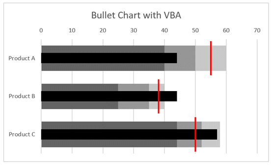
Just to prove how we can use these code snippets, I have created a macro to build bullet charts.
This isn’t necessarily the most efficient way to write the code, but it is to demonstrate that by understanding the code above we can create a lot of charts.
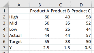
The data looks like this:
The chart looks like this:
The code which achieves this is as follows:
Sub CreateBulletChart()

Dim cht As Chart
Dim srs As Series
Dim rng As Range

'Create an empty chart
Set cht = Sheets("Sheet3").Shapes.AddChart2.Chart

'Change chart title text
cht.ChartTitle.Text = "Bullet Chart with VBA"

'Hide the legend
cht.HasLegend = False

'Change chart type
cht.ChartType = xlBarClustered

'Select source for a chart
Set rng = Sheets("Sheet3").Range("A1:D4")
cht.SetSourceData Source:=rng

'Reverse the order of a catetory axis
cht.Axes(xlCategory).ReversePlotOrder = True

'Change the overlap setting of bars
cht.ChartGroups(1).Overlap = 100

'Change the gap space between bars
cht.ChartGroups(1).GapWidth = 50

'Change fill colour
Set srs = cht.SeriesCollection(1)
srs.Format.Fill.ForeColor.RGB = RGB(200, 200, 200)

Set srs = cht.SeriesCollection(2)
srs.Format.Fill.ForeColor.RGB = RGB(150, 150, 150)

Set srs = cht.SeriesCollection(3)
srs.Format.Fill.ForeColor.RGB = RGB(100, 100, 100)

'Add a new chart series
Set srs = cht.SeriesCollection.NewSeries
srs.Values = "=Sheet3!$B$7:$D$7"
srs.XValues = "=Sheet3!$B$5:$D$5"
srs.Name = "=""Actual"""

'Change chart type
srs.ChartType = xlXYScatter

'Turn error bars on/off
srs.HasErrorBars = True

'Change end style of error bar
srs.ErrorBars.EndStyle = xlNoCap

'Set the error bars
srs.ErrorBar Direction:=xlY, _
    Include:=xlNone, _
    Type:=xlErrorBarTypeCustom

srs.ErrorBar Direction:=xlX, _
    Include:=xlMinusValues, _
    Type:=xlPercent, _
    Amount:=100

'Change color of error bars
srs.ErrorBars.Format.Line.ForeColor.RGB = RGB(0, 0, 0)

'Change thickness of error bars
srs.ErrorBars.Format.Line.Weight = 14

'Change marker type
srs.MarkerStyle = xlMarkerStyleNone

'Add a new chart series
Set srs = cht.SeriesCollection.NewSeries
srs.Values = "=Sheet3!$B$7:$D$7"
srs.XValues = "=Sheet3!$B$6:$D$6"
srs.Name = "=""Target"""

'Change chart type
srs.ChartType = xlXYScatter

'Turn error bars on/off
srs.HasErrorBars = True

'Change end style of error bar
srs.ErrorBars.EndStyle = xlNoCap

srs.ErrorBar Direction:=xlX, _
    Include:=xlNone, _
    Type:=xlErrorBarTypeCustom

srs.ErrorBar Direction:=xlY, _
    Include:=xlBoth, _
    Type:=xlFixedValue, _
    Amount:=0.45

'Change color of error bars
srs.ErrorBars.Format.Line.ForeColor.RGB = RGB(255, 0, 0)

'Change thickness of error bars
srs.ErrorBars.Format.Line.Weight = 2

'Changer marker type
srs.MarkerStyle = xlMarkerStyleNone

'Set chart axis min and max
cht.Axes(xlValue, xlSecondary).MaximumScale = cht.SeriesCollection(1).Points.Count
cht.Axes(xlValue, xlSecondary).MinimumScale = 0

'Hide axis
cht.HasAxis(xlValue, xlSecondary) = False

End Sub
Using the Macro Recorder for VBA for charts and graphs
The Macro Recorder is one of the most useful tools for writing VBA for Excel charts. The DOM is so vast that it can be challenging to know how to refer to a specific object, property or method. Studying the code produced by the Macro Recorder will provide the parts of the DOM which you don’t know.
As a note, the Macro Recorder creates poorly constructed code; it selects each object before manipulating it (this is what you did with the mouse after all). But this is OK for us. Once we understand the DOM, we can take just the parts of the code we need and ensure we put them into the right part of the hierarchy.
Conclusion
As you’ve seen in this post, the Document Object Model for charts and graphs in Excel is vast (and we’ve only scratched the surface.
I hope that through all the examples in this post you have a better understanding of VBA for charts and graphs in Excel. With this knowledge, I’m sure you will be able to automate your chart creation and modification.
Have I missed any useful codes? If so, put them in the comments.
Looking for other detailed VBA guides? Check out these posts:
Discover how you can automate your work with our Excel courses and tools.
The Excel Academy

Make working late a thing of the past.
The Excel Academy is Excel training for professionals who want to save time.
Thank you for this great article.
Very comprehensive and insightful.
Thank You 😁