
Titles are an overlooked aspect of most charts. Bland titles miss out on so much rich information that could enhance a user’s understanding. So, in this post, we look at how to create dynamic chart titles in Excel.
Here is an example of bad and good chart titles:
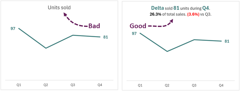
Hopefully, you agree the second chart provides a much richer experience for the user. It doesn’t just give the number but also provides context.
When creating static charts, this type of insight is no problem; we can manually format the text as we want. But in a world of dynamic charts, it becomes tricky.
In this post, we delve deeper into this area and discover how to create beautifully formatted chart titles that update whenever the numbers change.
Table of Contents
Download the example file: Join the free Insiders Program and gain access to the example file used for this post.
File name: 0171 Dynamic chart title with formatting.zip
Manually formatting chart title text
When creating a chart in Excel, the title is automatically set to either the series name or the text “Chart Title”.
Let’s manually turn this into something more meaningful.
Click the chart title.
We can type the text we wish to see directly into the Chart Title.
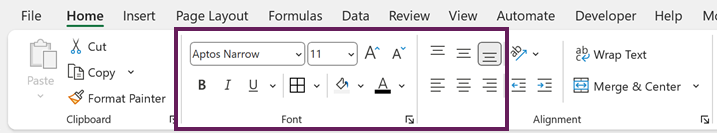
Highlight the sections of the text and apply text formatting from the Home ribbon.
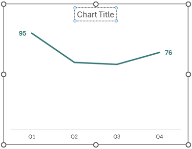
Once finished, the chart title might look something like this:
Fantastic, we now have a rich chart title. It’s just a shame it took so much manual work. Also, when the numbers update, we need to perform that manual work again.
Dynamic chart title text
If a chart is dynamic, the text within the chart title should also be dynamic; text should change to reflect the data presented.
The difficulty is creating a dynamic title that makes sense in all circumstances. To do this, we will make use of some simple Excel features.
- Concatenate strings with the “&” symbol
- TEXT function
- Line break characters
- Basic logic
- Linking chart title to a cell value
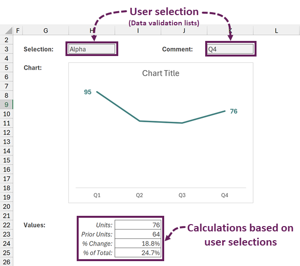
Here is the data that we are working with:
Concatenate text with the & symbol.
Within Excel, we can combine text into a single cell with the use of the & (ampersand) symbol. Here is a basic example.
- Cell H3 contains the product name: Alpha
- Cell K3 contains the name of the period: Q4
- Cell I22 contains the Q4 value for Alpha: 76
We could use the following formula to create a sentence.
=H3&" sold "&I22&" units during "&K3&"."
This formula would calculate as:
Alpha sold 76 units during Q4.
TEXT function
The TEXT function in Excel converts numbers to text using a custom number formatting code. Following on from the last example:
Cell I25 contains the % of total sales.
We could expand the formula as follows:
=H3&" sold "&I22&" units during "&K3&". "&I25&" of total sales."The percentage might be a number such as 0.246753246753247.
Therefore, this could display as:
Alpha sold 76 units during Q4. 0.246753246753247 of Total Sales.
That probably isn’t what we are looking for, right? This is where the TEXT function comes in.
=H3&" sold "&I22&" units during "&K3&". "&TEXT(I25,"0.0%")&" of total sales."
In the formula above the TEXT function converts 0.246753246753247 into a percentage with 1 decimal place (24.7%).
Our full formula now calculates as:
Alpha sold 76 units during Q4. 24.7% of total sales.
The TEXT function can use a variety of number formats. Check out these resources for further guidance on this area.
- Excel number formats for accounting & finance you NEED to know
- Change number format based on a cell value in Excel
Line break characters
We don’t always want text to appear on a single line. So, we can use the CHAR(10) to insert a line break.
=H3&" sold "&I22&" units during "&K3&"."&CHAR(10)&TEXT(I25,"0.0%")&" of total sales."If cell wrap is turned on, the text displays on two lines as follows:
Alpha sold 76 units during Q4.
24.7% of total sales.
Basic logic
We may want to add a comparison to the previous period. However, if the selected period is Q1, there is no previous period to compare against.
Therefore, we can use an IF function to determine if a comparison is included.
=H3&" sold "&I22&" units during "&K3&"."&CHAR(10)&
TEXT(I25,"0.0%")&" of total sales."&
IF(K3="Q1","",TEXT(I24," +0.0%; (0.0%)")&" vs Q"&RIGHT(K3,1)-1&".")
The formula has been split across multiple lines to make it more readable.
If the value in cell K3 is equal to Q1, it returns an empty text string, otherwise, it returns the % movement from the previous period.
If Q1 the result would be:
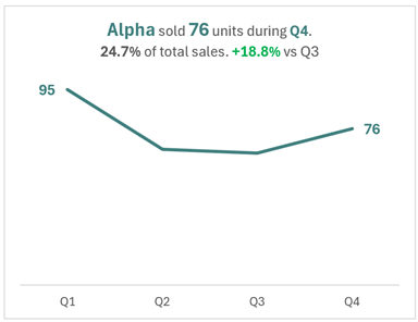
Alpha sold 95 units during Q1.
28.1% of total sales.
If Q4 were selected, the result might calculate as:
Alpha sold 76 units during Q4.
24.7% of total sales. +18.8% vs Q3.
Linking chart title to a cell
Once we have a cell containing the text we want to display, we just need to link the chart title to that cell.
Click the edge of the chart title to select it.
In the formula bar type = , then click on the cell which contains the text.
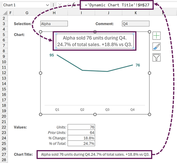
In the screenshot above we can see the text from cell H27 is linked to the chart title. The formula in the chart title is:
='Dynamic Chart Title'!$H$27With these features combined, we can create a dynamic text heading. Unfortunately, there is no formatting.
Dynamic chart titles with custom formatting
So, which would you prefer? Manually created formatted text, or dynamic text without formatting?
I say: why settle!
Let’s look at how to combine these and create dynamic chart titles with custom formatting.
Dynamic text
The first step is to create the dynamic text we want to use.
We will use the formula created in the section above:
=H3&" sold "&I22&" units during "&K3&"."&CHAR(10)&
TEXT(I25,"0.0%")&" of total sales."&
IF(K3="Q1","",TEXT(I24,"+0.0%; (0.0%)")&" vs Q"&RIGHT(K3,1)-1&".")
Formatting styles
The second step is to create a list of words with the format we want to apply. Let’s call these Power Words.
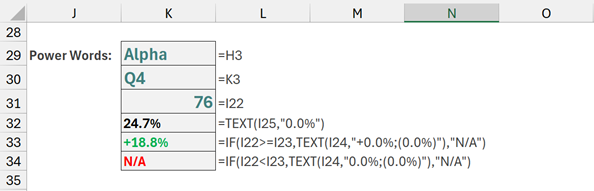
The Power Words are in cells K29:K34.
In K33 and K34 there are two calculations for % change.
- K33: If the % change is positive it displays the value in green with a + symbol, otherwise it displays N/A
- K34: If the % change is negative it displays the value in red with brackets, otherwise it displays N/A
We need two calculations because we are applying different colors depending on the value.
In these Power Word cells, we can set the color, size, font, bold and italic formats.
NOTE:
The order of words is important. The last instance of each text is applied. So, if the list includes increase, followed by in later in the list. The “in” of “increase” will be formatted differently. But if in preceded increase in the list, there would be no issues.
Applying the formatting to the dynamic text
Now, all we need to do is find each instance of the formatted text in the chart title and apply the relevant formatting.
For this, we will use a VBA User Defined Function.
- Press Alt + F11 to open the visual basic editor
- Select the workbook in the VBA Project list
- From the Visual Basic Editor ribbon click Insert > Module
- Add the following code in the newly created module.
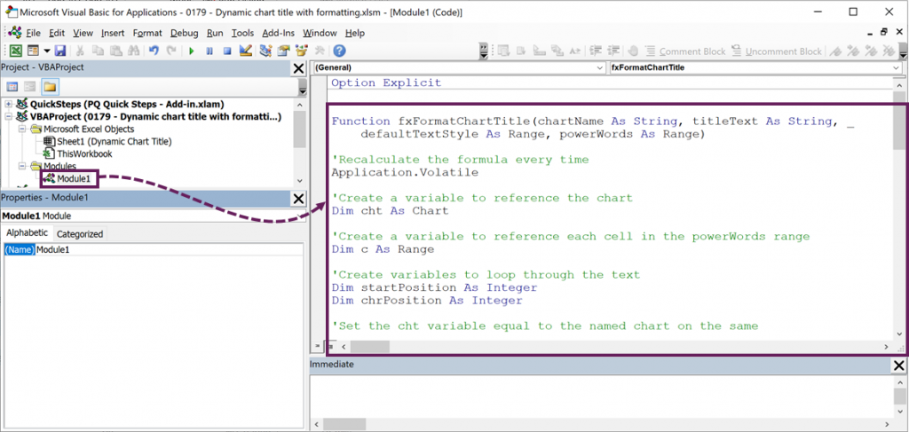
Function fxFormatChartTitle(chartName As String, titleText As String, _
    defaultTextStyle As Range, powerWords As Range)

'Recalculate the formula every time
Application.Volatile

'Create a variable to reference the chart
Dim cht As Chart

'Create a variable to reference each cell in the powerWords range
Dim c As Range

'Create variables to loop through the text
Dim startPosition As Integer
Dim chrPosition As Integer

'Set the cht variable equal to the named chart on the same
'sheet as the formula
Set cht = Application.Caller.Parent.ChartObjects(chartName).Chart

'Turn the chart title on
cht.HasTitle = True

'Change the chart title to the text in the cell
cht.ChartTitle.Text = titleText

'Reset the text in the chart to be the same as the defaultTextStyle
With cht.ChartTitle.Format.TextFrame2.TextRange.Characters.Font
    .Fill.ForeColor.RGB = defaultTextStyle.Font.Color
    .Bold = defaultTextStyle.Font.Bold
    .Italic = defaultTextStyle.Font.Italic
    .Name = defaultTextStyle.Font.Name
    .Size = defaultTextStyle.Font.Size
End With

'Loop through each cell in the powerWords range
For Each c In powerWords.Cells

    'Start searching for matching words at first position
    startPosition = 1

    'Keep looping until no more matches can be found
    Do While InStr(startPosition, cht.ChartTitle.Characters.Text, _
        CStr(c.Value), vbTextCompare) > 0

        'Search for the text in the powerWords range
        chrPosition = InStr(startPosition, cht.ChartTitle.Characters.Text, _
            CStr(c.Value), vbTextCompare)

        'If a match is found, format that text
        If chrPosition > 0 Then

            'Format the sections of the chart title which match the
            'powerWord range
            With cht.ChartTitle.Format.TextFrame2.TextRange. _
                Characters(chrPosition, Len(c)).Font
                .Fill.ForeColor.RGB = c.Font.Color
                .Bold = c.Font.Bold
                .Italic = c.Font.Italic
                .Name = c.Font.Name
                .Size = c.Font.Size
            End With

        End If

        startPosition = chrPosition + 1

    Loop

Next c

'Return the result of the chartName
fxFormatChartTitle = chartName & " - Formatted"

End Function
The syntax of the user-defined function is:
fxFormatChartTitle(chartName,titleText,defaultTextStyle,powerWords)- chartName: The name of the chart as a text string. If you’re not sure what its name is, click on the chart and look at the Name Box (the box to the left of the formula bar).
- titleText: The text to apply to the chart title
- defaultTextStyle: Reference to a cell containing any text that is formatted in the default style
- powerWords: Reference to a range of cells containing the power words and their formatting
That’s it. We are ready to apply the function.
Back in Excel, we can use the function.
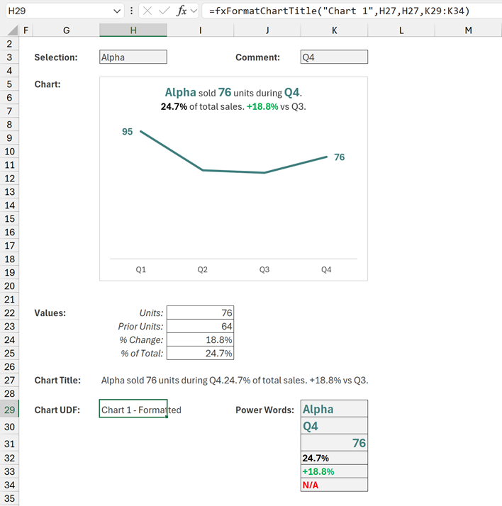
The formula in cell H29 is:
=fxFormatChartTitle("Chart 1",H27,H27,K29:K34)- “Chart 1” is the name of the chart
- H27 contains the text for the chart title
- H27 also contains the default font format
- K29:K34 contains the specific words to format
If everything has worked correctly, cell H29 returns “Chart 1 – Formatted”. This output shows the function was successful.
Testing
That’s it. Now change the values in the H3 and K3 and Ta-Dah!
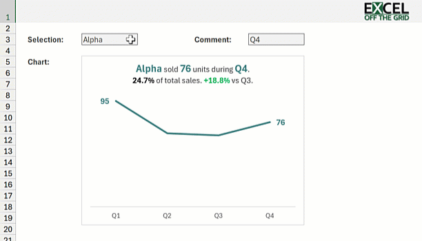
The chart title and the formatting changes – 100% dynamic.
Conclusion
In Excel, we can create static formatted text and we can create dynamic unformatted text, but in this post we gone even further. We created dynamic formatted text 🤯.
Your dashboards and reports no longer need to be left with boring chart titles! It’s automated, so once set up… it just works. 😁
Related Posts:
- How to create chart data with Power Query
- How to set chart axis based on a cell value
- How to create dynamic chart legends in Excel
Discover how you can automate your work with our Excel courses and tools.
The Excel Academy

Make working late a thing of the past.
The Excel Academy is Excel training for professionals who want to save time.