
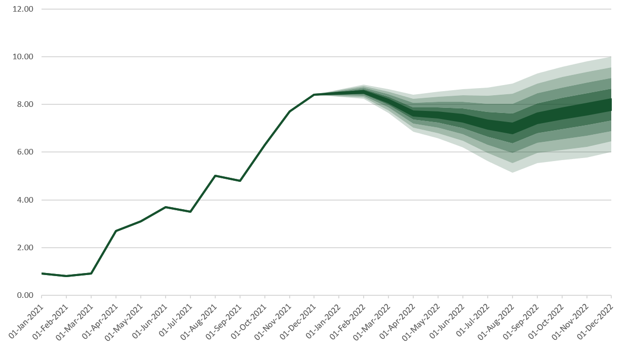
A fan chart, or uncertainty chart, as I like to call them, is a way to display historical data along with a prediction of future values. For example, they are often used to indicate inflation or exchange rate predictions, but can display any data with an uncertain future value. So how can we create a fan chart in Excel? They look similar to line charts, but the future values fan out to represent the range of possible future values.
The term “fan chart” was coined by the Bank of England, who started using this method for displaying inflation in 1997.
The image below shows the finished fan chart which we will be creating in this tutorial.
Download the example file: Join the free Insiders Program and gain access to the example file used for this post.
File name: 0069 Fan chart in Excel.zip
Watch the video
The data
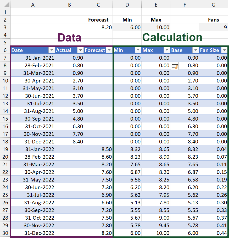
The data layout is one of the most critical factors for creating a fan chart. If we get this part wrong, the chart will not look how we expect. So, let’s take a bit of time to understand it.
In our example, we have taken 12 periods of actual results (Cells B7:B18) and 12 periods of future prediction (Cells C19:C30).
Cells D3 and E3 are set to the minimum and maximum values of the prediction. These are just for illustration; you will need to calculate estimates suitable for your scenario.
Cell G9 represents the number of fans to display. This needs to be an odd number to ensure there is a center fan, with an even number of fans above and below.
The calculations
I have used a Table to calculate and store the values in this scenario. It is possible to calculate using standard cell ranges, but you will need to adjust the formulas accordingly.
The calculations required are:
Final Forecast
Cell C3 calculates the last value from the Forecast column. We use this in some of the coming calculations.
=INDEX(Data[Forecast],ROWS(Data[Forecast]))
Min Column
The formula in the Min column is:
=[@Forecast]+($D$3-$C$3)/COUNT([Forecast])*
COUNT(INDEX([Forecast],1):[@Forecast])
This is the most complex formula in the entire Table, so let me break it down for you.
The difference between the min and the forecast at the end of the chart is -2.2 (D3 less C3). This is calculated in the highlighted section below.
=[@Forecast]+($D$3-$C$3)/COUNT([Forecast])*
COUNT(INDEX([Forecast],1):[@Forecast])
We want the fan size to increase the further the chart goes out into the future. In our scenario, we have 12 forecast periods, so let’s divided the value calculated above by the number of forecast periods (see highlighted section below)
=[@Forecast]+($D$3-$C$3)/COUNT([Forecast])*
COUNT(INDEX([Forecast],1):[@Forecast])
Having divided the value by the number of periods, we next want to multiply by the number of periods. This needs to increase as we move down the Table.
The first forecast period needs to calculate as 1, the second period must calculate as 2, the third period must calculate as 3, etc. We achieve this with a dynamic range (see the highlighted section below).
=[@Forecast]+($D$3-$C$3)/COUNT([Forecast])*
COUNT(INDEX([Forecast],1):[@Forecast])
Finally, we add the forecast value (see the highlighted section below) to calculate the lowest point of the fan.
=[@Forecast]+($D$3-$C$3)/COUNT([Forecast])* COUNT(INDEX([Forecast],1):[@Forecast])
Max
The calculation of the maximum value is similar to the minimum calculation. The only difference is the calculation points to the Max, rather than the Min value. The differences are highlighted below.
=[@Forecast]+($E$3-$C$3)/COUNT([Forecast])*
COUNT(INDEX([Forecast],1):[@Forecast])
Base
The Base column calculates the area below the line and fan.
=[@Actual]+[@Min]
Fan Size
The size of each fan is calculated as:
=([@Max]-[@Min])/$G$3
Create the fan chart
We’ve got all the calculations; now it’s time to create the chart.
Insert the chart
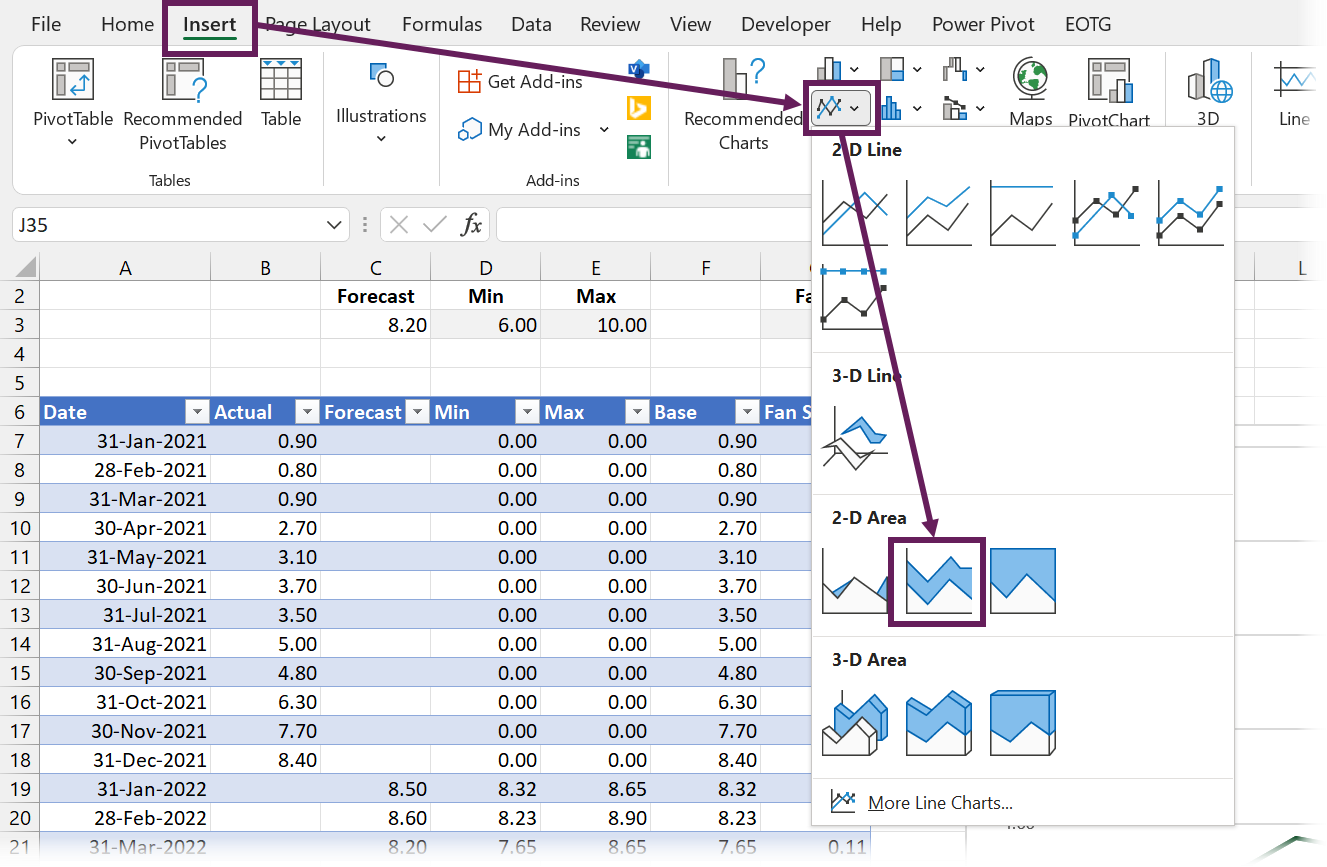
Select all the data in the Date, Base, and Fan Size columns.
Click Insert > Charts > Stacked Area to insert a chart.
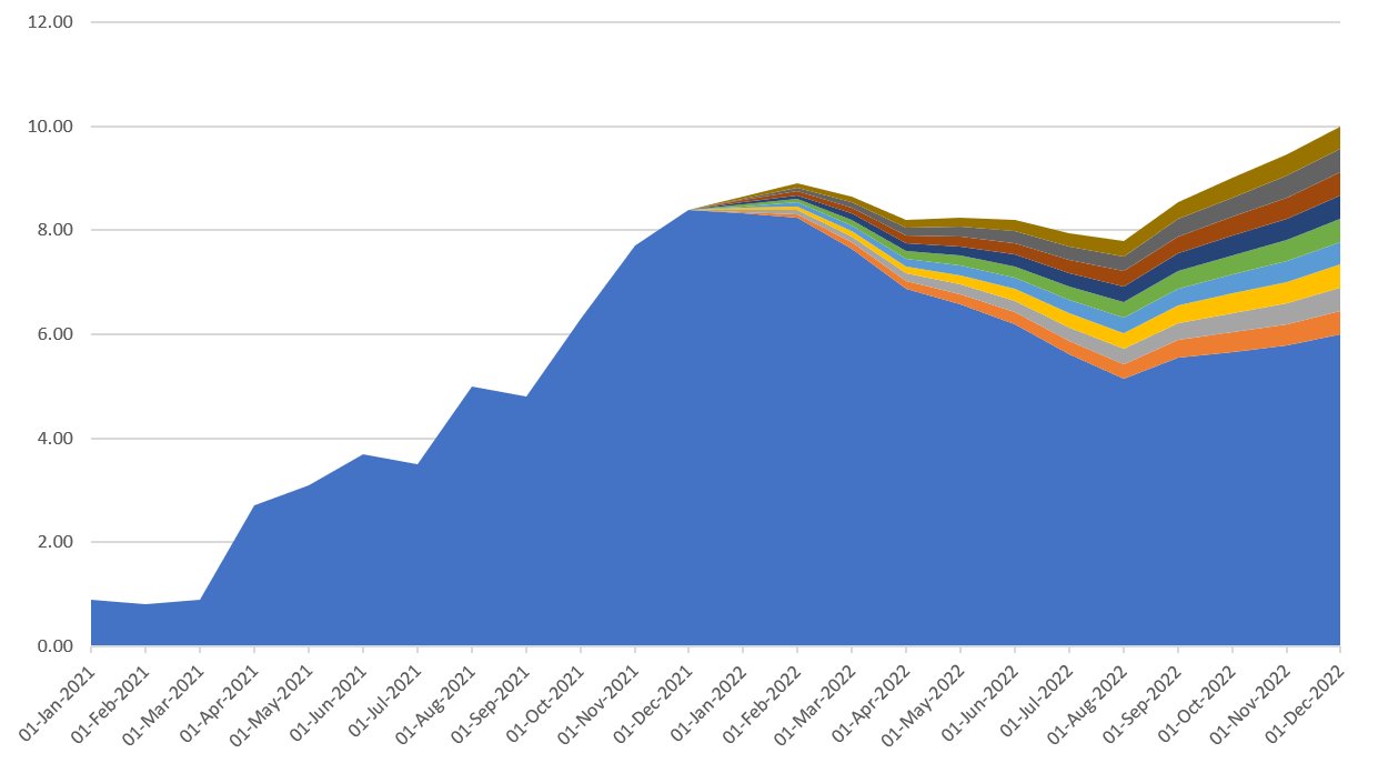
We only have one fan in our chart at present, so let’s add 8 more.
- Select the Fan Size column
- Copy the data (Ctrl + C)
- Select the plot area of the chart
- Paste the data into the chart (Ctrl + V)
Repeat the steps above until there are 9 fans.
Delete the chart legend and chart title.
The chart now looks like this:
From now on, it’s all about formatting.
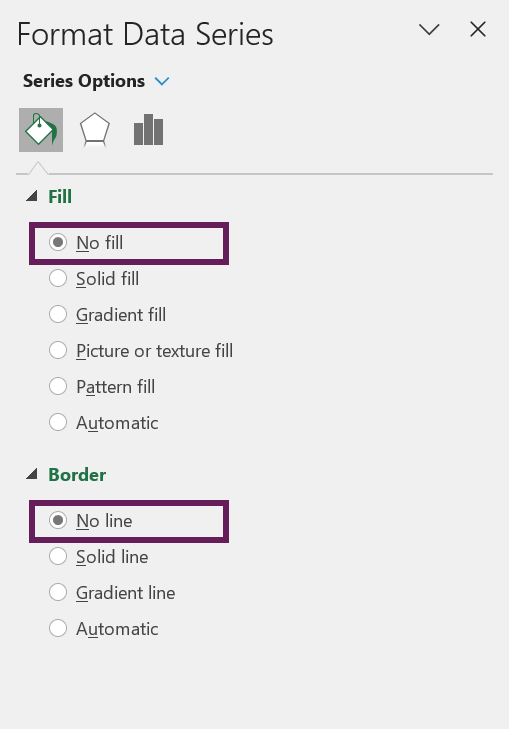
Format the base (the blue section below the line and fans)
- Select the bottom blue area of the chart
- Right-click and select Format Data Series… from the menu
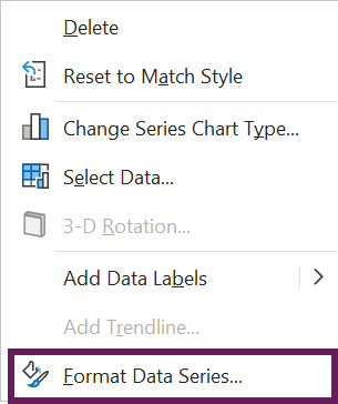
- Change the formats to be no fill and no line
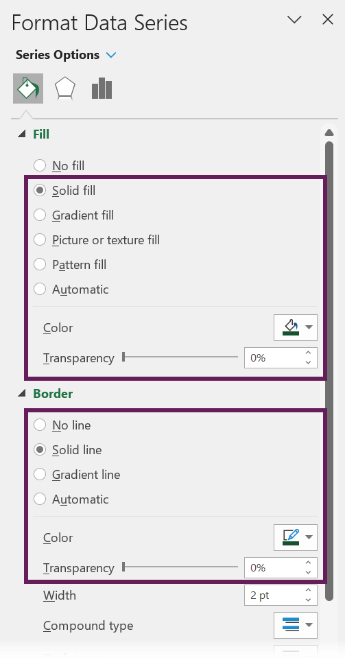
Format the center fan
Select the center fan.
Format with a solid fill and solid line with a color and 0% transparency.
Format the other fans
Finally, format each fan with the same color as the center fan, but with increasing transparency. The further the fan is away from the center the higher the transparency value.
In our example, we have 4 fans above and 4 fans below. Therefore, the transparency values applied are 20%, 40%, 60%, and 80%.
The final chart
And we are done. The final chart now looks like this:
Discover how you can automate your work with our Excel courses and tools.
The Excel Academy

Make working late a thing of the past.
The Excel Academy is Excel training for professionals who want to save time.
génial, merci énormément pour le partage.