
Recently, in our training academy, charting legend Jon Peltier demonstrated the best data structure required for working with Charts in Excel. Following this, one of our academy members asked this question:
I am trying to use what Jon was teaching in the charting master class for stacked legends. Is there anyway to get that layout out of power query or power pivot or data model or ????
In this post, I want to answer that question, and take a deeper look at how to create chart data with Power Query.
Table of Contents
Download the example file: Click the button below to join the Insiders program and gain access to the example file used for this post.
File name: 0181 Chart Data from Power Query.zip
Watch the Video
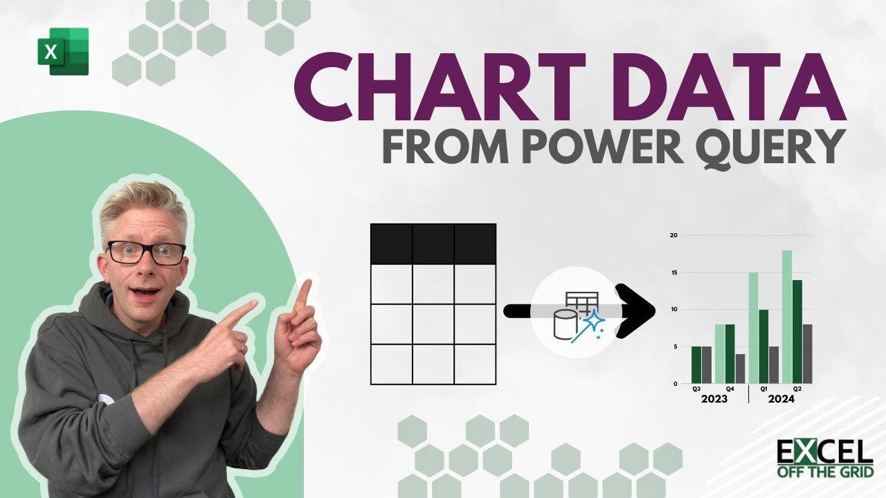
Chart data structure (TLC)
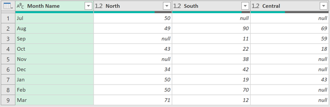
Charts in Excel work best when the data is in a specific layout. Jon Peltier calls this the TLC method (Top Left Cell method).
The image below shows the TLC method.
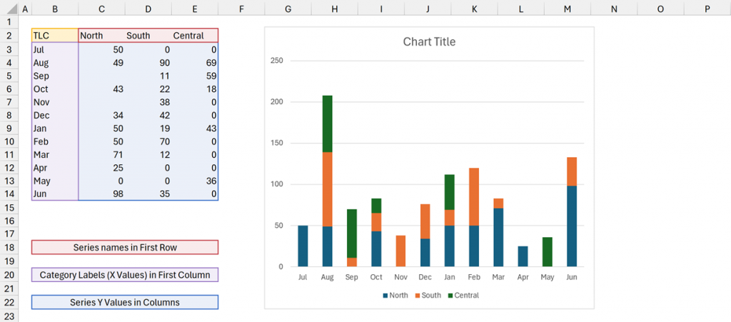
- Series names are in the first row
- Category labels are in the first column
- Values are included in columns
Select all the cells, including the Top Left Cell, then create the chart.
We can take category labels further by creating multi-level labels. Jon calls this the TLC+ method.
These also have a specific structure.
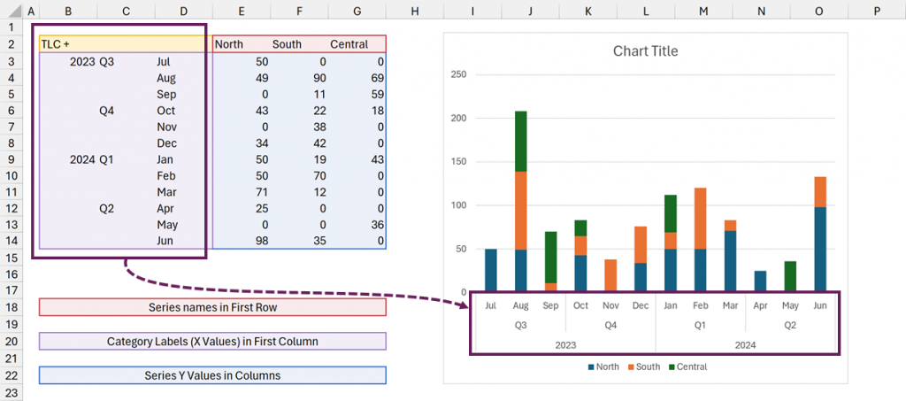
In the screenshot above, did you notice how the months are grouped into quarters and years? Pretty nice, right?
For Excel to create this, the data must be in the exact format shown in the image.
Getting our data into this layout now takes a bit more effort.
Charts using Tables as a source
For this post, we make use of three special characteristics about Tables, Charts and Power Query.
- Tables automatically expand/retract when data is added or removed.
- Charts using Tables as their source also expand/retract for new data points.
- Power Query can load data into a Table.
This means Power Query generated Tables can be a dynamic source for a chart data range.
By putting all these features together, we can update charts just by clicking Data > Refresh All (which is automation bliss).
NOTE: Normally, we use Power Query to create a data layout; however, in this circumstance, we create the information/presentation layout required for chart data.
We create the data layout as normal, then using Power Query’s pivot tansformation to convert into a chart data layout.
Example data
For this post, we use the following data (you can find this in the example file download):
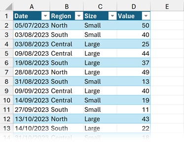
The Table is called ChartData and contains data for July 2023 – March 2024. We add Q2 2024 later in this post.
Power Query transformations
We need to get the data into the correct TLC layout for the chart.
Once the example data is loaded into Power Query, we can undertake the following transformations.
- Ensure the Date column has the date data type.
- Change the Date column to the month-end date by selecting the Date column, then clicking Transform > Date > Month > End of Month
- Insert the month name by selecting the Date column, then clicking Add Column > Date > Month > Month Name
- Change the month name to 3 characters by selecting the Month Name column, then clicking Transform > Extract > First Characters > Count: 3 > OK
- Next, we need to summarize the values to the correct level of granularity.
- Select the Date, Month Name and Region columns.
- Click Transform > Group By, then in the Group By dialog box, enter the following:
- New Column Name: Total Value
- Operation: Sum
- Column: Value
- Click OK
- We need to pivot the data to get the regions into the columns.
- Select the Region column and click Transform > Pivot
- In the Pivot Column dialog box, apply the following:
- Values Column: Total Value
- Click OK
- To ensure the data is in the correct order, select the Date column and click Home > Sort (A-Z)
- Finally, delete the Date column by selecting it and pressing the Delete key
The Power Query now looks as follows:
WARNING:
For this transformation to be fully dynamic, it is essential the Series names (e.g., North, South, Central) do not appear in the M code. Therefore, it might take a bit of care to get the steps into the correct order.
Load the query into an Excel Table. Then, select the full data set and create a chart.
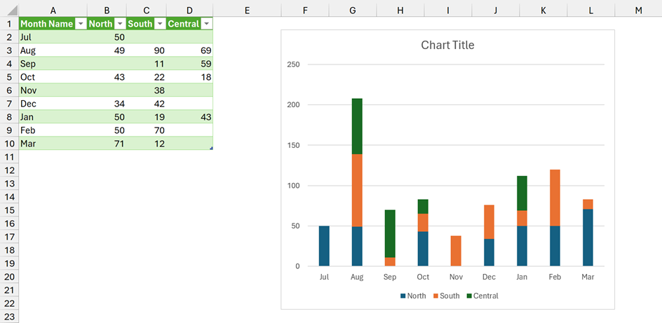
OK, that was simple enough for a basic chart.
Power Query transformations for TLC+ layout
The TLC+ layout is a little more complex, for which we will use a custom function (more on that later).
Transformation steps
The transformation steps are similar to before, but there are a few additional steps:
- Ensure the Date column has the date data type.
- Change the Date column to the month-end date by selecting the Date column, then clicking Transform > Date > Month > End of Month
- Insert the month name by selecting the Date column, then clicking Add Column > Date > Month > Month Name
- Change the month name to 3 characters by selecting the Month Name column, then clicking Transform > Extract > First Characters > Count: 3 > OK
- Insert the quarter column by selecting the Date column, then clicking Add Column > Date > Quarter > Quarter of Year
- Prefix the letter Q to the quarter by selecting the Quarter column, then clicking Transform > Prefix > Value: Q > OK
- Add a year column by selecting the Date column, then clicking Add Column > Date > Year > Year
- Next, we need to summarize the values to the correct level of granularity.
- Select the Date, Year, Quarter, Month Name and Region columns.
- Click Transform > Group By, then in the Group By dialog box, enter the following:
- New Column Name: Total Value
- Operation: Sum
- Column: Value
- Click OK
- We need to pivot the data to get the regions into the columns.
- Select the Region column and click Transform > Pivot
- In the Pivot Column dialog box, apply the following:
- Values Column: Total Value
- Click OK
- To ensure the data is in the correct order, select the Date column and click Home > Sort (A-Z)
- Finally, delete the Date column by selecting it and pressing the Delete key
In Power Query, the preview window displays the following:
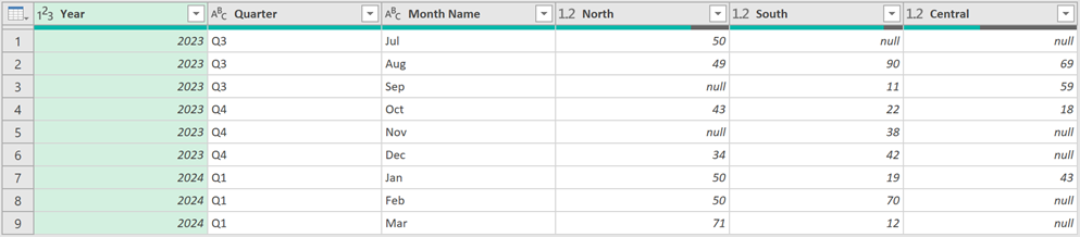
Unfortunately, the Year and Quarter columns contain repeated values, so this is not in the correct layout for TLC+. We need to find a way to replace the repeated values with null.
Power Query has a transformation to fill down over null values. But there is no transformation to unfill up to create null values. So, we will use a custom function.
fxRepeatValueToNull custom function
In Power Query, copy the code below into a blank query and call it fxRepeatValueToNull.
(Table as table, ColumnNamesList as list) as table =>
/*
ARGUMENTS:
- Table (table) - Table or step to perform the transformation on
- ColumnNamesList (list of text) - List of column names containing the repeat values to change to null

PURPOSE:
Changes repeat values in a column to null

NOTES:
- (None)

AUTHOR: Mark Proctor / Excel Off The Grid
DATE: 2024-03-12
VERSION: 1.2
*/
  let

    unfillColumn = (Table, ColumnName) =>

      let

        //Process parameter
        Temp1 = "Temp`¬|@#~1", // Offset column
        Temp2 = "Temp`¬|@#~2", // Calculation column

        //New full list
        offsetColumn = {null} & List.RemoveLastN(Table.Column(Table, ColumnName), 1),

        //Buffer the original column
        initialColumn = List.Buffer(Table.Column(Table, ColumnName)),

        //Convert Table to columns
        tableToColumns = Table.ToColumns(Table) & {offsetColumn},

        //Rejoin columns
        joinColumns = Table.FromColumns(tableToColumns, Table.ColumnNames(Table) & {Temp1}),

        //Add custom column
        customColumn = Table.AddColumn(joinColumns,
          Temp2,
          each if Record.Field(_, ColumnName) = Record.Field(_, Temp1)
            then null
            else Record.Field(_, ColumnName)),

        //Remove original columns
        removeOriginal = Table.RemoveColumns(customColumn , {ColumnName,Temp1}),

        //Rename column
        renameColumn = Table.RenameColumns(removeOriginal, {{Temp2, ColumnName}}),

        //Reorder columns
        reorderColumns = Table.ReorderColumns(renameColumn, Table.ColumnNames(Table))

      in
        reorderColumns,

    //Apply to multiple columns
    returnValue = List.Accumulate(
      ColumnNamesList,
      Table,
      (state, current) => unfillColumn(state, current)
    )
  in
    returnValue
OK, now it’s time to use the custom function.
Head back to the query with the TLC+ chart data. Click the fx icon next to the formula bar and enter the following:
= fxRepeatValueToNull(#"Removed Columns",{"Year","Quarter"})- #”Removed Columns” – the name of the previous step
- {“Year”,”Quarter”} is the list of column names for which we want to convert repeat values to null
The data in Power Query now looks like this.
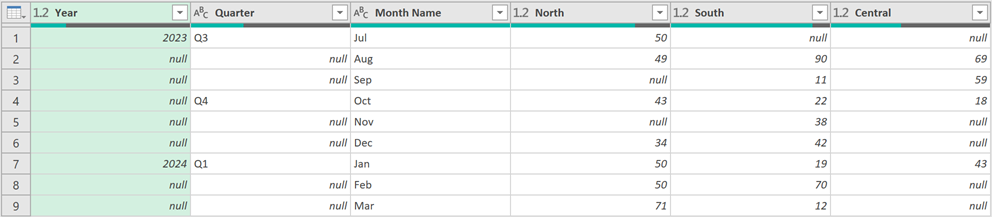
That is exactly what we want.
Now, let’s load this into Excel and create the chart.
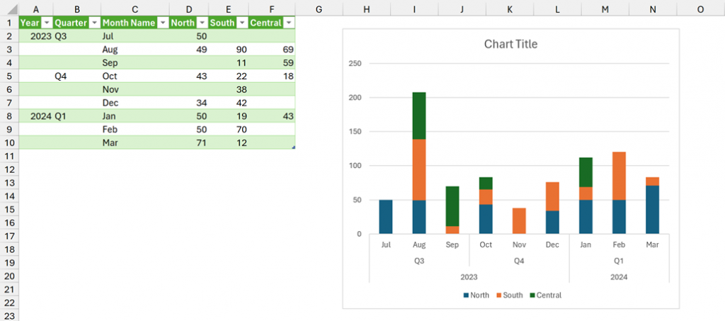
Amazing! The chart now has multi-level axis labels.
Updating for new data
So, what happens if we get new data?
If you’re working along with the example, there is additional data already available. Just add it to the Table on the Data tab. The data includes new data points for Q2 2024 and also a new region, East.
Click Data > Refresh All.
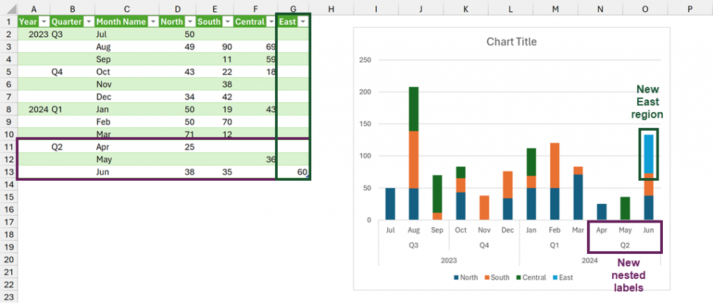
Ta-dah! The chart expands automatically for the new data points and the new series.
Conclusion
Using a Power Query generated Table, we can create the perfect layout for working with charts.
By adding some Power Query magic (in the form of the fxRepeatValueToNull custom function) we can even generate the TLC+ layout for nested category labels.
Best of all, to update the charts, we only need to click Data > Refresh All. AMAZING!!
Related Posts:
- How to add fiscal Month, Quarter or Year Column in Power Query
- How to create dynamic chart legends in Excel
- Create dynamic chart titles with custom formatting
Discover how you can automate your work with our Excel courses and tools.
The Excel Academy

Make working late a thing of the past.
The Excel Academy is Excel training for professionals who want to save time.
A year ago in my blog I wrote about a LAMBDA Function to Build Three-Tier Year-Quarter-Month Category Axis Labels (https://peltiertech.com/lambda-function-three-tier-year-quarter-month-axis-labels/). I’ve used this or modifications in many of my workbooks, because two- or three-tiered axis labels make a chart easier to read than a sequence of dates.
Wow! That is cool. I need to have a play with this.
I wonder if the new GROUPBY and PIVOTBY can provide this too. 🤔