Chart legends show us what each Series in a chart represents. These legends are often placed in boxes near the chart. However, research shows that separating the labels from the item in this way requires more brain power from readers and detracts from the key message. So, in this post, we look at how to create dynamic chart legends in Excel, which help readers to focus on the key message.
Table of Contents
Download the example file: Join the free Insiders Program and gain access to the example file used for this post.
File name: 0128 Dynamic chart labels.zip
Watch the video

Why legend position matters?
Based on research from the 1920s, known as the Gestalt principles, we know the human brain will naturally find patterns and meaning from visuals.
One of the key Gestalt principles relates to proximity, whereby items placed close to each other are considered to be related. Therefore we can help readers of our charts by placing labels close to the items they refer to. Look at the two images below; the first image shows the standard Excel legend box, while the second image shows a dynamic label position.
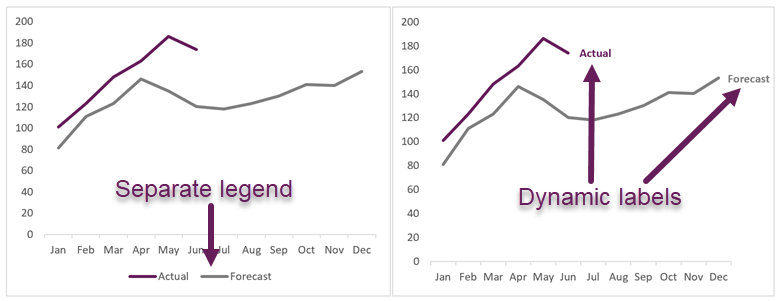
In the second chart, the label is placed close to each line, therefore the brain naturally accepts the label, and does not need to look elsewhere.
Another Gestalt principle relates to similarity. It states that items that look similar are likely to be considered as related. Therefore, using the same color for the label as the line also helps readers to easily understand the chart.
We know charts often have data added to them. Therefore, we need to ensure labels are dynamic and the proximity of the label to the line is retained as data is added. We don’t want to move the label manually, so let’s see how to use Excel’s functionality to achieve this automatically.
Example file
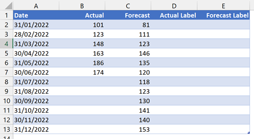
The example file contains the data we are using throughout this post. The source data is contained within an Excel Table (which is the best way to hold data in Excel).
Since Tables have structured references, we need to be a little bit smarter about our formulas.
Using the NA() function in charts
The NA() function is not one we often use in Excel. It generates the #N/A error. This may not sound particularly useful; however, NA() has a specific purpose when used within a chart.
In Excel, an empty cell is not rendered on a chart because no value exists. However, if we use a formula in a cell, even if the result of that formula appears to be an empty cell, it is not. Excel calculates the cell and renders the empty value as zero.
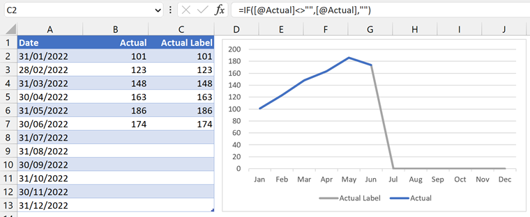
In the example above, the source data for 31 July in the Actual Label column appears to be empty, but the line is shown on the chart as zero. This is because there is a formula in the Actual Label column:
=IF([@Actual]<>"",[@Actual],"")If there is no value in the Actual column, the formula returns an empty text string, but this is not the same as an empty cell. As a result, the grey line in the chart above is rendered.
To force the chart to recognize the value as empty, we can use the NA() function.
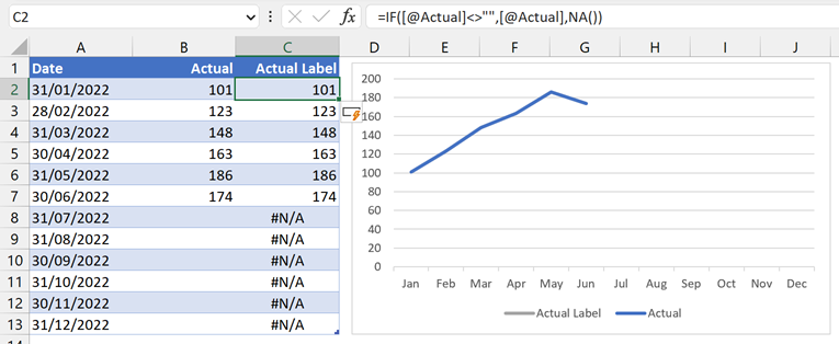
In the chart above, the formula in the Actual Label column is:
=IF([@Actual]<>"",[@Actual],NA())This formula returns the #N/A error, which is not rendered on the chart (i.e., the grey line is not visible for July to December).
Create the chart
That’s enough principles; let’s start working through our example. First, we need to create the chart.
- Select all the cells in the Date column (including the header), hold the Ctrl key, then select the cells in the Actual to Forecast Label columns (including the headers)
- Create a standard 2D line chart by clicking Insert > Line chart (drop-down) > Line chart
Let’s delete the items that we do not require. Select each item and press Delete:
- Chart title
- Major gridlines
- Legend
Depending on your scenario, you may decide to delete other items too.
The initial chart now looks like this.
Create a dynamic chart legend for the forecast
Next, let’s create a dynamic label for the Forecast line.
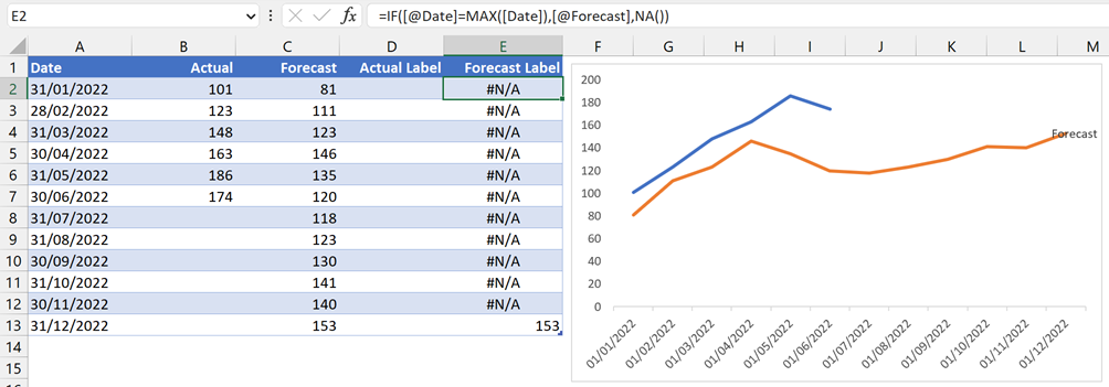
The goal is to create a cell with #N/A for every row in the column, except the last row.
We are using an Excel Table, so we must ensure our formulas react to any new data.
In the first cell in the Forecast column, enter the following formula:
=IF([@Date]=MAX([Date]),[@Forecast],NA())This formula states:
If the date in the same row as the formula is equal to the last date in the Forecast column, then return the value from the Forecast column otherwise, return #N/A.
This ensures that only the last date includes a value; all other rows return #N/A. If we add new data to the Table, the formula copies down and automatically moves the total accordingly.
To add the data label:
- Select the chart and click the Chart Format ribbon from the menu
- In the drop-down, in the top-left of the ribbon, select the Label Forecast series
- Click Chart Design > Add Chart Element > Data Labels > Right
- Right-click the data label in the chart, select Format Data Labels… from the menu
- In the Format Data Labels pane, check Series Name and uncheck Value.
This displays the name of the Series, which is currently Forecast Label.
- Right-click on the chart, click Select Data
- The Select Data Source dialog box opens, select Forecast Label in the Legend Entries (Series) box, then click Edit.
- In the Edit Series dialog box, point the Series name to cell $C$1 (which is the Label we want to apply).
- Click OK to close the Edit Series box, then OK again to close the Select Data Source box.
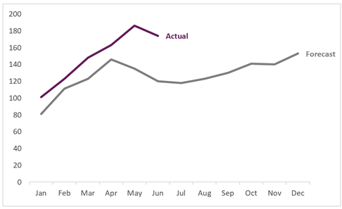
The chart now has the correct label for the forecast line.
Create a dynamic label for the actual
Now, let’s create a dynamic label for the Actual line.
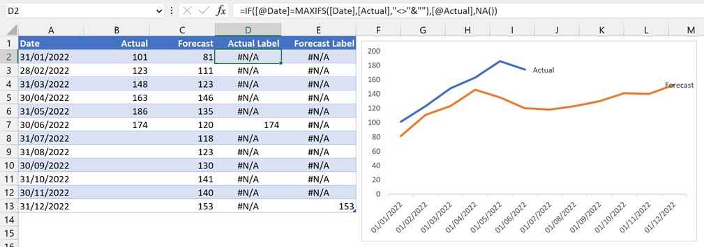
We want to create a cell with the #N/A error for every row in the column, except the row with the latest value entered.
In the first cell of the Actual column, enter the following formula:
=IF([@Date]=MAXIFS([Date],[Actual],"<>"&""),[@Actual],NA())MAXIFS([Date],[Actual],”<>”&””) calculates the latest date where Actual is not blank.
The remainder of the formula states:
If the date in the same row as the formula is equal to the maximum date containing a value, then return the value from the Actual column otherwise return #N/A.
Now apply the same steps as above to add the data label for the Actual line.
Complete the formatting
From here, it’s all about formatting:
- Select suitable colors for each line
- Use the same colors for each data label (consider bolding the font to make it easier to read)
- Change the width of the plot area to ensure the labels fit
- Finally, let’s make the date axis fit correctly:
- Right-click on the date axis, select Format Axis… from the menu
- In the Format Axis Pane, expand the Number section
- In the Format Code field, enter mmm to show three letters for each month (alternatively, enter mmmmm to show only a single letter for each month, or mmm-yy to show month and year). Then click Add.
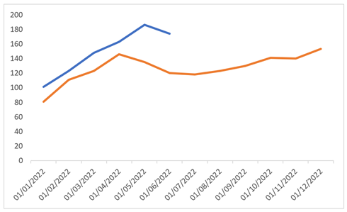
The final chart looks like this:
Try it out
When we add more data into the Actual column, the label moves accordingly.
Also, because we have used a Table, if we add more months to the Table, all the formulas copy down automatically.
Conclusion
Creating dynamic labels takes a small amount of extra effort. However, because we’ve applied the Gestalt principles, we know it provides significant benefits to the reader as it is easier for them to see what each line relates to.
Related Posts:
- How to create a Sankey diagram in Excel
- Create Slopegraphs in Excel
- Ultimate Guide: VBA for Charts & Graphs in Excel (100+ examples)
Discover how you can automate your work with our Excel courses and tools.
The Excel Academy

Make working late a thing of the past.
The Excel Academy is Excel training for professionals who want to save time.
My forecast label is still over the line, what am I missing ?
Either:
– You selected “Above” rather than “Right” for the label type
– You need to move the plot area slightly so there is room for the label
A very nice idea.
For the Excel versions before 2016.
Formula
=IF([@Date]=MAXIFS([Date];[Actual];””&””);[@Actual];NA())
by
=IF([@Date]=MAX(([Actual]””)*[Date]);[@Actual];NA())
replace.
Salü
Ernst
Thanks Ernst ✅