
Dumbbell dot plots are an excellent chart style for presenting comparative data. These chart styles quickly show the difference or progress between two data points.
Often, Excel tutorials for dumbbell dot plots create charts that require manual updating for new data. But using the right Excel techniques these charts can be fully dynamic.
So, in this post, we will create a dumbbell dot plot in Excel that updates automatically when we add new data.
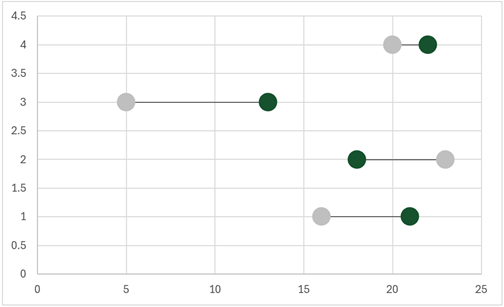
The final chart looks like this:
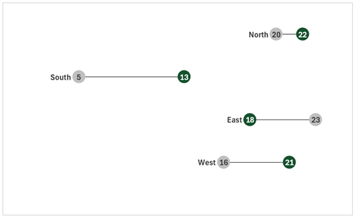
Table of Contents
Download the example file: Click the button below to join the Insiders program and gain access to the example file used for this post.
File name: 0192 Dynamic dumbbell dot plot.zip
Watch the video

Data
The source data for the example is a Table called Data.
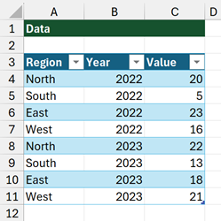
We are building our dumbbell dot plot so that when we add new regions to the data, everything updates automatically.
Calculations
We are using dynamic array calculations for this solution. These are available in Excel 2021 and Excel 365.
Let’s start by creating the formulas we require.
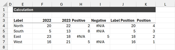
The values in cells E3-K3 are static values used for column headings.
The remaining values are all formulas. Each formula is detailed below.
Label
The formula in cell E4 is:
=UNIQUE(Data[Region])This provides a unique list of regions from the Data table. The results spill into the cells below.
Comparison (2022)
The formula in cell F4 is:
=SUMIFS(Data[Value],Data[Region],E4#,Data[Year],F3)This calculates the sum of the Value column where the Region is equal to those listed in the E4# spill range, and where the year is equal to cell F3 (value 2022).
Value (2023)
The formula in cell G4 is:
=SUMIFS(Data[Value],Data[Region],E4#,Data[Year], G3)This is similar to the calculation in F4, but returns the values where the year matches cell G3 (2023).
Positive & Negative
To create the line between the two dots, we use a chart feature called Error Bars.
For these to display correctly, we need two numbers:
- The absolute positive movement between 2022 and 2023.
- The absolute negative movement between 2022 and 2022
To calculate the positive movement, the formula in cell H4 is:
=IF(G4#>F4#,G4#-F4#,NA())The NA() function is used in this formula so that where the movement is negative the #N/A error returns.
#N/A is a special value in Excel because it is not rendered on a chart.
To calculate the negative movement, the formula in cell I4 is:
=IF(G4#<F4#,F4#-G4#,NA())This formula also uses the NA() function to return the #N/A error where the movement is positive.
Label Position
The Label Position provides a location to anchor the region label. Ultimately this is a hack to get the label to appear in the right place.
Our label will be to the left of the leftmost dot. As there are positive and negative movements, we don’t know if 2022 or 2023 will be the leftmost dot. So, we use the Label Position to calculate that for us.
The formula in cell J4 is:
=IF(F4#<G4#,F4#,G4#)Position
As we are using an XY Scatter plot we need to provide Y values to place the dots in the correct order. The Position formula provides the position of the dot along the Y-axis.
The formula in cell K4 is:
=SEQUENCE(ROWS(E4#),1,ROWS(E4#),-1)This formula creates a count for the number of rows. In our example, there are 4 rows, so the results are numbers from 4 to 1.
Named Ranges
To enable the chart to be dynamic, we must create a named range for the spill range of each calculation in the section above.
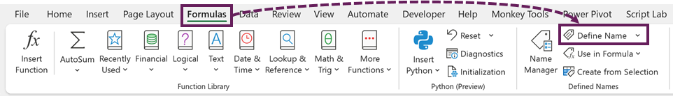
Click Formulas > Define Name
In the New Name box, enter the following:
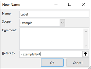
- Name: Label
- Scope: Example (the name of the worksheet)
- Refers to: =Example!E4#
- Click OK
NOTE:
If your worksheet has a space in the name, you will need to surround the sheet name with single quote (e.g. =’Example Sheet’!E4#)
That is how to create one named range. We need to repeat this process for each column in the calculations section.
Once finished, there should be 7 in total.
- Label: =Example!E4#
- Comparison: =Example!F4#
- Value: =Example!G4#
- Positive: =Example!H4#
- Negative: =Example!I4#
- Label Position: =Example!J4#
- Position: =Example!K4#
Create the chart
Now it’s time to build the chart.
Add data to the dumbbell dot plot chart
Select the 2022 (comparative) column, then click Insert > Scatter (drop-down) > Scatter
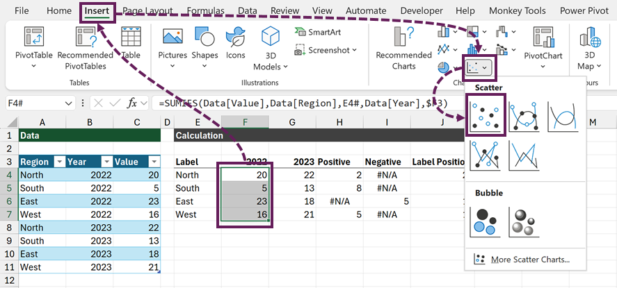
A chart will appear.
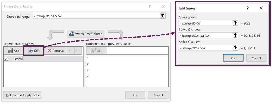
Right-click on the chart, click Select Data…
In the Select Data Source dialog box, select Series1, then click the Edit button.
In the Edit Series dialog box, enter the following named ranges.
- Series name: =Example!$F$3
- Series X values: =Example!Comparison
- Series Y values: =Example!Position
- Click OK
REMEMBER: Use single quotes around the worksheet name if it includes a space.
Click the Add button, to add another data series.
- Series name: =Example!$G$3
- Series X values: =Example!Value
- Series Y values: =Example!Position
- Click OK
Click OK to close the Select Data Source dialog box.
The chart looks like this:
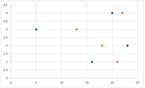
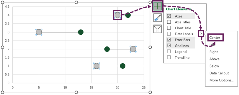
Chart error bars
Select the dots for the 2022 (comparison) series. Click on the [+] symbol next to the chart and add Error Bars with More Options…
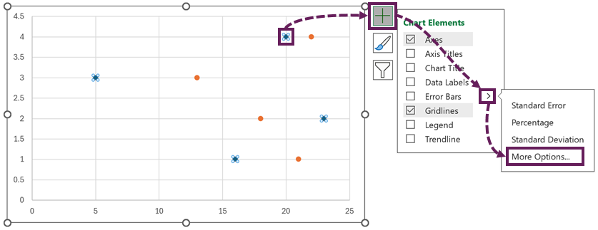
Error bars are added to the chart.
We don’t need the vertical error bars. Select the vertical error bars and press the Delete key.
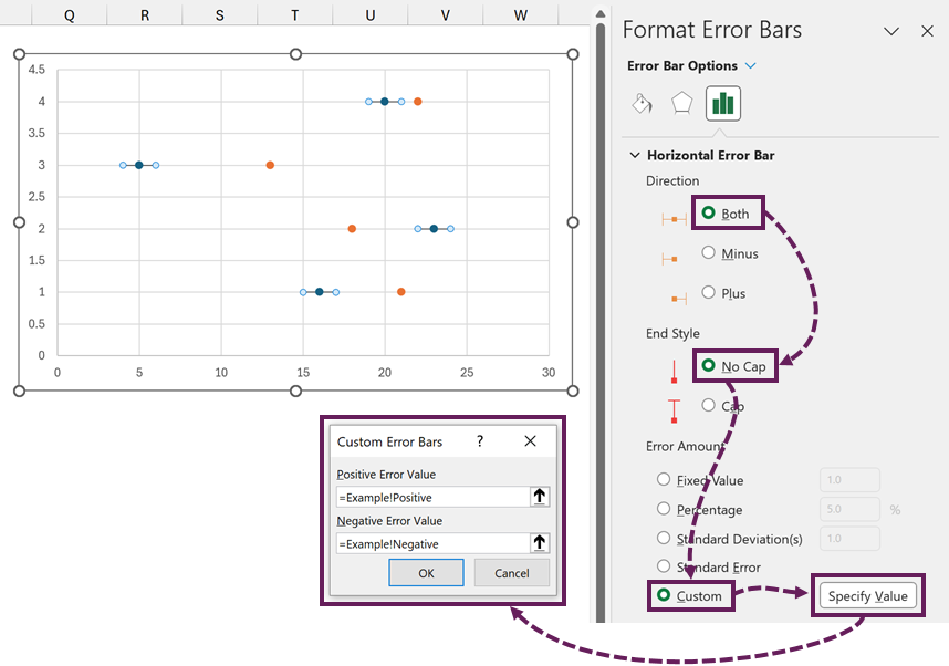
Select the horizontal error bars. Apply the following settings:
- Direction: Both
- End Style: No Cap
- Error Amount: Custom > Specify Value
- Positive Error Value: =Example!Positive
- Negative Error Value: =Example!Negative
- Click OK
This adds a line connecting the two dots.
Format the dots
The dots on the chart are known as markers. Click on the 2022 (comparison) dots.
Click on the Paint can icon, then select Markers. Apply the following settings:
- Marker Options: Built-in
- Type: Circle
- Size: 14
- Fill: Solid fill – select a color. As this is the comparison, I’ve chosen light grey.
- Border: No line
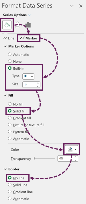
Follow the same steps to format the 2023 (Value) dots. Choose a more vibrant color to emphasize the current value.
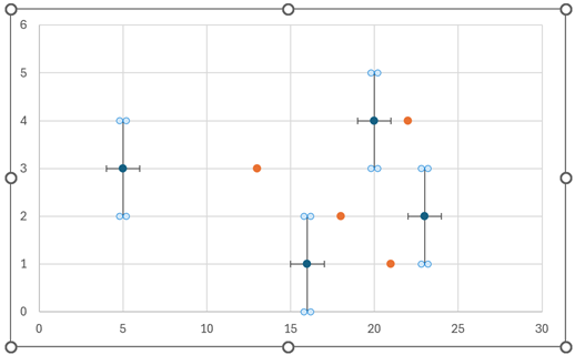
After formatting the 2022 and 2023 dots, the chart should look like this:
Data labels
Select the 2022 (comparison dots). Click the [+] next to the chart and add Data Labels to the Center.
Select the data label, then change it to display the X Value only.
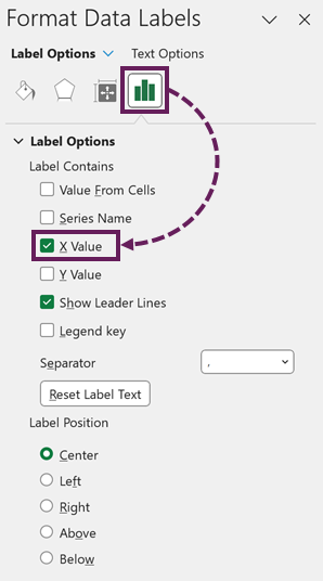
Repeat the steps above for the 2023 (value dots).
Format the data labels to match the style of your chart.
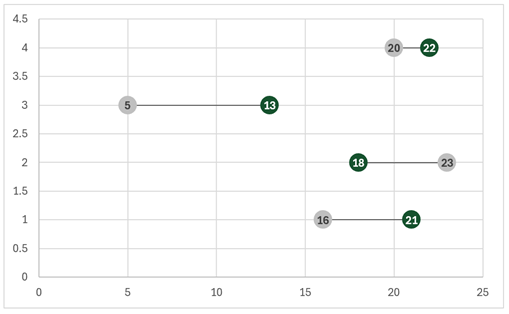
The chart now looks as follows:
Category labels
We don’t currently know which dots relate to which category, so let’s add the labels.
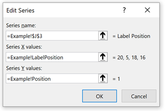
In the same way, as we added the 2022 and 2023 dots, add the Label Position dots.
The data series should be set up as follows:
- Series name: =Example!$J$3
- Series X values: =Example!LabelPosition
- Series Y values: =Example!Position
- Click OK
The dots will appear over the existing value or comparison dots.
It may be difficult to select the LabelPosition series. So, from the Ribbon, click Format, then select Series “Label Position” from the Current Selection drop-down (on the left-hand side of the Ribbon).
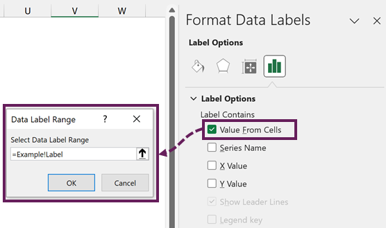
Click the [+] icon on the chart and add Data Labels to the Left.
Select the data labels. Uncheck the Y Values. Check Values From Cells.
In the Data Label Range dialog box enter the following:
- Select Data Label Range: =Example!Label
- Click OK
Format the label as required.
For the Label Position dot, change the Marker Option to None.
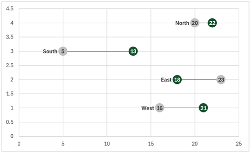
The chart now looks like this:
Delete the chart junk
We now have everything we need. Delete the following:
- Horizontal major gridlines
- Vertical major gridlines
- X axis
- Y axis
The final chart looks as follows:
Add new data
OK, it’s time to prove this is fully dynamic.
Add new data to the Data table.
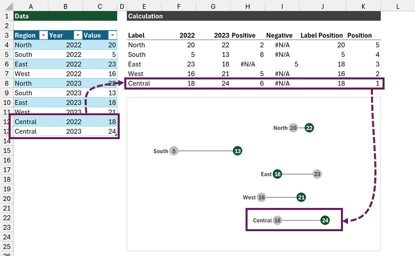
Ta Dah! Everything updates magically!!!
Conclusion – Dumbbell dot plots
In this post, we have seen how to create dumbbell dot plots in Excel.
By using dynamic array calculations and named ranges the chart is fully dynamic and expands when we add new data.
Related Posts:
- How to create dynamic chart legends in Excel
- Create a fan chart in Excel
- How to create a Sankey diagram in Excel
Discover how you can automate your work with our Excel courses and tools.
The Excel Academy

Make working late a thing of the past.
The Excel Academy is Excel training for professionals who want to save time.