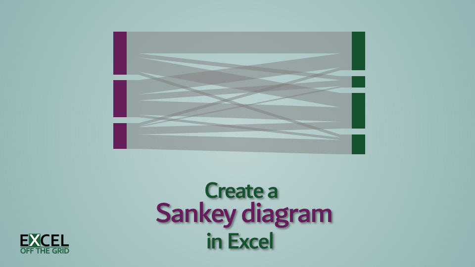
Sankey diagrams are used to show flow between two or more categories, where the width of each individual element is proportional to the flow rate. These chart types are available in Power BI, but are not natively available in Excel. However, today I want to show you that it is possible to create a Sankey diagram in Excel with the right mix of simple techniques.
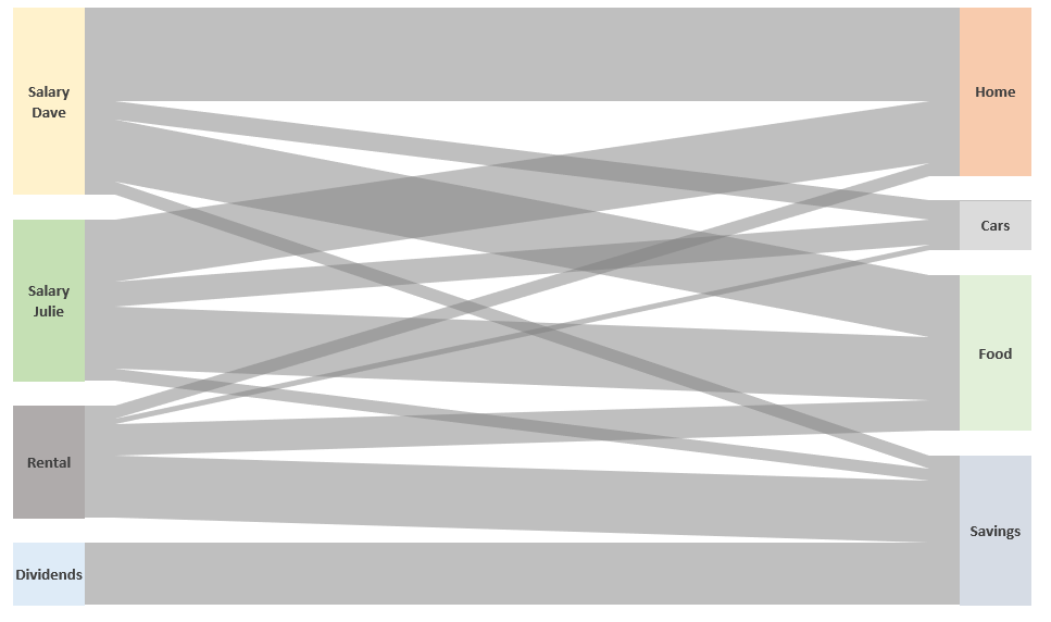
While Sankey diagrams are often used to show energy flow through a process, being a finance guy, I’ve decided to show cashflow. The simple Sankey diagram above shows four income streams and how that cash then flows into expenditure or savings.
Table of Contents
Download the example file: Join the free Insiders Program and gain access to the example file used for this post.
File name: 0050 Sankey diagrams in Excel.xlsx
Watch the video
This blog post will be slightly different from others; rather than show you how to do each step, I will demonstrate the overall approach. There are additional details covered in the YouTube video.
The secret to create a Sankey diagram in Excel
While I should wait to reveal the secret until the end of the post, I think it will help to explain how it all fits together if I reveal it upfront.
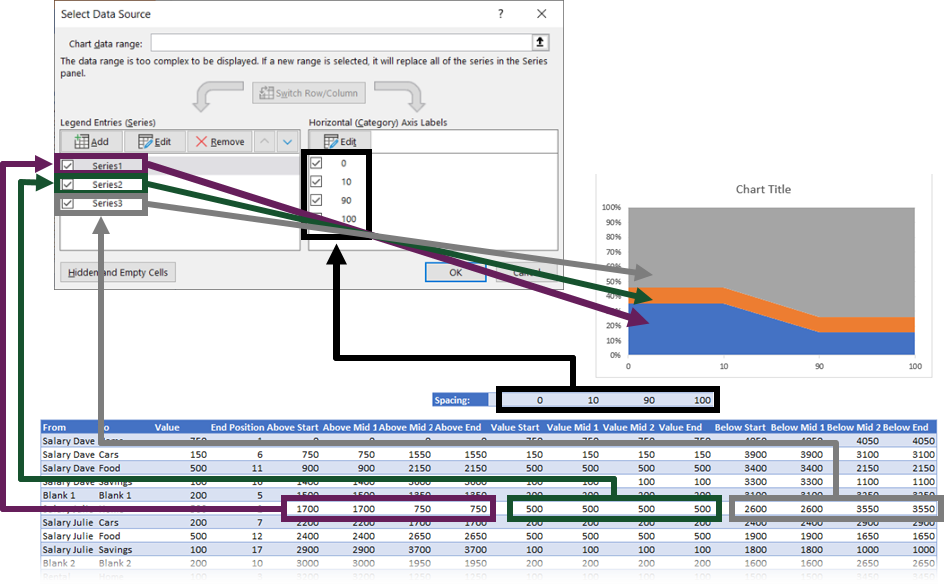
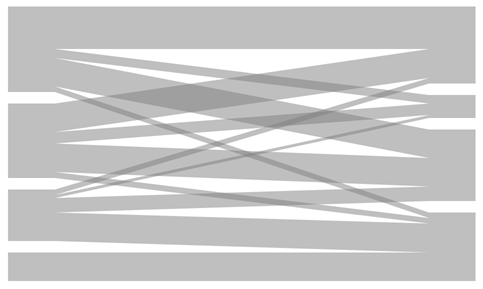
Here is the secret: the Sankey diagram you see in the example file is not one chart, far from it. There are actually 21 charts all stacked on top of each other.
The following image shows the 21 individual charts that could make up a Sankey diagram.
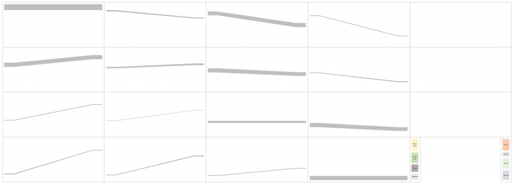
By setting the backgrounds to be fully transparent, and the shaded lines as partially transparent; overlaying the charts on top of each other creates the Sankey effect. The pillars at each end are 100% stacked column charts, which are also overlaid on top.
Now that I’ve revealed how simple this secret is, let’s look at each stage in a bit more detail. Then you will be able to create your own Sankey diagram templates.
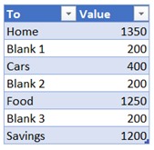
Initial data
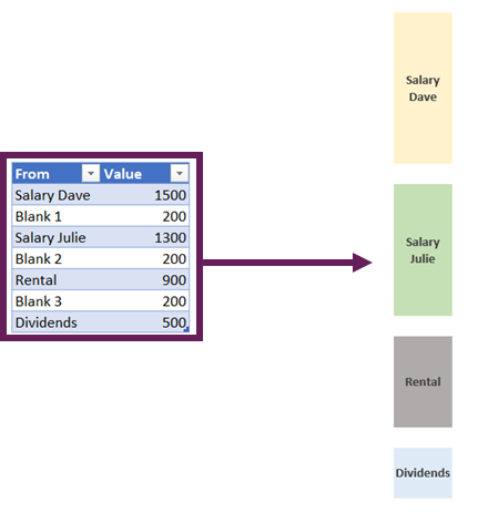
Our initial data is a two-dimensional table. The rows are the start point for our Sankey diagram, while the columns are the endpoint. The value at the intersection of these is the flow rate.
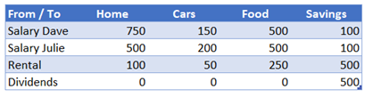
Within the template, we also have a named range called Blank. The value in here represents the spacing to be applied between each category.![]()
Interim calculation tables
To create the Sankey effect from our initial data, we need to create interim calculations.
- SankeyLines table
- SankeyStartPillar table
- SankeyEndPillar table
- Spacing named range
Let’s look at each in turn.
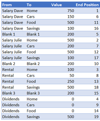
SankeyLines table
From the source data, we create a table with a row for each possible combination of rows and columns. This table is called SankeyLines table in the example file. Each row category is separated by an additional line which creates the blank spaces we see in the charts.
Our initial SankeyLines table needs to contain the following base information:
Value
The formula in the Value column is:
=IF(LEFT([@From],5)="Blank",Blank,
INDEX(SankeyData,MATCH([@From],SankeyData[From / To],0),
MATCH([@To],SankeyData[#Headers],0)))
This formula retrieves either:
- Value from the source table
- Value of the Blank named range (where it is a row used for spacing between categories).
End Position
The End Position column determines the order of the lines at the end of the Sankey diagram. Where 1 is finishes at the top, 2 is the second item from the top, etc.
SankeyLines table additional data points
To create the data for the 100% stacked area chart, we need to calculate some additional data points:
- Space above the shaded Sankey line
- Value of the shaded Sankey line
- Space below the shaded Sankey line
Our SankeyLines table needs to expand with the following calculations.
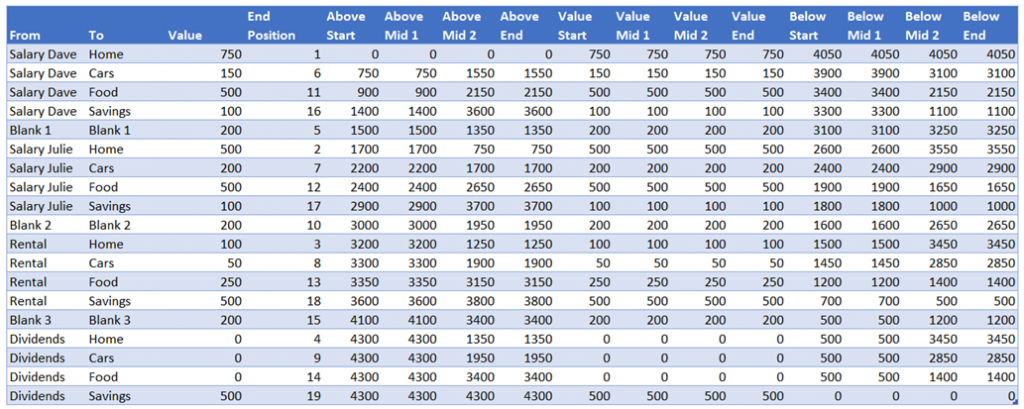
The formulas in each column are as follows:
Above Start
=SUM(SankeyLines[[#Headers],[Value]]:[@Value])-[@Value]
This calculates the amount of space required above the Sankey line at the start point.
Above Mid 1
=[@[Above Start]]
This is sent to equal the Above Start column.
Above Mid 2
=[@[Above End]]
This is set to equal the Above End column (see below)
Above End
=SUM([Value])-SUMIFS([Value],[End Position],">="&[@[End Position]])
This calculates the amount of space required above the Sankey line at the end point.
Value Start, Value Mid 1, Value Mid 2, Value End
=[@Value]
The height of the shaded Sankey line never changes. Therefore, we can set the value of all 4 columns to equal the Value column.
Below Start, Below Mid 1, Below Mid 2, Below End
The columns calculate the amount of space required below the shaded Sankey line. Each calculation is constructed the same way. It takes the SUM([Value]) then takes away the value from the equivalent Start, Mid 1, Mid 2 or End columns.
Below Start:
=SUM([Value])-[@[Above Start]]-[@[Value Start]]
Below Mid 1:
=SUM([Value])-[@[Above Mid 1]]-[@[Value Mid 1]]
Below Mid 2:
=SUM([Value])-[@[Above Mid 2]]-[@[Value Mid 2]]
Below End:
=SUM([Value])-[@[Above End]]-[@[Value End]]
SankeyStartPillars table
The SankeyStartPillar table is reasonably easy to understand. It just needs each row category from the source data listed with a “Blank” item in between.
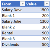
The formula for the Value column is:
=SUMIFS(SankeyLines[Value],SankeyLines[From],[@From])
End pillars
The SankeyEndPillar table is similar to the SankeyStartPillar table. It just needs each column category from the source data listed with a “Blank” item in between.
The formula for the Value is:
=SUMIFS(SankeyLines[Value],SankeyLines[To],[@To])
Spacing named range
The final part of the interim calculations is a named range called Spacing. This is used as the Category (horizontal) Axis for the chart. It determines at what point the slope of the chart starts and finishes.

Chart layering
Once all the interim calculations are ready, the chart creation can begin.
Create the individual shaded Sankey lines
Each row of the SankeyLines table needs to be a separate 100% stacked area chart with 3 data series:
Once the chart has the correct series data, it then all comes down to formatting.
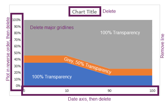
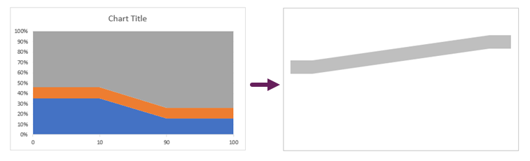
After all the formatting has been completed the chart will become a single grey line.
If the row in the SankeyLines table starts with “Blank”, then technically it can be deleted, however for completeness, I prefer to keep it there, but set it to No Fill. It means that if I ever need to use it, I can just change the fill color and it can be used as a standard shaded Sankey line.
Once all the shaded Sankey lines have been created, they can be overlaid on top of each other.
Create the Sankey pillars
Most of the hard work has now been completed. We just need to create two 100% stacked column charts—one for the start pillar and one for the end pillar.
The pillars are set to be formatted as follows:
- Plot series in reverse order
- Your preferred fill colors
- Set the “Blank” sections with No Fill
- Add data labels to the relevant points.
After all of that, we overly the pillars on top of our chart. Finally, our Sankey diagram is complete.
Conclusion
That’s it. Individually there is nothing too difficult with any of the techniques involved. But they need to be combined in the right way to create the Sankey effect. Initially, this takes quite a long time to create, but once set-up, it can be used over and over with different categories. It’s definitely the case of invest the time once, to create a template big enough then and reuse it.
Related Posts:
- Ultimate Guide: VBA for Charts & Graphs in Excel (100+ examples)
- Variable width column charts and histograms in Excel
- Creating custom Map Charts using shapes and VBA
Discover how you can automate your work with our Excel courses and tools.
The Excel Academy

Make working late a thing of the past.
The Excel Academy is Excel training for professionals who want to save time.
Hi Mark. I am trying to have four lines (pillars) converge into 1 pillar. In the case of this data it would be regional revenue flowing into Total revenue. When I set up the data the revenue pillar does not size correctly in accordance to the 4 lines flowing to it. Is there are way to do this, or do you need the same amount of end pillars to start pillars?
The start and end pillars will be of the same size. However you can have more/less sections on one side that the other. The blank areas are also parts of the pillar, but with no fill color. So, it’s really about how you manage those sections that counts.