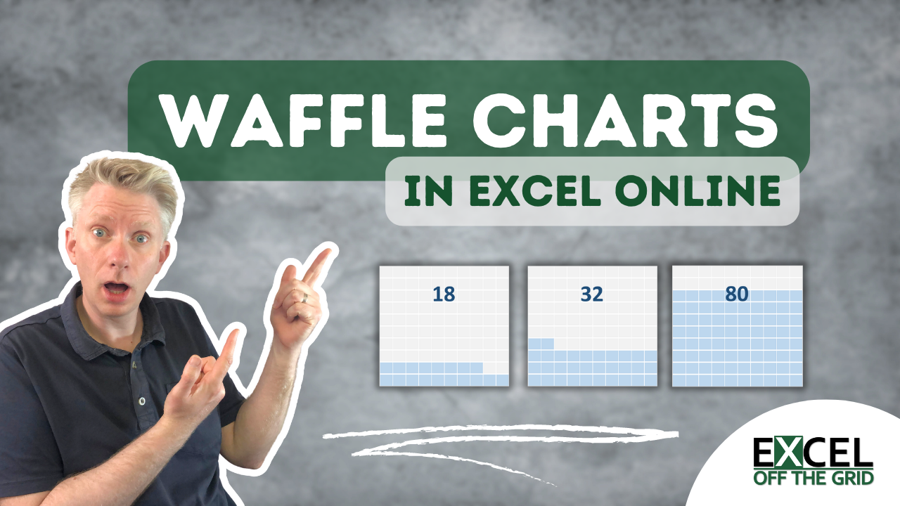
In a previous post, we created a waffle chart in Excel using the easiest method. To use it as an object on any worksheet, we needed to use a linked picture. The problem is that linked pictures don’t work in Excel Online (I know!!! Super annoying, right!). So, in this post, I want to show you how to make Waffle Charts in Excel that work everywhere.
For this post, we will use a 10 x 10 grid, but you can use any grid you like.
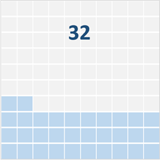
This is the chart we are creating.
This method uses a lot of chart formatting, so there are quite a few steps. The steps aren’t complicated; there is just a lot of them.
Table of Contents
Download the example file: Join the free Insiders Program and gain access to the example file used for this post.
File name: 0149 Waffle Chart Complete.xlsx
Watch the video

Setting up the data
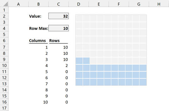
The first step is to set up the data the right way.
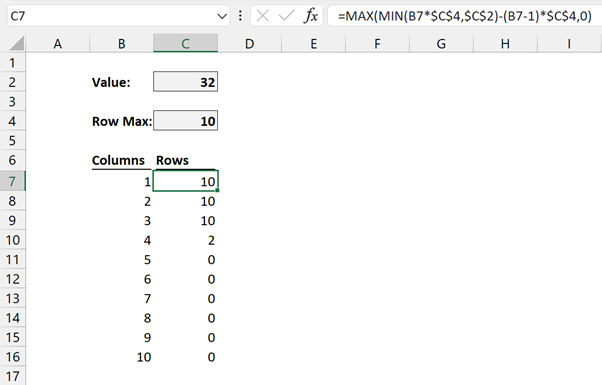
- Value – Cell C2 – the value to display in the waffle chart
- Row Max – Cell C4 – the maximum length of an individual row. As we are using a 10×10 waffle, the Row Max is 10.
- Columns – Cells B7:B16 – a list that is the length of the number of columns. We have a 10 x 10 grid, so our columns display 10. But this could be any size you want.
- Rows – Cells C7:C16 – the value to display in each row. The following formula is in cell C7 and then copied down to C16.
=MAX(MIN(B7*$C$4,$C$2)-(B7-1)*$C$4,0)Add the chart
Now let’s add the chart.
Select all the values from B6 to C16 and click Insert > Charts > Recommended Charts.
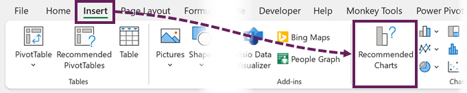
Don’t worry, we are not going to use the Recommended Chart; it’s just an easy way to open the box we need.
In the Insert Chart dialog box, select the All Charts tab, then click Combo.
Change the Columns series to a Scatter and the Rows series to a Stacked Bar.
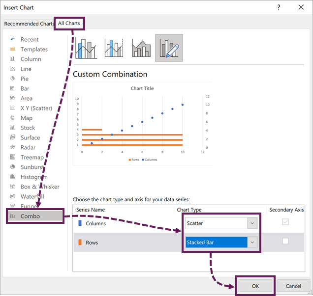
We only have a single value, so we could have used Clustered Bar instead. However, for the occasions we have multiple values, we will need the Stacked Bar.
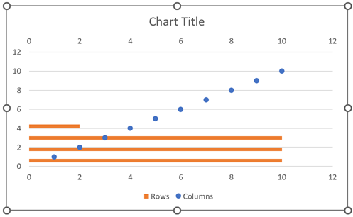
The chart currently looks like this:
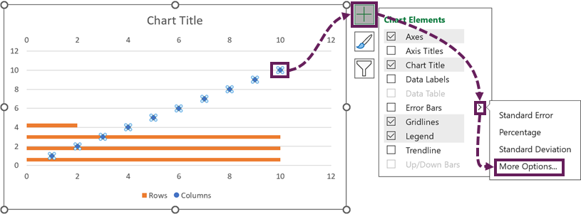
Creating the waffle effect
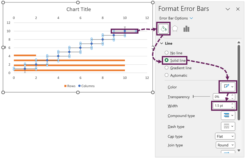
Now time to create the waffle effect. Select one of the blue markers. Click the plus icon. Then click Error Bars > More Options...
Select the horizontal error bar. Then, in the Format Error Bars pane, change the line to white, with a width of 1.5 pt.
Next, click the Error Bar Options icon. Change the setting for the errors bars as follows:
- Direction: Both
- End Style: No Cap
- Fixed Value: 10 (choose an alternative value if your grid is not 10 x 10)
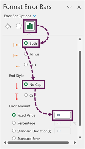
Apply the same formatting to the vertical error bars.
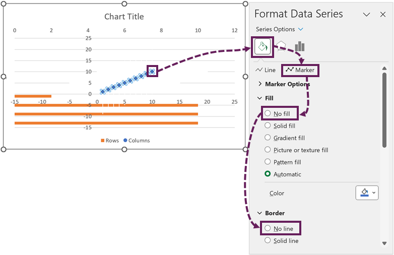
Now, select the blue marker in the chart. In the Format Data Series pane, set the Marker to no fill and no line.
The charts now looks like this.
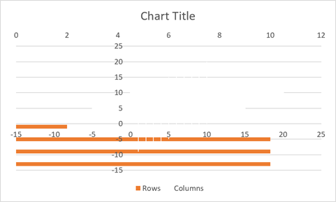
Come on, be honest. You think I’ve lost it. But I promise you; it’s about to come good.
Set the chart axis
Let’s get the axis to display correctly.
- Delete the secondary horizontal axis at the top
- Delete the major gridlines
- Select the vertical axis. In the Axis options, set the following:
- Minimum: 0
- Maximum: 10 (change this if you’re not using a 10 x 10 grid).
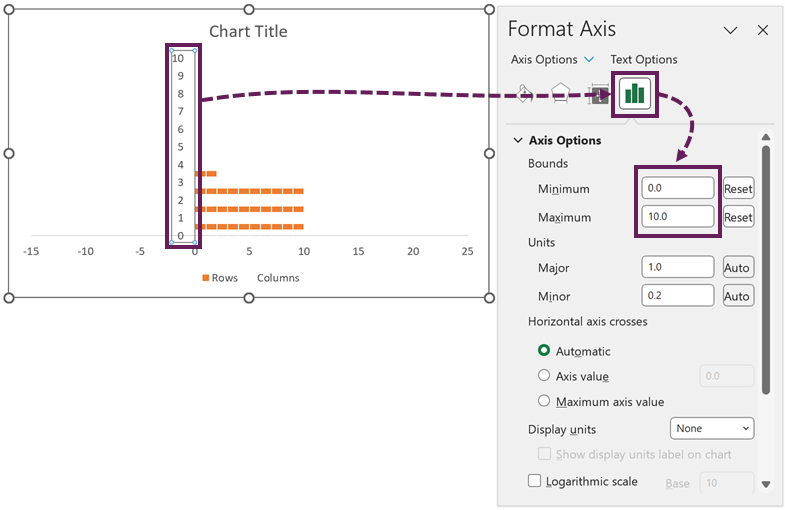
Apply the same Minimum and Maximum to the horizontal axis.
Admit it, you doubted me for a second. But now, things are starting to come together.
Final Formatting
Let’s apply the final formatting elements:
- Set the fill color for the background of the chart to grey
- Set the fill color for the stacked bar chart series
- In the Series Options for the Rows, change the Gap Width to 0%
- Delete the Chart Title, Legend, Horizontal axis, and Vertical axis.
- Resize the plot area to fill the chart area.
The chart now looks like this.
Adding the Label
To match the styling of the waffle we created last week, we can add a dynamic label.
Click Insert > Shapes > Text Box.
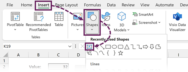
Draw the text box over the top section of the waffle chart.
Click the edge of the text box to highlight it. Then enter =$C$2 into the formula bar to link the value to the text box.
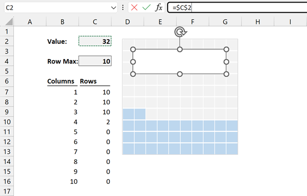
The Text box is now linked to the cell. Format the text box as you wish, and that’s it.
Test it out – Waffle charts in Excel online
If we change the number in cell C2, the chart updates. Magic!
Don’t forget that one of the goals was to make waffle charts that work in Excel online. If you test that out… it still works.
Conclusion
Excel Online does not have the full feature set of Excel Desktop. As a result, the easy waffle chart method using cells and conditional formatting doesn’t work as well as it should. Instead, using a stacked column chart and error bars provide a useful alternative that works in Excel Online. It requires a few more steps, but is more robust as a solution.
Related posts:
- How to make Waffle Charts in Excel: The EASIEST way
- Highlight specific bars in a bar chart
- How to create a Sankey diagram in Excel
Discover how you can automate your work with our Excel courses and tools.
The Excel Academy

Make working late a thing of the past.
The Excel Academy is Excel training for professionals who want to save time.
Hi Mark, it is as easy, to make waffle charts with the x-y scatter chart.
You can even make an parliament seats chart out of this method.
kind regards,
Stefan
I’m assuming you’re using markers to make the squares? Yes, that will work too. But a little trickier to setup.