
Sometimes in a chart we want to highlight certain bars so the reader can quickly see the important information. An example would be to highlight our company when it is compared with its competitors (see the chart below).
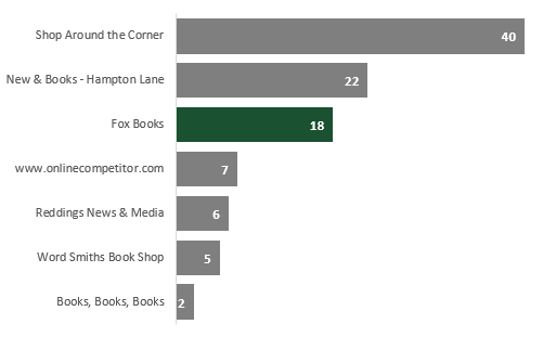
In this chart, it is very easy to see how Fox Books compares to its competitors. There is very little brain power required as the key information clearly stands out. Firstly, the data is presented is size order, so we can easily see the rank and value. Secondly, the bar relating to Fox Books is highlighted in a different color. This post will show you how to create a similar chart, starting with the source data and working through to a final visualization.
The source data
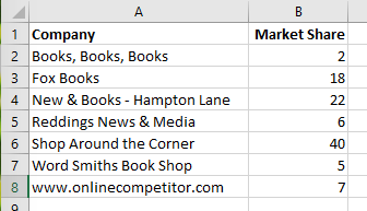
The source data we are using is based on an unsorted list. In this scenario, we are assuming we cannot or do not want to sort the data manually. We will use basic formulas to put the data into the correct order before creating the chart.
Ranking the source data
The first task is to get the data into descending order. To do this we will use the RANK function.
=RANK(number,array,[order])
The RANK function takes 3 arguments:
- Number – The value you wish to find the rank for.
- Array – An array of numbers you wish to rank against
- Order – this argument is optional, 0 or blank = descending order, or 1 = ascending order.
We can use the RANK function to find out the order of our bars should be in.
![]()
The formula in Cell A2 is:
=RANK(C2,$C$2:$C$8)
This formula can be copied down to the bottom of the list. Now our data is ranked.
Note, we will have an issue where there are duplicate values in the data, as the RANK function will give both values the same rank. To prevent this, we could change the formula in Cell A2 to be as follows:
=RANK(C2,$C$2:$C$8)+COUNTIF($C$2:C2,C2)-1
The COUNTIF adds 1 to the RANK if there is a tie between values, this ensures all the rank numbers are unique. This formula can be copied down to the bottom of the list.
Creating the chart data
In Cells E2-E8 I have listed the numbers 1 to 7 in order, as there are 7 companies in the source data.
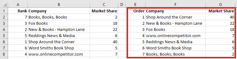
In the previous section, we inserted the RANK function into the first column, this is so we could use VLOOKUP to get the ordered data. We do not need to insert the rank into the first column, if we use the INDEX/MATCH or some other functions. However, for this example we will use VLOOKUP as that is a more well-known function.
The formula in Cell F2 is:
=VLOOKUP($E2,$A$2:$C$8,2,0)
The formula in Cell G2 is:
=VLOOKUP($E2,$A$2:$C$8,3,0)
The formulas in F2 and G2 can be copied down to the bottom of the list.
We now have our data listed in descending order. The next step is to guarantee the values associated with our company is always highlighted. To do this we will create two columns of data, one for the normal values, and one for the highlighted value.
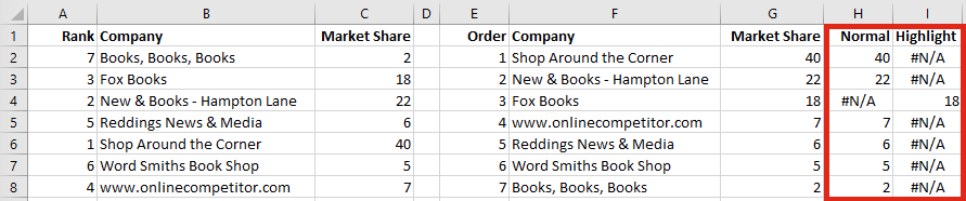
We can use a simple IF function. The formula in Cell H2 is:
=IF(F2="Fox Books",NA(),G2)
The formula in Cell I2 is:
=IF(F2="Fox Books",G2,NA())
The formulas in H2 and I2 can be copied down to the bottom of the list.
The NA() function is used to force an #N/A error as the result of the IF function. We use this because Excel charts ignore #N/A values completely. If a value is blank or zero Excel will show the value as zero, but #N/A does not display at all. This is important, as we only want data labels displayed for the bars which are displayed.
Creating the chart
Once the data is ready, we can create a Stacked Bar Chart. Select Cells F1-I8 then click Insert -> Charts -> Stacked Bar (this is based on Excel 2016; other versions may vary slightly).
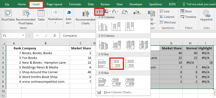
This will create a chart with 3 sections, Market Share, Normal and Highlight. Delete the section of the chart which relates to the Market Share as we do not need this information in the chart (simply click on the first color and press delete)
Right-click on the label axis, click Format Axis. From the Format Axis window select Categories in reverse order. This will put the data into the correct order.
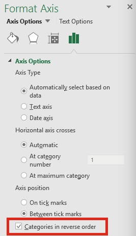
Note: If we sorted our data in ascending order when using the RANK function it would not be necessary to put the Categories into reverse order.
The next steps are down to personal preference, but to replicate the chart I have made do the following:
- Delete the chart title, legend, numbered axis and gridlines (this removes unnecessary noise from the chart).
- Add data labels and format them as required.
- Increase the Gap Width to make the bars wider.
- Make the bar associated with the Normal value a mid-grey color
- Make the bar associated with the Highlight value a suitable color for it to stand out.
The chart should look similar to this:
Discover how you can automate your work with our Excel courses and tools.
The Excel Academy

Make working late a thing of the past.
The Excel Academy is Excel training for professionals who want to save time.
Is ranking necessary for highlighting a bar in the bar graph? Can’t we straightaway create normal and highlight columns?
The ranking is not necessary. But from a data visualization perspective, it can make a chart easier for the brain the process.
=RANK(C2,$C$2:$C$8)+COUNTIF($C$2:AC2,AC2)-1
This should written like ,,
=RANK(C2,$C$2:$C$8)+COUNTIF($C$2:C2,C2)-1
And to highlight specific bar, better Hold CTRL and select F2:F8, then Select H2:I8 , by holding CTRL(now Excel will use one these 3 columns). And automatically set different color to FOX BOOKS bar.
Thanks Rajesh – good spot. I appreciate you letting me know. 🙂
Is it possible to emphasize even if there is more than one figure per value?
For example, the X axis is codes and for each graph the display code is two years old
Hi Yair – yes, it should be possible. The key to this method is getting the formulas to work. They don’t have to be exactly as per this post, so provided you can get that work, then the chart should still work in a similar way.
There is no date on the post, so I assume it predates SORT().
I prefer clustered bars/columns over stacked. You need to change the overlap to 100%, but then you don’t need NA() for the gray bar for the category you’re highlighting. Also clustered lets you use Outside End for data labels, which isn’t available for stacked.