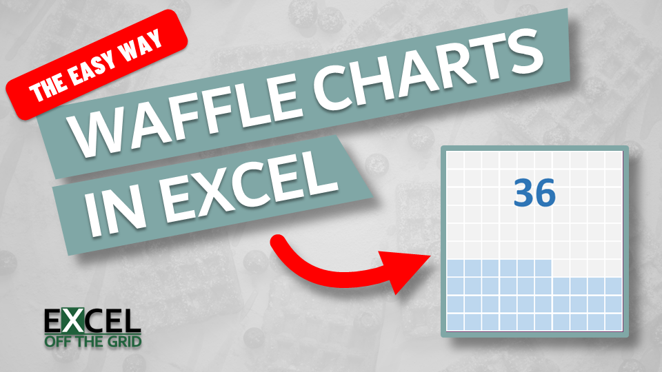
Waffle charts are like square pie charts. However, rather than slices of a pie, values are represented by the number of colored squares. They are commonly found on dashboards and newspaper articles because they are easy to read at a glance. In this post, we look at how to make waffle charts in Excel using the easiest method.
The following is the waffle chart we are creating in this post.
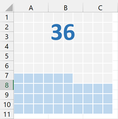
We are using a 10×10 grid, but you can make your grid any size you like.
Table of Contents
Download the example file: Join the free Insiders Program and gain access to the example file used for this post.
File name: 0148 Waffle Chart in Excel.xlsx
Watch the video

Why use a waffle chart?
With so many visualizations available, why should we use waffle charts at all?
- Easy to read and understand at a glance
- Having solid blocks of color helps to grab readers’ attention quickly
- The size of the area is easy for the human brain to process and, therefore, less likely to distort the numbers (as pie charts can)
- Finally, they just look cool!
However, let’s be balanced here. Waffle charts do have some downsides:
- Using too many data points creates a visual which is hard to read.
- When working with multiple data points, the final shapes may not be uniform, making them harder to compare than bar or column charts.
- If working with a single data point, they take up a lot of dashboard real estate for what could be displayed as a single value.
- Not natively available in Excel, we need to pull a bit of trickery.
Waffle Chart in Excel: Conditional Formatting Method
In this post, we create waffle charts using the easiest method, which involves Excel’s grid and conditional formatting. The chart is created on a separate worksheet; then, we use a linked picture to display the visual in the required location.
Create the chart
Let’s start by creating a new worksheet.
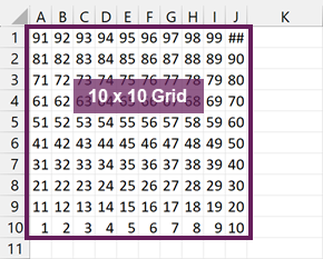
In cell A1 enter the following formula:
=SORT(SEQUENCE(10,10,1,1),1,-1)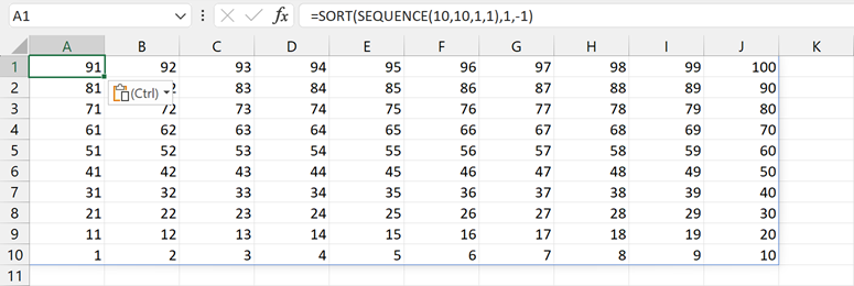
For this example, I’ve used the SEQUENCE and SORT functions. If you’ve not got Excel 2021 or Excel 365, use other formulas, or hardcode values, to create the numbers from 1 to 100.
Next, adjust the row widths and column heights of the 10×10 area to form squares.
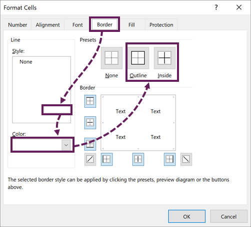
Now, apply formatting to the grid as follows.
- Light grey fill
- Light grey text
- Thick white border – inside and outside
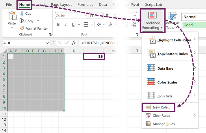
In cell L1, enter the value to represent in the chart. Then, select the entire grid, and click Home > Conditional Formatting > New Rule…
In the New Formatting Rule dialog box, select Format only cells that contain.
Set the rule as cell values between 0 and $L$1.
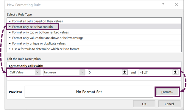
Click the Format button.
In the Format Cells dialog box, select the format you wish to apply.
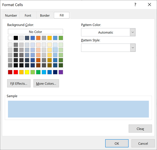
Use the same fill color and font color so the numbers are not visible.
Click OK to close the Format Cells dialog box, then click OK again to close the New Formatting Rule dialog box.
Our waffle chart now looks like this:
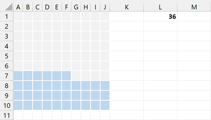
If we change the value in cell L2, the chart updates automatically.
Adding the waffle chart to a report or dashboard
Usually, we add charts onto the face of a report or worksheet. However, we don’t have a chart. We have the colored cells on a grid.
So, here is the trick.
Select all the cells in the grid, then press Ctrl + C to copy the cells.
Select your report worksheet, then click Home > Paste (drop down) > Linked Picture
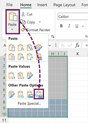
This creates a picture that is linked to the cells of the waffle chart grid.
We can put this picture wherever we want on the worksheet. As it is a linked picture, if the value changes, the colored cells update, and the picture updates too.
Adding the label
The next step is to create a dynamic label.
On the same worksheet as the linked picture, click Insert > Shapes > Text Box.
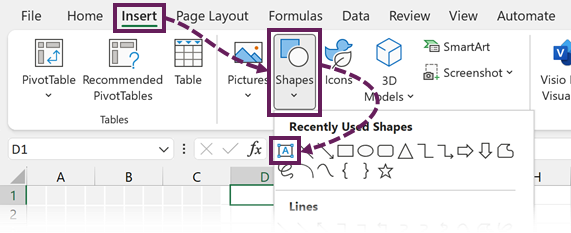
Draw the text box over the top section of the linked picture.
Don’t manually enter a value into the text box. Instead, click on the edge of the box, then enter a link back to the original value in the formula bar. In our example, it is =Sheet!L1.
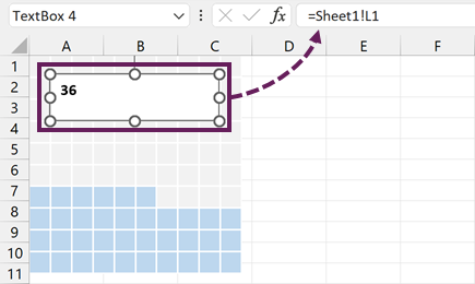
Format the text box to match your style, and apply no fill and no line.
The final chart looks like this. See, that was a pretty easy method for making waffle charts in Excel.
Conclusion
We can easily create waffle charts in Excel just by using the grid, a single formula, and conditional formatting. The trick to using the waffle chart on a report is creating a linked picture object; then, we can place it wherever we want.
Related Posts:
Discover how you can automate your work with our Excel courses and tools.
The Excel Academy

Make working late a thing of the past.
The Excel Academy is Excel training for professionals who want to save time.