My first experience of Bullet Charts came from reading Information Dashboard Design by Stephen Few in 2007. This was the year I started to get serious with dashboards.
Initially, to create Bullet Charts I used the 3 stacked bar/column charts approach. Later, I moved to using the two-axis stacked column where possible, but in general, bullet charts still seemed overly painful. But then, I stumbled across one of my favorite Add-ins of all time, Sparklines for Excel.
The Sparklines for Excel Add-in is amazing. Whilst it was created in the days long before Sparklines existed in Excel, this Add-in still does some things better that Excel’s built-in functionality. The Add-in creates in cell charts just by using formulas which are simple to use and understand. Plus, the Sparklines for Excel Add-in has the VBA code visible and can be distributed or modified under the GNU General Public License. It doesn’t look like the Add-in has been updated in a while, so it is possible that it is no longer an active project (or maybe it doesn’t require any further work). Anyway, enough of the introduction, let’s get into Bullet Charts.
Download the Sparklines for Add-in
The Add-in can be downloaded here. Click on the relevant link for your version of Excel and download the .xlam file. Save the file in a location where you can always access it.
In Excel click File -> Options -> Add-ins.
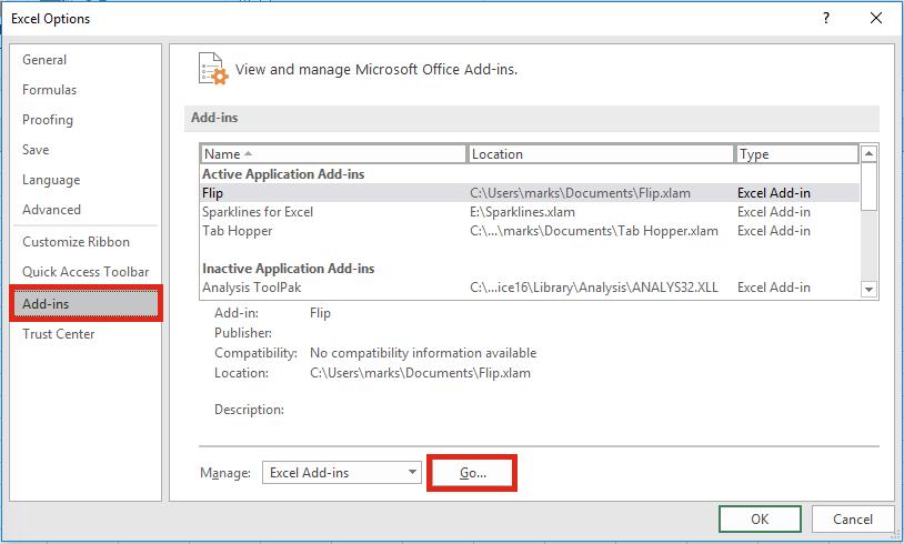
Click Go…
From the Add-in window select Browse…
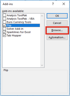
Find the downloaded file and click OK.
A Sparklines Ribbon will appear with a variety of options.

You will also want to download the Manual and Color Codes documents, which are also available from the website.
Bullet Charts
I created the Bullet Charts below with just a few clicks. Don’t they look good!
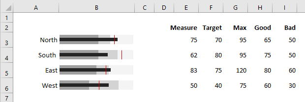
The example Bullet Charts above require the following data:
- Measure – the black bar in the middle
- Target – the red line
- Max – the light grey
- Good – the mid-grey
- Bad – the dark grey
There are loads more options available, but we will just consider these for now.
Select a cell, then select Bullet from the Sparklines Ribbon.
The Bullet Chart function will be entered into the Cell. The Function Arguments window will open. Set the Function arguments as if it were a normal formula. Then click OK.
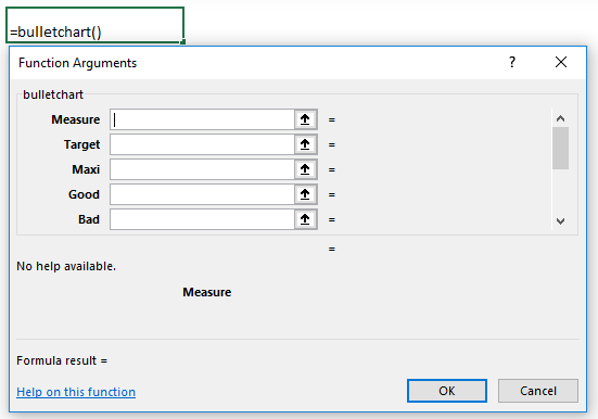
Hopefully, you will now have a beautiful Bullet Chart in your cell.
A few tips
Here are a few of my tips to help you with this Add-in.
- Whilst I love this Add-in, it can be a bit temperamental from time to time. If necessary, use the buttons in the Utilities section to reset and clean things up.

- If you want to create a vertical Bullet Chart, there is an option to change the orientation of the Bullet Chart. Look in the instruction manual for more information.
- If the chart does not display correctly, check your data and read the manual. Chances are you’ve not used the data in the method expected by the function.
- If something isn’t quite as you want, and you feel brave enough, you can edit the VBA code. If changing the code goes wrong, you can always download a new version and save over your old version.
One problem
The one big problem is . . . if anybody who doesn’t have the add-in opens your workbook the charts won’t function properly. So this method is best saved for printed or PDF’d reports and presentations.
In a future post I will cover how to create Bullet Charts using standard Excel chart.
Please note – whilst I have downloaded and have used this Add-in, if you decide to do this same, it is at your own risk.
Discover how you can automate your work with our Excel courses and tools.
The Excel Academy

Make working late a thing of the past.
The Excel Academy is Excel training for professionals who want to save time.

