
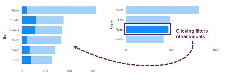
Power BI has a really nice way of cross-filtering visuals. When you click on a visual, it highlights the selected item in other charts while also retaining the total value in a lighter color. Can we cross filter visuals in Excel? No. But we can create something pretty close.
Power BI Example:
This post was inspired by a question I received:
With a slicer linked to a pivot chart, is there a way of highlighting the column but keeping all the data?
So, let’s see how we might achieve something similar in Excel.
Table of Contents
Download the example file: Join the free Insiders Program and gain access to the example file used for this post.
File name: 0159 Cross filtering visuals in Excel.xlsx
Watch the video

The Data
The data in this example is from a single Table called Data.
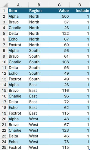
The data is all fixed values, except the Include column that contains the following formula:
=SUBTOTAL(3,[@Value])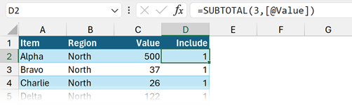
As the formula is in an Excel Table, it automatically copies down into the rows below.
This formula is critical to the entire process. It currently calculates to 1 in every row because every row is visible. But if we filter the Table, the hidden rows recalculate to 0. This is the method we use to identify if a value should be displayed in the chart.
Find out more about this technique here: Using Slicers with dynamic array formulas in Excel
The Calculations
There are various calculations required to achieve the cross-filter effect.
We are using dynamic array formulas for this solution. You will need Excel 2021 or later to work with the example file. However, it’s not essential, and this solution can work without dynamic array formulas.
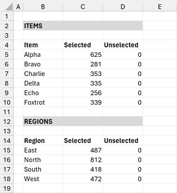
The calculations have a category column and two data series columns (Selected and Unselected). This isn’t a post about the formulas, so I will not go through these in any detail.
The formulas for the Item chart are as follows
Cell B5:
=SORT(UNIQUE(Data[Item]))Cell C5:
=SUMIFS(Data[Value],Data[Include],1,Data[Item],B5#)Cell D5:
=SUMIFS(Data[Value],Data[Item],B5#)-D5#These calculations are then repeated for the equivalent Region chart:
Cell C15:
=SORT(UNIQUE(Data[Region]))Cell D15:
=SUMIFS(Data[Value],Data[Include],1,Data[Region],C15#)Cell E15:
=SUMIFS(Data[Value],Data[Region],C15#)-D15#As a subsequent step, we could use HSTACK to put all the calculations into a single array. Charts linked to a single array expand automatically; therefore, that might reduce the amount of manual effort required to maintain the charts for new data.
Create the Charts
Using the Item, Selected, and Unselected columns, create a stacked bar chart for the Items calculations.
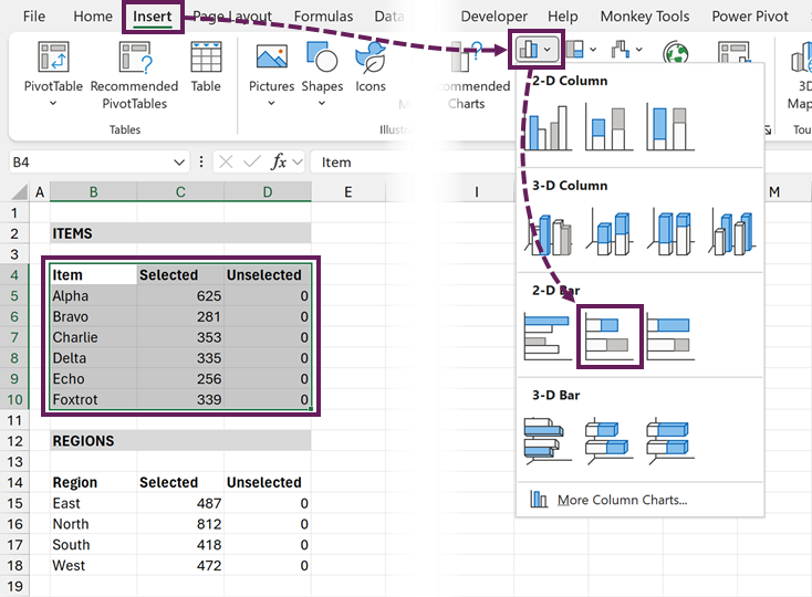
Repeat the above for the Region calculations.
Then, cut and paste the charts into a new Presentation worksheet.
We will come back and format these charts shortly.
Create the Slicers
Now, let’s create the slicers.
- Select a cell in the Data Table.
- Click Insert > Slicer from the ribbon
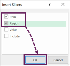
- In the Insert Slicers dialog box, select Item and Region, then click OK.
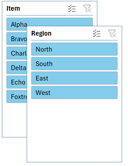
This creates 2 new slicers. Cut and paste the slicers to the same worksheet as the charts.
The Formatting & Presentation
All the calculations and connections are set up. Clicking the slicers filters both charts. It’s now all about formatting and presentation.
Format the Charts
Repeat the following steps for both charts
- Delete the Title
- Delete the Legend
- Remove the chart border
- Select suitable colors for the bars
- Format the category axis
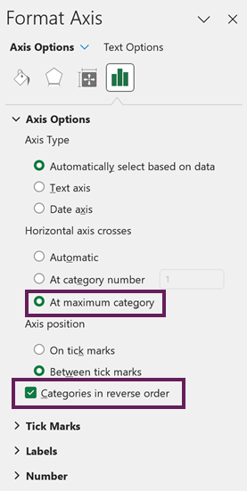
- Check the Categories in reverse order
- Set the horizontal axis to cross at maximum category
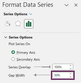
- Format the Data Series by setting the Gap width to at least 50%
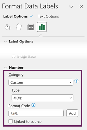
- Add data labels to the Selected series.
- Format the data label however you wish, but ensure the number format displays blank for zero.
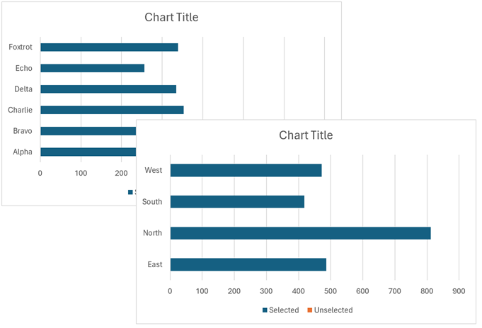
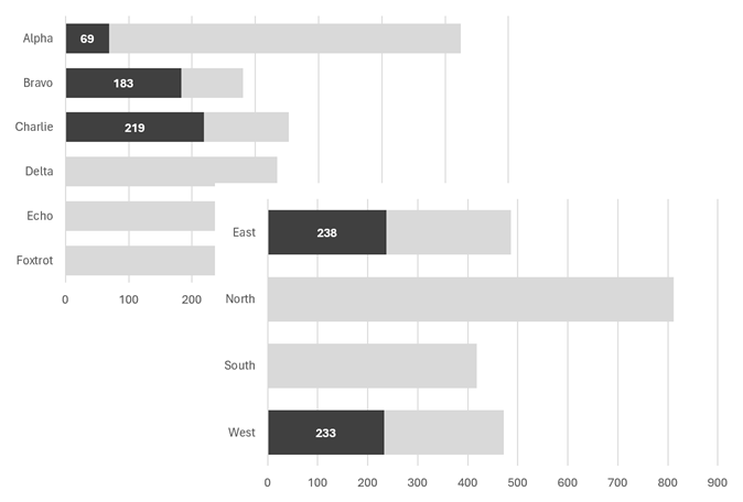
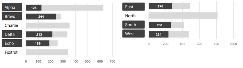
With East and West selected in the region slicer and Alpha, Bravo and Charlie selected in the region slicer, the charts will look a bit like this.
Format the Slicer
Now it’s time to format the slicers.
- Right-click a slicer and select Slicer Settings from the menu:
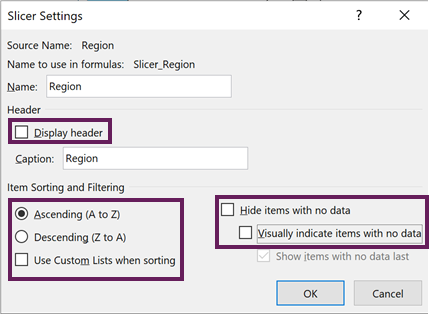
- Uncheck Display header
- Select Ascending (A to Z)
- Uncheck Use Custom Lists when sorting
- Uncheck Visually indicate items with no data
- Ensure Hide items with no data is unchecked
- Click OK
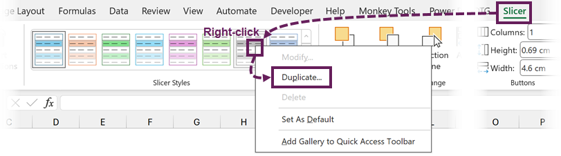
- Select a slicer, then from the Slicer ribbon, right-click on a slicer style and click Duplicate…
- In the Modify Slicer Style dialog box, modify the slicer style to fit your requirements.
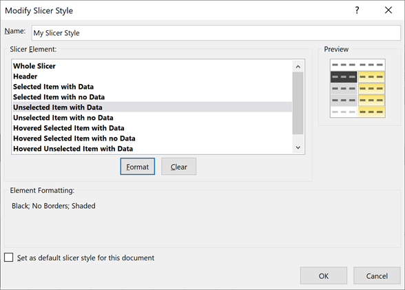
- After creating the slicer style, apply the style to both the Item and Region slicers.
For our example, the slicers look like this:
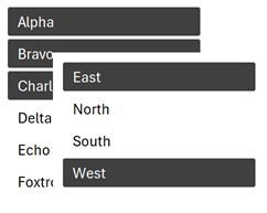
I have chosen quite a dark fill color for the slicer, but you might choose a bold font or other formatting to indicate which items have been selected.
Layout
The final step is to lay out the slicer and chart so the slicer looks like the axis labels of the charts.
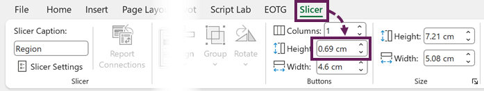
If necessary, resize the slicer buttons by selecting the slicer, then change the button height in the Slicer ribbon.
Now, resize the chart so the bars visually align with the slicer buttons.
Clicking the slicer buttons cross filters the other charts.
BOOM! Cross-filtering visuals in Excel – Done!
Conclusion – cross filter visuals
While Excel does not have cross-filtering, we can create a similar effect using slicers and standard charts. The Include column is the key to making this technique work; this identifies which items have been selected.
Some other cross-filtering solutions use PivotTables and Power Pivot, so make sure to check those out too:
- Amazing! Cross Filtering Charts in Excel Dashboards Like in Power BI
- Cross Filter and Highlight Excel Charts like Power BI
Related Posts:
- Using Slicers with dynamic array formulas in Excel
- How to make an interactive view-only dashboard from Excel
- 5 rules for a dashboard color palette
Discover how you can automate your work with our Excel courses and tools.
The Excel Academy

Make working late a thing of the past.
The Excel Academy is Excel training for professionals who want to save time.