In this post, I would like to consider the use of colors in a dashboard (or, for that matter any analysis tool which uses colors to highlight areas of interest). Everybody believes they have good taste, even though everybody has different tastes. When choosing colors for a dashboard the key consideration is not your taste – “do I like these colors”, but what message the colors tell. Here is the thing . . . I’m not a graphic designer (and I doubt you are, there can’t be many graphic designers reading Excel blogs), I’m not even particularly good at matching colors for the clothes I wear but I know how to follow rules. Thankfully there is a wealth of knowledge out there on the internet, so all we have to do is follow the rules, as laid down by people who do know. I know that if I follow these rules, then my dashboards will be much more usable than if I just went with my own color preferences.
Here are the basic rules I follow:
- Grey is my friend
- Avoid colors which mean something (unless I want it to mean something).
- Add color only where needed to bring out the message
- Select a base color, then use complementary colors
- Humans can distinguish between 4 shades of the same color
Grey is my friend
After white (the background color) the most used colors on my dashboard should be grey. Sounds boring, doesn’t it? But that’s the point. Everything on the dashboard cannot be a significant item. So, if it’s not worth highlighting, it should be grey. If you want to show how your company compares to its competitors you only need to highlight your company, your competitors should be grey.
When it comes to separating sections or borders for tables then white space is preferable. But sometimes we have to squeeze things in a little bit and natural white space ceases to be an option. In these circumstances use light grey borders and lines. No dashboard designer want’s their audience to focus on the borders first. Make them just visible enough to subconsciously tell the reader that it’s separating the things either side of it. Then the reader can focus on what is actually important.
Avoid colors which mean something
Look at the chart below – what is it telling you? It seems to be telling you that Thingies (the red bars) are doing very badly in comparison to Widgets (the green bars). In western culture, red is a warning color and green is a good color. Therefore, by using red and green we are telling a story we might not want to tell.
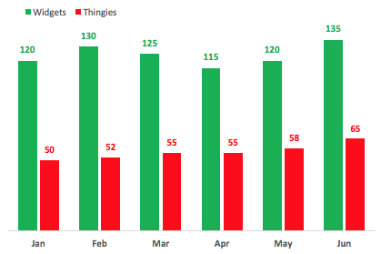
However, you’ve probably missed the point that Widgets have improved by 15 (that’s 30%) from January through June. That’s good, right! But your eyes are too focused on the colors and you are missing other important information in the chart. I admit that a clustered column chart may not be the best option for this data, (but that can be the topic of a whole different post).
Add color only where needed to bring out the message
Sometimes it can be easy to include colors just because we can, or feel that we should. Firstly, we should ask “what is the point of this chart/table?”. Once we have the answer, only then we can pick colors accordingly.
Think about a RAG status for a moment, by its definition it shows red, amber and green. However, as much as we might think it shows a clear message, chances are that it does not. Instead, t can overload our sense so that we become desensitized to the message.
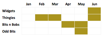
Here is a RAG status for various projects, showing whether they have fallen behind schedule at any point from Jan through Jun.
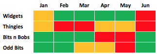
Too much color! Once we decide that the purpose of the RAG status is to highlight projects which are falling behind schedule, we can add color to highlight just this.
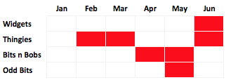
This second table is much easier for our eyes and brains to process.
RAG status has the added problem that approx 8% of men are red/green color blind. So, your RAG status could look like this to some people:
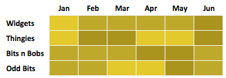
Oh dear! That’s really, really bad. That won’t communicate any messages. But if you could focus on one message it doesn’t matter which color you choose, as it still communicates that one message.
Select a base color, then use complementary colors
As I said in the introduction, I’m not a graphic designer, I’m an Excel geek. What do I know about this selecting colors? Nothing.
Thankfully, in this internet age I don’t need to know anything, as there are tools which will give me complementary color palettes. Adobe Color CC is once such tool.
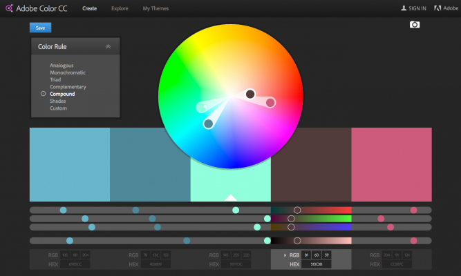
Start with a base color from your corporate logo, and this tool will give you 4 other colors which will work well with it. You definitely should not use all those colors, selecting 1 or 2 to use together will be sufficient.
Over on Twitter, Deven Wisner, suggested I check out ColorBrewer.

It’s aimed at cartographers (map makers), so I was a bit skeptical at the start. It turns out that cartographers also need good color palettes too.
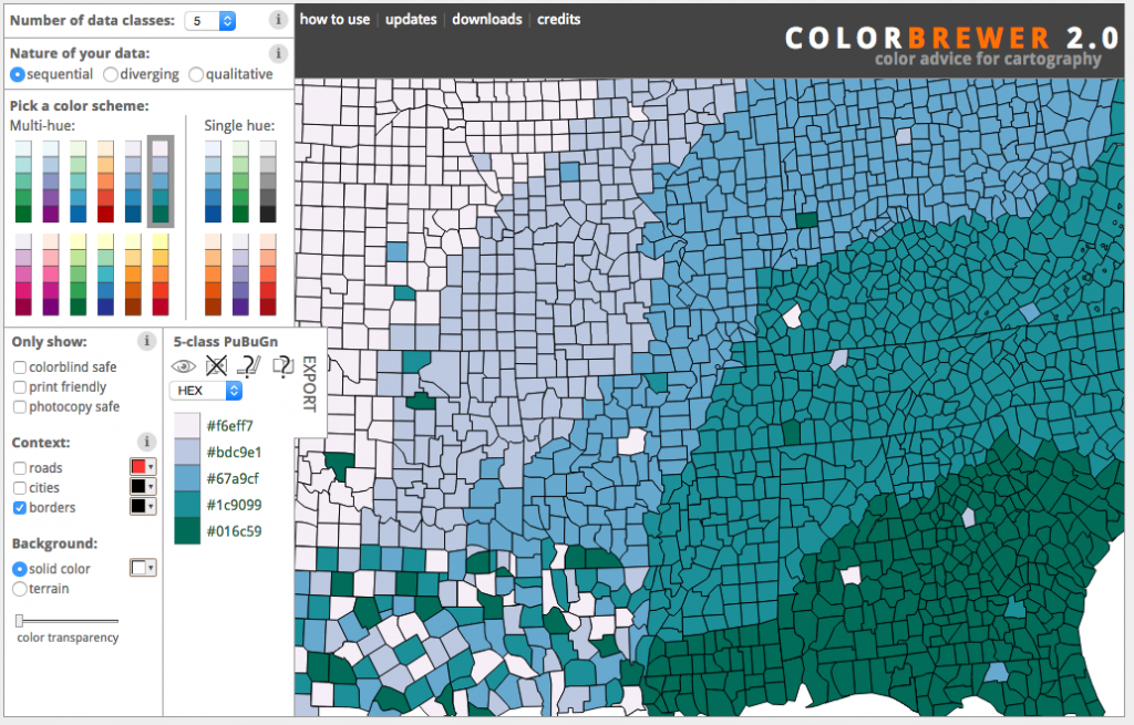
For designing dashboards, ColorBrewer is a great tool.
Humans can distinguish between 4 shades of the same color
One of the things I learned from Effective Data Visualization: The Right Chart for the Right Data by Stephanie Evergreen is that humans can quite easily distinguish between 4 shades of the same color. Some of this comes down to your definition of color, but it means that in many scenarios we can just use a single color in different shades.
So, with this idea in mind, I created the same charts/tables as before but with different shades of the same color. Compare the two.
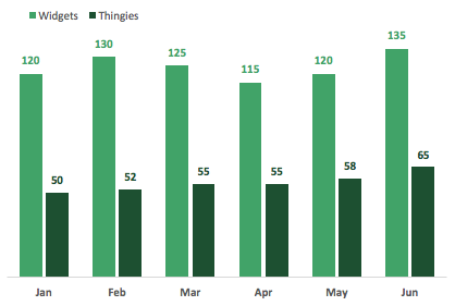
Here is the RAG status again, but in two colors.
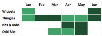
The options with fewer colors look better, don’t they?
I know what you’re thinking: “This is green, but you said not to use green”. Yes, this is true, but the dark green is also my main ‘corporate’ color (bad planning on my part). However, by using green as the only highlight color, it doesn’t have the same impact as when used in combination with red.
Conclusion
When selecting colors we want to achieve two things:
- Ensure the message we want to communicate is clear
- Ensure our communication does not show other messages which are not intended
With these two goals in mind it becomes much easier to follow a set of rules. These are just the ‘rules’ which I try to apply. I believe these rules will protect me from making some very bad color choices. Do you have any rules for color choice which you apply? Let us know in the comments below.
Discover how you can automate your work with our Excel courses and tools.
The Excel Academy

Make working late a thing of the past.
The Excel Academy is Excel training for professionals who want to save time.

Wow!
Now onwards following the rules & tools, I’m making Excel Spreadsheet more faster & accessible. Thanks to your recommendations.
Excellent summary with examples to boot! Thank you
Thanks JD 😀