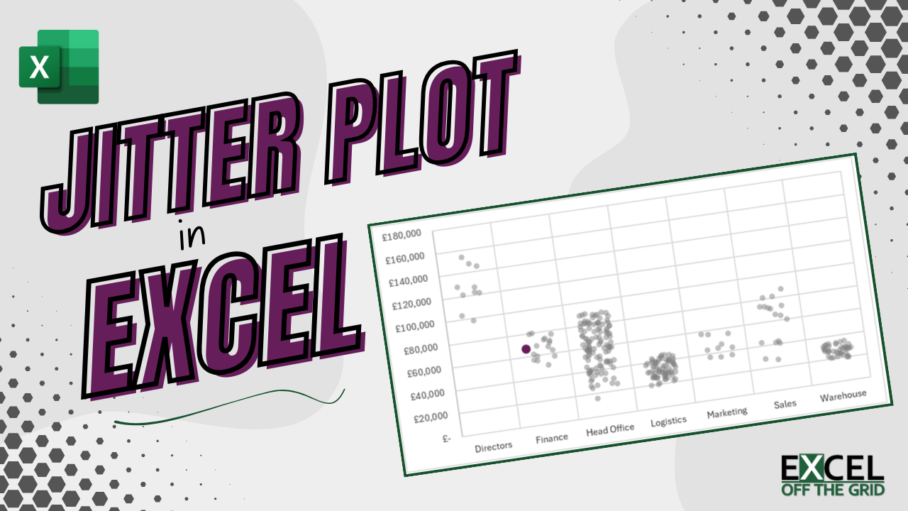
At this year’s Global Excel Summit, two presentations included Jitter plots. So, this got me thinking about how I would create one in Excel.
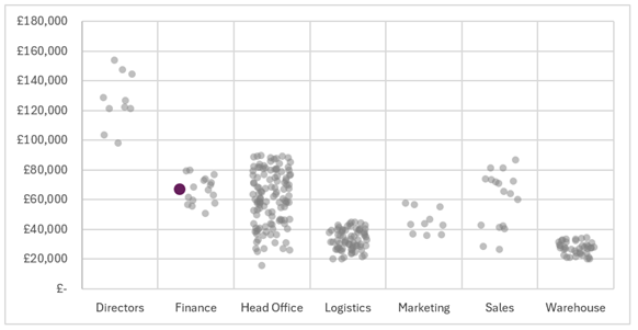
If you’re not sure what a jitter plot is, this is the final chart we are creating in this post:
I decided to make the jitter plot 100% dynamic so the chart automatically updates for new data.
In each stage, there are many approaches we could have used. This post contains one method; therefore, you may decide to take an alternative approach for creating your jitter plot in Excel.
Table of Contents
Download the example file: Click the button below to join the Insiders program and gain access to the example file used for this post.
File name: 0194 Dynamic jitter plot.zip
Watch the video
Example
The source data for the jitter dot plot is a Table called Data with Name, Department and Salary columns.
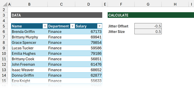
We also have two parameters Jitter Offset (cell G5) and Jitter Size (cell G6). These are used in the calculations and can be adjusted for fine-tuning the final display.
Calculations
Before we create the chart, we need to calculate all the values. Unfortunately, there are quite a lot of them.
Depending on how you structure workbooks, you could avoid some of the calculations. However, in the interests of splitting data from presentation, and providing a clear flow, these are the calculations I have included.
Sections and labels
We start by creating the list of departments and the XY values required to place them on the chart in the correct location.
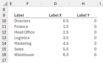
Label
The formula in cell F10 is:
=SORT(UNIQUE(Data[Department]))This creates an alphabetically sorted list of values from the Department column.
Label X
The department name label is placed in the center of each section. For this, we need a list of values starting at 0.5 and increasing by 1 for each department (0.5, 1.5, 2.5, 3.5… etc.)
The formula in cell G10 is:
=SEQUENCE(ROWS(F10#))+G5This simply creates a list representing the number of departments and adjusts for the value in the Jitter Offset cell (G5).
Label Y
The department lables are placed at the bottom of the chart; therefore, we need a Y value of 0 for each department.
The formula in cell H10 is:
=SEQUENCE(ROWS(F10#),1,0,0)This creates a zero for each department name.
Chart values
The next stage is to calculate the XY values for the grey dots.
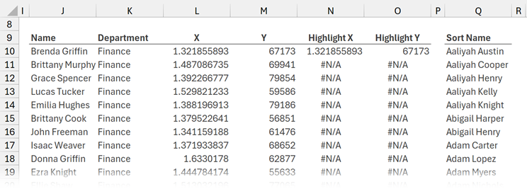
Name
Let’s start with a list of the employee names.
The formula in cell J10 is:
=Data[Name]That’s simple enough.
Department
Now let’s add the department name.
The formula in cell K10 is:
=Data[Department]Also pretty simple.
X Values
Along the horizontal axis, the values are grouped by department.
To ensure the values are not all in a vertical line, they require a random offset to create the jitter effect.
The formula in cell L10 is:
=MATCH(K10#,F10#,0)+RANDARRAY(ROWS(Data[Department]),1,-G6,G6)/2+G5Let’s break down this formula:
=MATCH(K10#,F10#,0)Returns the position of the Department in the Label list (cell F10#). For example, Finance is the second department in the list, so it returns 2.
=MATCH(K10#,F10#,0)+RANDARRAY(ROWS(Data[Department]),1,-G6,G6)/2Next, we want to calculate the jitter effect. RANDARRAY creates a list of random numbers from -0.5 to 0.5 (the 0.5 is based on the value in cell G6).
The value is divided by two to ensure the spread of the jitter is less than the Jitter Size.
=MATCH(K10#,F10#,0)+RANDARRAY(ROWS(Data[Department]),1,-G6,G6,FALSE)/2+G5To ensure the dots fall between the vertical lines we apply the Jitter Offset (cell G5, which is -0.5 in our example).
This calculation may seem confusing. Ultimately, this calculation ensures:
- Directors have X values between 0.25 and 0.75
- Finance staff have X values between 1.25 and 1.75
- Head Office staff have X values between 2.25 and 2.75
- etc, etc.
Y Value
The Y Value comes from the Salary column. Therefore, the formula in cell M10 is:
=Data[Salary]Highlight values
The chart includes a selector to determine which value to highlight. We require XY calculations for this value.
Where the name is not the same as the selector, we return the NA() function. #N/A is a special value as it is not rendered on a chart. This ensures only the selected values are displayed.
Highlight X
The formula in cell N10 is:
=IF(J10#=T6,L10#,NA())Cell T6 contains the employee name we wish to highlight in the chart.
If the name value in J10# is equal to the selected employee name, then the X value is returned. Otherwise, the NA() function is returned.
Highlight Y
Highlight Y is similar to Highlight X, but for the Y values.
The formula in O10 is:
=IF(J10#=T6,M10#,NA())Sorted name list
Cell T6 will contain an alphabetically sorted data validation list containing the employee names. This makes it easier to find which employee to highlight.
The formula in cell Q10 is:
=SORT(Data[Name])Named Ranges
To ensure the chart is dynamic, we create a named range for each element that appears on the chart.
Select cell F10.
Click Formulas > Define Name.
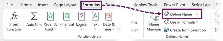
Enter the following values in the New Name dialog box:
- Name: Label
- Scope: Example (the name of the worksheet containing the calculations).
- Refers to: Example!$F$10#
Follow these steps to create all the following named ranges. There should be 7 in total.
- Label: Example!$F$10#
- LabelX: Example!$G$10#
- LabelY: Example!$H$10#
- X: Example!$L$10#
- Y: Example!$M$10#
- HighlightX: Example!$N$10#
- HighlightY: Example!$O$10#
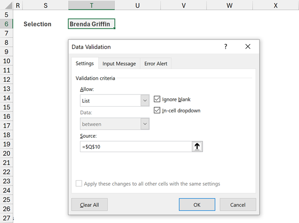
Data validation List
Now let’s create the data validation list to select the employee to highlight.
Select cell T6. Click Data > Data Validation.
In the Settings tab of the Data Validation dialog box enter the following.
- Allow: List
- Source: =$Q$10#
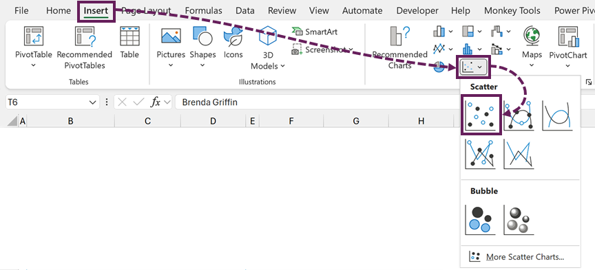
Create the chart
All the groundwork has been completed, we are now ready to create the chart.
In the ribbon, click Insert > Scatter (drop-down) > Scatter
Right-click on the chart area, click Select Data… in the menu.
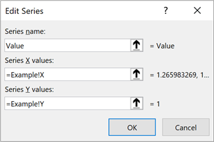
In the Select Data Source dialog box click Add.
In the Edit Series dialog box enter the following
- Series name: Value
- Series X values: =Example!X
- Series Y values: =Example!Y
Add two more data series as follows:
Labels
- Series name: Label
- Series X values: =Example!LabelX
- Series Y values: =Example!LabelY
Highlight Values
- Series name: Highlight
- Series X values: =Example!HighlightX
- Series Y values: =Example!HighlightY
There should be 3 data series:
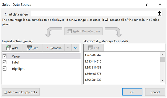
Click OK to close the dialog box.
The chart currently looks like this:
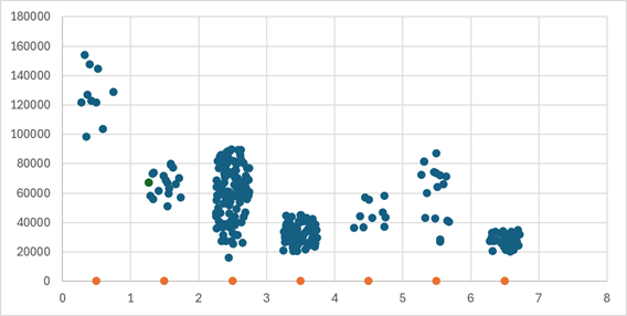
Chart formatting
From here it’s all formatting.
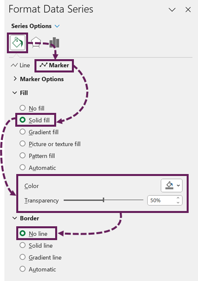
Format the data points
Format the value markers as follows:
- Fill: Solid fill: Dark grey, Transparency: 50%
- Border: No line
Next, format the highlight value dots to provide emphasis:
- Fill: Solid fill: Select a bright color, Transparency: 0%
- Border: No line
- Marker Size: Consider changing the size to make the selection clearer
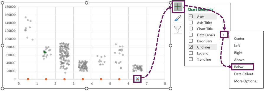
Format the labels
Select the Label markers. Click the [+] > Data Labels > Below
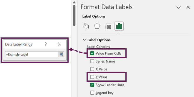
The data labels appear showing 0. Format the data labels to show the Value from Cells. In the Data Label Range dialog box, use the Label named range.
Finally, set the label markers to no border and no fill.
Final formatting
The final formatting required:
- Delete the X-axis labels
- Apply suitable number formatting to the Y-axis labels
- Resize the plot area to fit nicely in the chart area
Auto-resizing the X axis
Unfortunately, we have an issue. Due to how Excel scales chart axis automatically, there is likely to be a blank selection to the right of the chart.
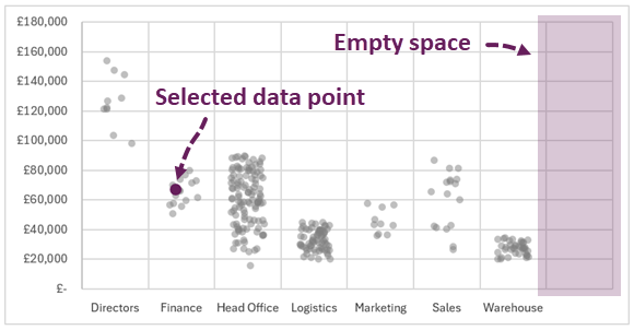
As we want the chart to be dynamic, we cannot change the Max of the X axis as it will become hard-coded.
To make this dynamic we will apply one formula and some VBA.
Axis count
In cell K10 enter the following formula:
=COUNTA(F10#)This calculates the number of departments required for the chart.
Create a named range for this cell called Axis Count.
VBA code
In the code module for the worksheet enter the following code:
Private Sub Worksheet_Calculate()

Dim chtObj As ChartObject
Dim value As Integer
Dim chtName As String

chtName = "Chart 1" 'Change to your chart name

Set chtObj = Me.ChartObjects(chtName)

value = Me.Range("'" & Me.Name & "'!AxisCount").value

chtObj.Chart.Axes(xlCategory).MaximumScale = value

End Sub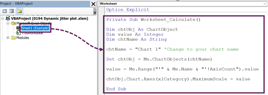
The code above adjusts the X-axis so that the maximum value is equal to the number of departments.
Every time the sheet calculates the chart axis also updates.
The chart now looks as follows:
Adding new data
Now, let’s see if this is fully dynamic. What happens if we add new data for the Legal department to the Table?
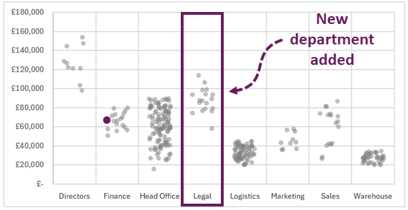
Boom! Everything updates correctly and the chart includes the new data.
Conclusion
To create the dynamic jitter plot, we used the following steps:
- The Table holds the data.
- Dynamic array calculations refer to the Table.
- Name ranges refer to the dynamic array calculations.
- The chart refers to the named ranges.
- Any non-updating aspects are handled with VBA.
Through this, we created a jitter plot in Excel that is fully dynamic.
Related Posts
- How to make a Dumbbell Dot Plot in Excel (100% dynamic)
- How to create dynamic chart legends in Excel
- How to create a step chart in Excel
Discover how you can automate your work with our Excel courses and tools.
The Excel Academy

Make working late a thing of the past.
The Excel Academy is Excel training for professionals who want to save time.