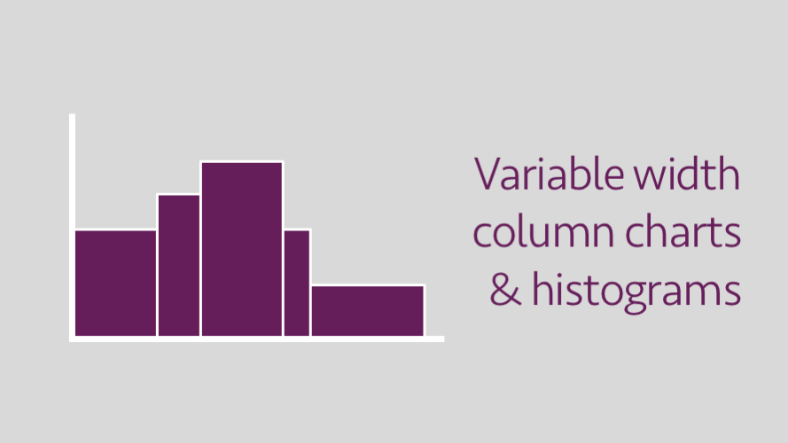
In Excel, the standard column chart will display all columns with the same width at regular intervals. However, in some circumstances, it would be better for the width of each column to be different. For example, where each column represents different ranges of data. This same principle of column width also applies to histograms.
Excel does not have any settings to change the width of individual columns when using a column chart. However, it is possible to get creative with a stacked area chart and the correct data layout. With a bit of trickery, it is possible to create this chart:
Basic principles
To create a variable width column chart we will be using a stacked area chart. Normally, this chart type uses fixed intervals for the x-axis (the bottom axis). By changing the x-axis to display a data axis we can plot a point anywhere along the x-axis. It is even possible to plot points in the same place along the x-axis, which results in a vertical line. This provides us with the ability to create the illusion of columns.
The data labels in the chart above are also an illusion. They are created by a line chart which has been set to have no color.
The chart
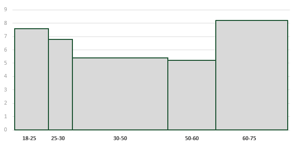
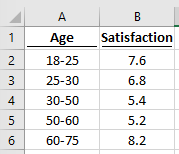
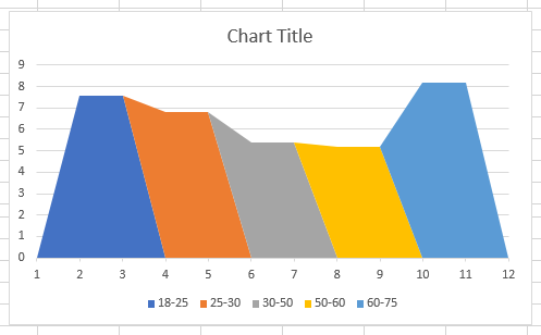
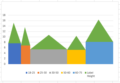
The chart we will be creating in this example uses fictional data to show customer satisfaction for a product based on various age ranges. The main data is shown below,
This data will be used to create this chart.
Setting up the data
The first step is to set-up the data in the right way.
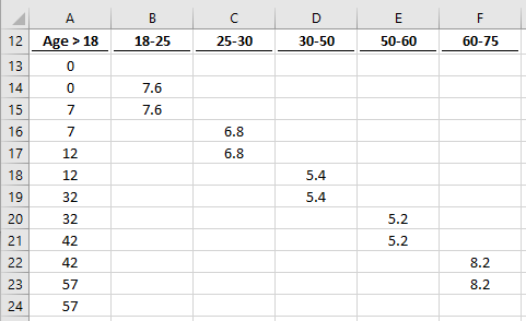
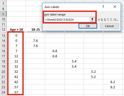
Our data starts at 18, but the chart axis starts from zero, therefore the values in Cells A13 – A57 (shown above) are the number of years above 18.
Each category has 4 main points. Using the 18-25 group as an illustration, the first point is zero (blank), the next point is the value 7.6. Both of these points happen at zero years over 18. The next two points happen at 7 years over 18 (i.e. 25 years), the 7.6 is repeated, then reduces to zero. The remainder of the points in Cells B17 – B24 are zero (blank). Each subsequent category follows a similar pattern, but has more or less zeros before or after the data.
Creating the variable width chart
This tutorial is based on Excel 2016. The chart can be created with other versions of Excel, however, whilst the options may be in a different place, the principles are the same.
Select the cells without the age range column (Cells B12 – F24 in our example).
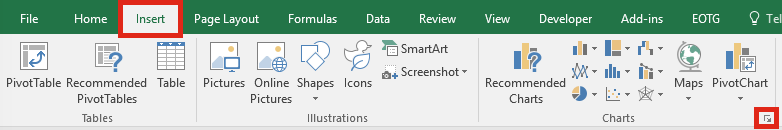
From the Ribbon click Insert -> Charts -> See All Charts.
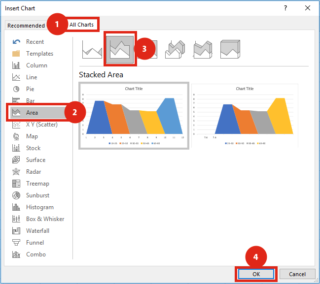
From the Insert Charts window click All Charts -> Area -> Stacked Area -> OK.
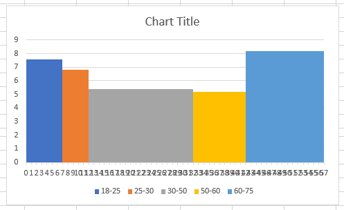
A new area chart will appear
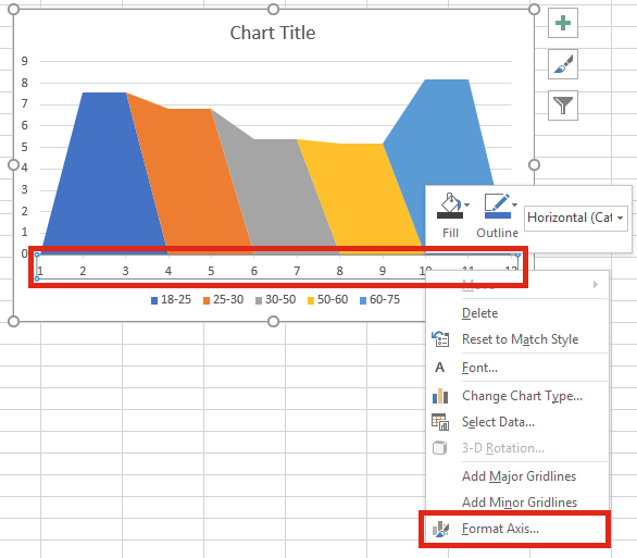
Right-click on the X-axis and select Format Axis…
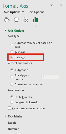
From the Format Axis window select Date axis.
Right-click on one of the chart series, click Select Data…
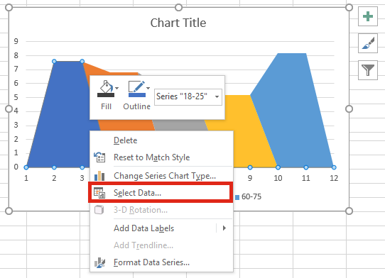
From the Select Data Source window click Edit from the Horizontal (Category) Axis Labels box.
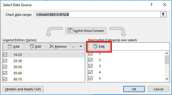
Set the Ages column as the Axis Labels. Then click OK.
The chart will now start to take shape as a variable width column chart or histogram.
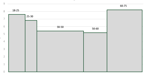
Adding data labels to the variable width Chart
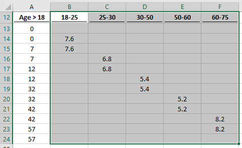
The chart above is OK. But it would look better if the data labels were directly above or below the columns. Once we have this, we can delete the unsightly numbering on the X-axis. Unfortunately adding labels requires changing the source data, there needs to be additional columns and rows.
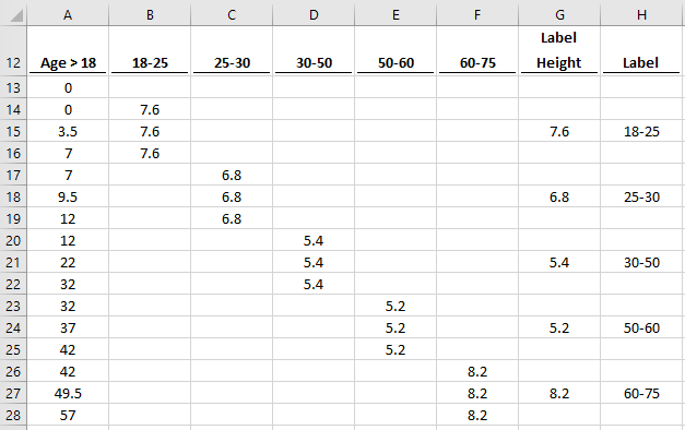
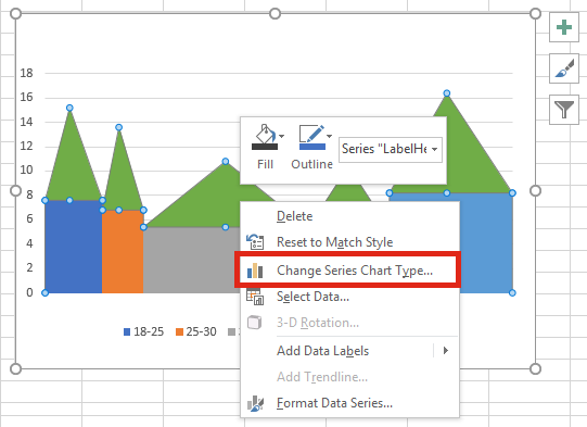
Notice that there are now 3 rows for each value, a mid-point has been inserted into the middle of each age range. Create the chart in the same manner as above, also including the Label Height in the chart data source. The chart should look like this:
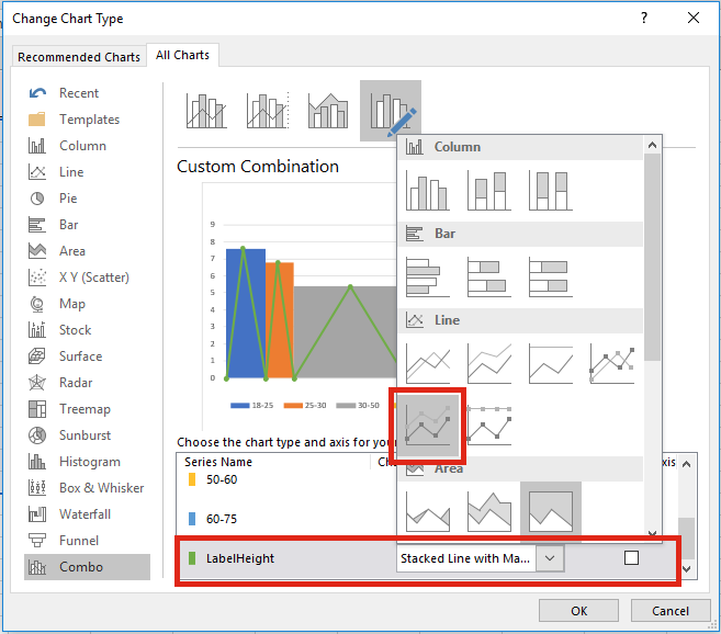
Right-click on the Label Height chart series and select Change Series Chart Type…
Change the chart type to a line chart – as there is only one line, the type of line chart does not matter too much.
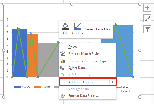
Right-click on the line chart and select Add Data Labels…
Next, right click on the data labels and select Format Data Labels…
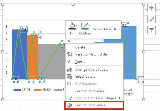
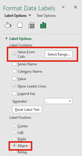
From the Format Data Labels window, set the Label Position to Above. If you are using Excel 2013 or later, click Value From Cells and select range containing the data labels (Cells H13 – H28 in our example).
For those using Excel 2010 and before, Value From Cells will not be an option. If so, double-click on each data label and type the label description manually. Delete any labels you do not wish to keep.
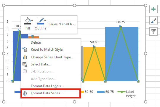
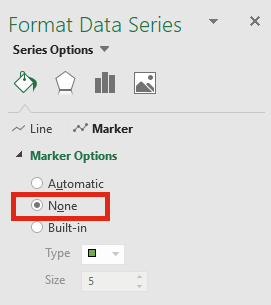
Right-click on the Line Chart and select Format Data Series…
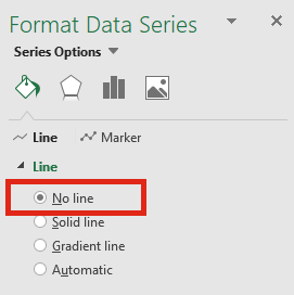
Set the Line to No Line and the Marker Options to None.
Delete any unnecessary chart items, such as Chart Title, Legends etc, then apply any additional formatting you do want.
If you would prefer the data labels below, that’s possible too.
Discover how you can automate your work with our Excel courses and tools.

Excel Academy
The complete program for saving time by automating Excel.

Excel Automation Secrets
Discover the 7-step framework for automating Excel.

Office Scripts: Automate Excel Everywhere
Start using Office Scripts and Power Automate to automate Excel in new ways.
Can anyone think of a solution to get a chart like this:
http://www.evernote.com/l/AA2Th3iCbjxLMZeRFT_LfE11wMLjZw6PPSw/
It is a bar chart, with the % improvement (if a negative number) to the left of the vertical axis or deterioration (if a positive number) to the right of the vertical axis – but then crucially with the thickness of the bar proportionate to the significance of that series (e.g. the thicker it is the larger and more significant it is). Have had a good look at cascade charts and Marimekko charts – but to not avail so far… maybe it needs x-y or bubble… but surely it is possible? Any thoughts very much welcomed!
Hi Matthew,
It is possible. It’s a Stacked Area chart where each visible bar is 3 sections of Stacked Area Chart.
(1) Blank
(2) -ve values
(3) +ve values
By using as date axis you can apply a similar approach to this article. I was able to create this in a few minutes. I’ll send you the file.
Hello, when i choose Date for my horizontal axis, my minimum unit is 1 day. However, my horizontal axis values are non-integer with most values less than 1, unlike the example shown on this page. As a result, the chart only shows categories when the horizontal value increases by 1. Is there any way to make the minimum unit less than 1?
Thank you.
Hey Mark
Love this chart. By any chance, would you know how we could make this easy to adjust to any number of categories, by using a dynamic array to create the helper range?