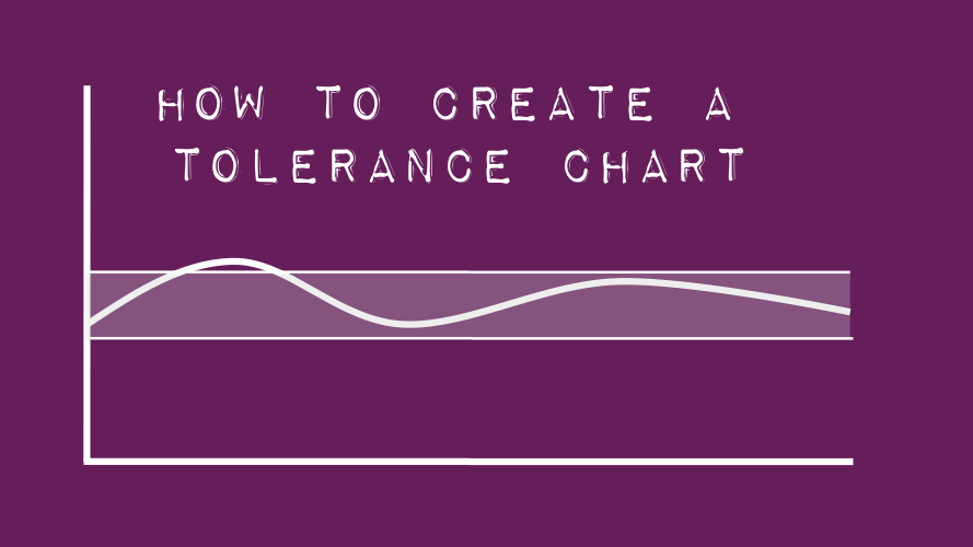
A tolerance chart shows how a result compares to a maximum and minimum permitted range. These charts are often used in industry to check whether a process is working correctly and within permitted limits.
The image below shows the type of chart we will be creating.
The data
This chart requires various values:
- Minimum value – the lowest acceptable value
- Maximum value – the highest acceptable value
- Range – the difference between the highest and lowest values
- Result – the actual result
The example data below uses 15 periods of data.

Create the chart
A tolerance chart is a combination of two chart types, a stacked area chart and 3 line charts.
- Area Chart – Minimum and Range
- Line Charts – Minimum, Maximum and Result
This example is created using Excel 2016. The principles for other versions of Excel will be the same, but the menus may be in slightly different locations.
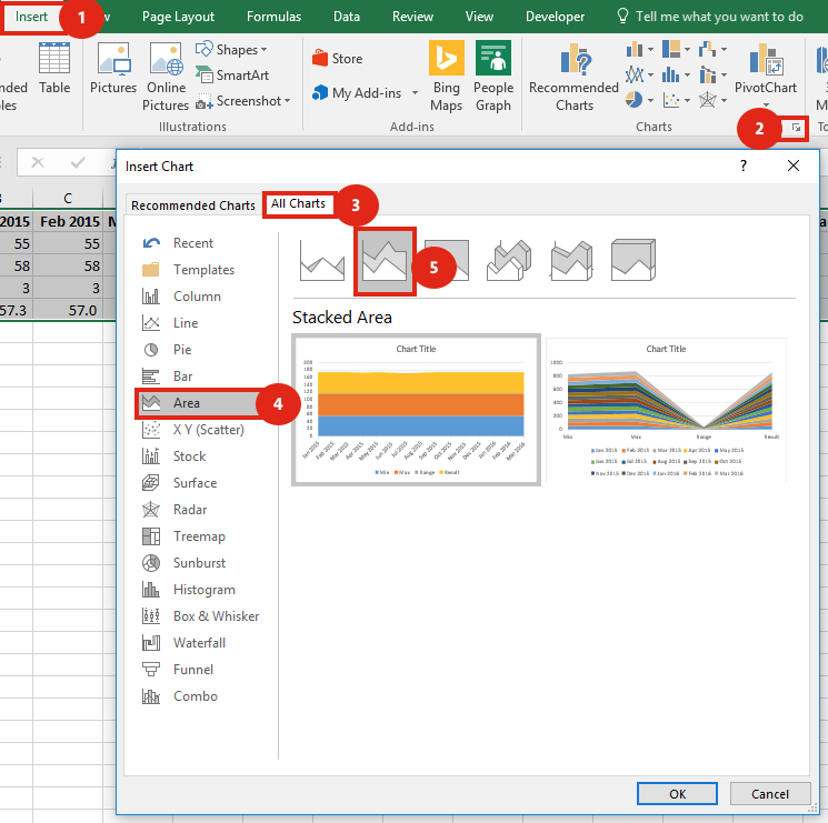
Select cells A1-P5
Click: Insert -> Charts -> All Charts -> Area -> Stacked Area
Then click OK.
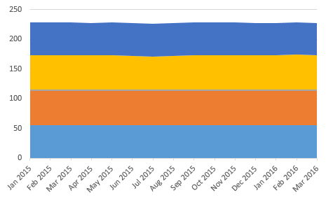
We now need to add the minimum result into the chart again (this will form one of the thick borders of the acceptable range). To do this select Cells A2-P2
Home -> Copy (or Ctrl + C)
Select the chart
Home -> Paste (or Ctrl + V)
Next, delete the title and the legend (unless you specifically require them). The chart should look like this:
Next, right-click the data series relating to the Result (yellow in the screenshot above). From the menu select “Change Series Chart type . . .”. Change the chart types as follows:
- Max – Line
- Min – Line
- Result – Line with Markers
The Min and Range should remain as Stacked Area charts
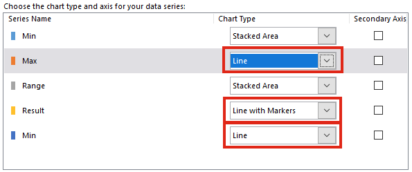
Please note, in other versions of Excel it is necessary to right click on the data series you wish to change, then changing the data series one by one to the chart type you wish.
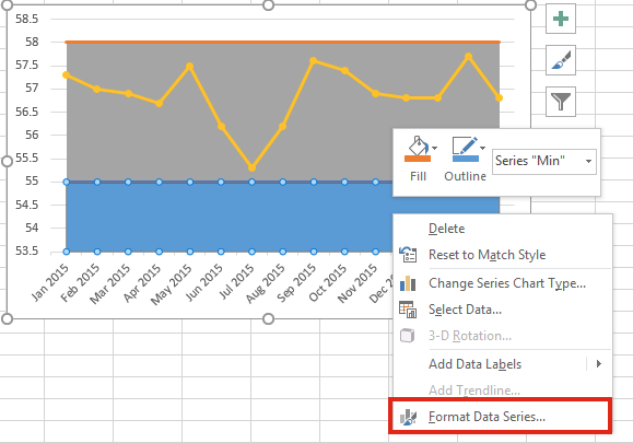
Next, right click on the bottom area (the Min). From the menu select “Format Data Series”. Change the fill for this section to ‘No Fill’.
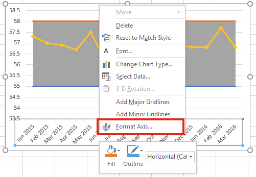
Right-click on the bottom axis. Select “Format Axis”
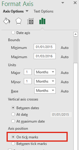
Within the Format Axis window select Axis Options -> Position Axis: – On tick marks
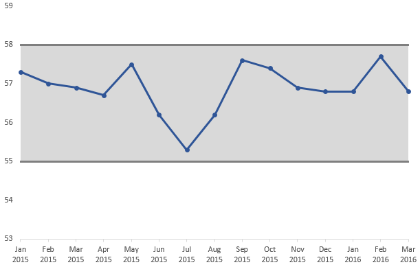
You may now format the left axis, Min, Max and Result on the chart to display as you wish. The final tolerance chart should look something like this:
Notes
Some recommend using a Stacked Column chart to create the highlighted tolerance area. However, I prefer the Stacked Area chart method. Whilst both methods enables the highlighted tolerance area to be different for each period, the Stacked Area chart can provide a smooth change, rather than a stepped change.