Step charts show data that changes at specific points, then remain consistent until the following change occurs. It’s not a default chart type, but I want to share with you how to create a step chart in Excel.
Interest rates set by central banks across the world follow a similar system. Some important people in suits meet together on a particular day and decide the interest rate. That change happens and remains in place until those same people (probably in the same suits) decide to change the rate again. A standard line chart is not suitable for this, but a step chart is a perfect option.
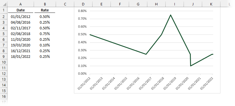
The data below shows the Bank of England interest base rates set for the past ten years. Using a line chart distorts the values as shown below. Between any two points, the line gradually increases or decreases, so they are all incorrect.
A step chart, as shown below, would be the right way to display the data.
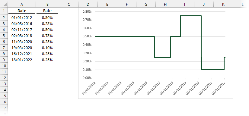
Pick any date and the chart will show the correct value.
While a step chart is not a default chart type, it is easy to create. So, let’s learn how to create a step chart in Excel.
Table of Contents
Download the example file: Join the free Insiders Program and gain access to the example file used for this post.
File name: 0067 Create step chart in Excel.zip
Watch the video
Data concepts
The source data has only one data point at each date. But we should think of a step chart as a line chart with two data points, both happening at the same time. At each step, the first data point is the value before the change; the second data point is the value after the change.
If our data were constructed as follows, it would be perfect for a step chart.
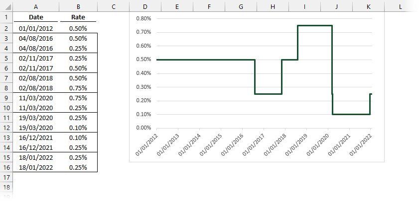
Notice in the screenshot above how all the dates are in order, and each date has two values, the value before the change and the value after the change.
But don’t start moving your data around quite yet. As data in Column A is a date field, Excel will sort this automatically. The dates do not need to be presented in the exact order. Of the two data points happening at each step, provided the first data point (the value before the change) occurs in the data set before the second data point (the value after the change) the chart will display correctly.
With this concept in mind, there are two options to create a step chart in Excel:
- Change the data to match the chart
- Non-contiguous data range used in the chart
Option 1: Change the data to match the chart
The first option requires us to change the shape of our data to create the step chart we need. This is not the best method, so don’t do this. But it will illustrate how the process works for Option 2.
- Copy the data twice, one directly above the other.
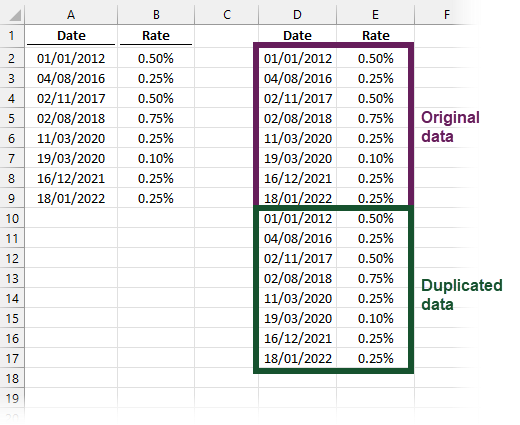
- In the original data section, delete the first date cell and the last value cell (as highlighted in the screenshot below).
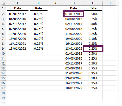
To delete individual cells:- Right-click on the cell and select Delete… from the menu.
- From the Delete dialog box, select Shift cell up
- Click OK
- Create a line chart as usual – it will display as a step chart.
Option 2: Non-contiguous data range used in the chart
When working with ranges in Excel, the comma ( , ) is an important character. The comma creates a non-contiguous range, which is a range of cells not contained within a single border. It sounds more confusing than it really is, and the good news is you don’t need to understand it to use it.
The Source data inside an Excel chart can be non-contiguous; therefore, we can create a step chart without changing any data at all – Woop, Woop!
- Create a line chart as usual, using the original data.
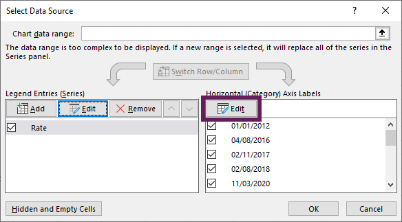
- Right-click on the chart, click Select Data… from the menu.
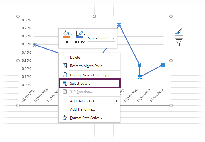
- Select the data series and click Edit.
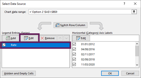
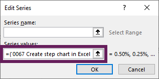
- Change the series values to be:
- All the values except the last cell
- followed by a comma ( , )
- then all the values again (including the last cell).
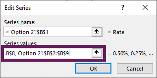
In our example, the series values are now as follows:='Option 2'!$B$2:$B$8,'Option 2'!$B$2:$B$9
Click OK to close the Edit Series dialog box.
- Click Edit for the Axis Labels.
- Change the axis label range to be:
- all the cells containing the labels except the first cell
- followed by a comma ( , )
- then all the cells again (but this time including the first cell).
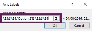
In our example, the Axis label range is now:='Option 2'!$A$3:$A$9,'Option 2'!$A$2:$A$9
Click OK to close the Axis Labels dialog box.
- Click OK to close the Select Data Source dialog box
That’s it. You now have a Step Chart without needing to change your data.
Option 2 (continued): Using an Excel Table
Over time there will be new data to add to the Step Chart. While it is not difficult to update it manually, it would be better if it were completely dynamic.
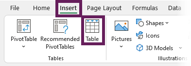
Create an Excel Table
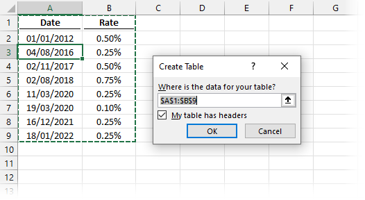
Turn the data into an Excel Table by selecting the data and clicking Insert > Table (Shortcut: Ctrl + T).
The Create Table window will open, check the My table has headers setting is correct, then click OK.
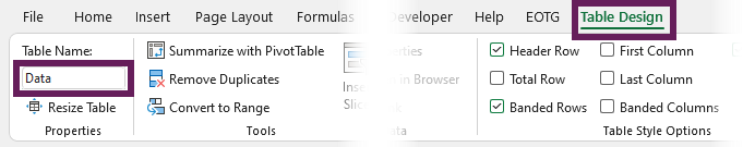
The style of the cells will change to a blue striped format.
Let’s change the name of our Table to Data.
- Click a cell in the Table.
- Then change the name in the Table Design > Table Name section.
Create named ranges
From the Table, we need to create four Named Ranges.
To create a Named Range, click Formulas > Name Manager.
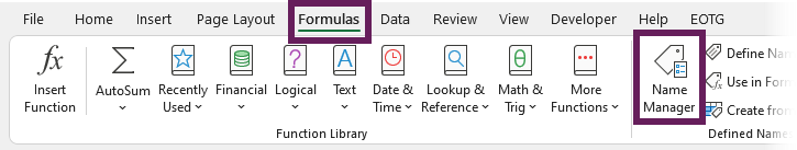
Then, in the Name Manager window, click New.
The New Name window will open. Create each of the named ranges shown below.
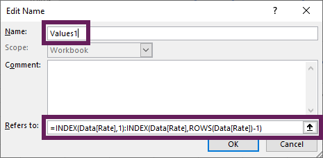
Named Range 1
Name: Values1
Refers to:
=INDEX(Data[Rate],1):INDEX(Data[Rate],ROWS(Data[Rate])-1)
Named Range 2
Name: Values 2
Refers to:
=Data[Rate]
Named Range 3
Name: Dates1
Refers to:
=INDEX(Data[Date],2):INDEX(Data[Date],ROWS(Data[Date]))
Named Range 4
Name: Dates2
Refers to:
=Data[Date]
Use the named ranges in the chart
Finally, use the Named Ranges as the chart source.
As the named ranges have a workbook scope, we need to include the worksheet’s name in the address. The Series Values and Axis labels below have been split into multiple lines to make it easier to read. When you enter it into Excel, it can all be on a single line.
Series Values:
='0067 Create step chart in Excel - Complete.xlsx'!Values1
,
'0067 Create step chart in Excel - Complete.xlsx'!Values2
Axis label Range:
='0067 Create step chart in Excel - Complete.xlsx'!Dates1
,
'0067 Create step chart in Excel - Complete.xlsx'!Dates2
Conclusion
And that’s it. In this post, we have covered 3 ways to create a step chart in Excel. In doing so, we have also learned about non-contiguous data rages and the power of the INDEX function for creating dynamic ranges.
Discover how you can automate your work with our Excel courses and tools.

Excel Academy
The complete program for saving time by automating Excel.

Excel Automation Secrets
Discover the 7-step framework for automating Excel.

Office Scripts: Automate Excel Everywhere
Start using Office Scripts and Power Automate to automate Excel in new ways.
Hi Mark; great post! Perhaps you’ll remember me from your post a couple years ago on Dynamic Array UDFs. Well this post got me thinking/wondering if Excel 365 spill ranges might offer a third option for step charts, and I came up with something that works. (That’s right, my company finally deployed O365, so I’m a kid in a candy store!) The biggest advantage to this method is that the solution remains fully dynamic while the original data no longer has to be sorted for the named references to work.
The spill for Date: =INDEX(SORT(tblData[Date]),SEQUENCE(ROWS(tblData)*2-2,,3/2,1/2))
The spill for Rate: =INDEX(SORTBY(tblData[Rate],tblData[Date]),SEQUENCE(ROWS(tblData)*2-2,,1,1/2))
And then just two named references instead of four. Something like…
Dates: =’Option 3 (Spill)’!$D$2#
Values: =’Option 3 (Spill)’!$E$2#
The purist in me would probably put a TRUNC around the SEQUENCE so that INDEX receives true integers instead of just ignoring the decimals/fractions on its own, but the solution can work without that.
=INDEX(SORT(tblData[Date]),TRUNC(SEQUENCE(ROWS(tblData)*2-2,,3/2,1/2)))
=INDEX(SORTBY(tblData[Rate],tblData[Date]),TRUNC(SEQUENCE(ROWS(tblData)*2-2,,1,1/2)))
Wow! What a great approach. I hadn’t even thought of using a dynamic array. Thanks for sharing 🙂
I found one tiny mistake in what I submitted before. When I doubled the number of rows and subtracted two — ROWS(tblData)*2-2 — I should only have subtracted one. This makes sense because the manual approach involves deleting just one value from each column of the duplicated dataset. The only reason subtracting two appeared to work before was the fact that your data used 1/18/2022 as a representation of “today” with the same rate as the previous row. But using a minus one absolutely works no matter what.
And for those who might be interested in getting automatic inclusion/representation of “today” without having to include that final row in the data…
Date:
=INDEX(SORT(IF(ISNUMBER(tblData[[#All],[Date]]),tblData[[#All],[Date]],TODAY())),TRUNC(SEQUENCE(ROWS(tblData[#All])*2-1,,3/2,1/2)))
Rate:
‘=INDEX(SORTBY(IF(ISNUMBER(tblData[[#All],[Rate]]),tblData[[#All],[Rate]],INDEX(tblData[Rate],XMATCH(99^9,tblData[Date],-1))),IF(ISNUMBER(tblData[[#All],[Date]]),tblData[[#All],[Date]],TODAY())),TRUNC(SEQUENCE(ROWS(tblData[#All])*2-1,,1,1/2)))
Thanks for the update David, this is great 🙂